library(hmisindia)
library(dplyr)
library(tidyr)
library(ggplot2)
library(DT)

data_available <- tryCatch(
  {
    pq <- hmisindia::get_parquet_path()
    nzchar(pq) && file.exists(pq)
  },
  error = function(e) FALSE
)
knitr::opts_chunk$set(eval = data_available)

# Month colors: warm for high-birth months, cool for low-birth months
month_colors <- setNames(
  c(
    "#4575B4", "#74ADD1", "#ABD9E9", "#E0F3F8",
    "#FEE090", "#FDAE61", "#F46D43", "#D73027",
    "#A50026", "#D73027", "#74ADD1", "#4575B4"
  ),
  month.abb
)

exclude_non_geo <- c("All India", "M/O Defence", "M/O Railways")

# Union territories (excluded from state-level analysis)
union_territories <- c(
  "Andaman & Nicobar Islands", "Chandigarh",
  "Dadra & Nagar Haveli and Daman & Diu", "Delhi",
  "Jammu & Kashmir", "Ladakh", "Lakshadweep", "Puducherry"
)
male_births <- get_hmis("Number of male live births",
  category = "Total", sector = c("Total", "Rural", "Urban"), to = "Dec 2024"
) |> rename(setting = sector)

female_births <- get_hmis("Number of female live births",
  category = "Total", sector = c("Total", "Rural", "Urban"), to = "Dec 2024"
) |> rename(setting = sector)
# National monthly totals (Total setting for trend/periodicity analysis)
national_male <- male_births |>
  filter(!state %in% exclude_non_geo, setting == "Total") |>
  group_by(monyear) |>
  summarise(male = sum(value, na.rm = TRUE), .groups = "drop")

national_female <- female_births |>
  filter(!state %in% exclude_non_geo, setting == "Total") |>
  group_by(monyear) |>
  summarise(female = sum(value, na.rm = TRUE), .groups = "drop")

births <- inner_join(national_male, national_female, by = "monyear") |>
  mutate(
    total = male + female,
    date = parse_monyear(monyear),
    year = as.integer(format(date, "%Y")),
    month_num = as.integer(format(date, "%m")),
    month = factor(month_num, levels = 1:12, labels = month.abb),
    pct_male = male / total * 100
  ) |>
  arrange(date)

# Keep only complete years (all 12 months present)
complete_years <- births |>
  count(year) |>
  filter(n == 12) |>
  pull(year)
births <- births |> filter(year %in% complete_years)
India’s HMIS records male and female live births separately across 36 states and UTs from April 2008 to December 2024. We restrict to complete calendar years for seasonal analysis.
Is there seasonality in births?
Trend with monthly color coding
ggplot(births, aes(date, total / 1e6)) +
  geom_line(color = "grey70", linewidth = 0.4) +
  geom_point(aes(color = month), size = 1.5) +
  scale_color_manual(values = month_colors, name = "Month") +
  scale_x_date(date_breaks = "2 years", date_labels = "%Y") +
  labs(
    x = NULL,
    y = "Live births (millions)",
    title = "Total live births in India, 2009\u20132024"
  ) +
  theme_hmis() +
  theme(axis.text.x = element_text(angle = 45, hjust = 1))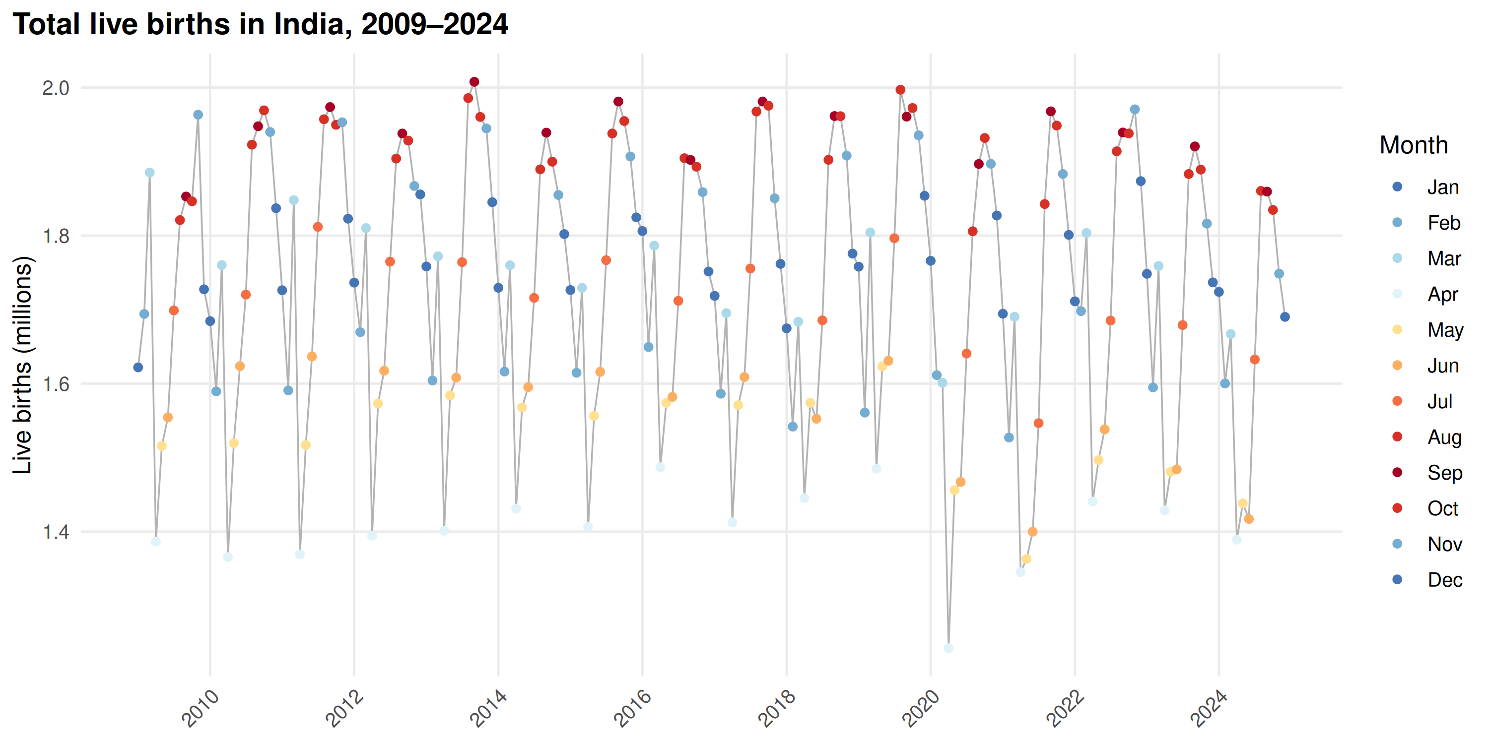
August013November points sit above the line average; April013May points fall below.
Periodicity test
prd <- detect_periodicity(births |> select(monyear, value = total))
print(prd)
#> Periodicity analysis (n = 192 observations)
#>   Detrended: TRUE
#>   Dominant period: 12 observations
#>   Spectral power concentration: 12.5 %
#>   ACF at dominant lag: 0.871 (threshold: 0.141 )
#>
#> Top frequencies:
#>  period    power
#>    12.0 3.81e+11
#>    12.8 3.79e+11
#>    13.7 3.78e+11
#>    11.3 3.77e+11
#>    10.7 3.68e+11
plot(prd)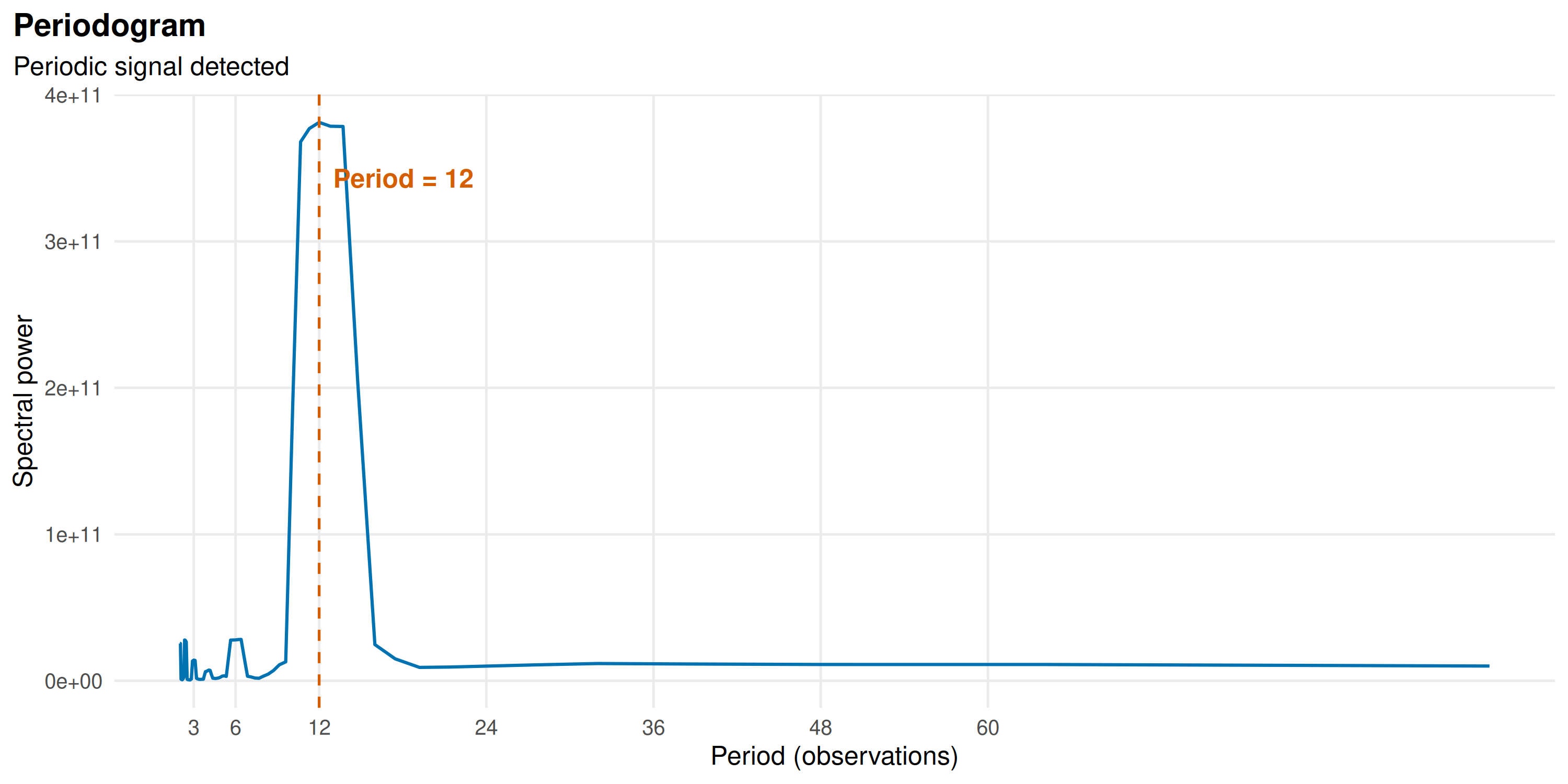
The dominant period is 12 months.
Monthly profiles
month_profile <- births |>
  group_by(month, month_num) |>
  summarise(
    mean_births = mean(total, na.rm = TRUE),
    se          = sd(total, na.rm = TRUE) / sqrt(n()),
    .groups     = "drop"
  ) |>
  arrange(month_num)

ggplot(month_profile, aes(month, mean_births / 1e6, fill = month)) +
  geom_col(width = 0.7) +
  geom_errorbar(
    aes(
      ymin = (mean_births - se) / 1e6,
      ymax = (mean_births + se) / 1e6
    ),
    width = 0.3
  ) +
  geom_hline(
    yintercept = mean(month_profile$mean_births) / 1e6,
    linetype = "dashed", color = "grey40"
  ) +
  scale_fill_manual(values = month_colors, guide = "none") +
  labs(
    x = NULL,
    y = "Mean live births (millions)",
    title = "Mean monthly live births (total)",
    subtitle = "Dashed line = annual monthly average; error bars = \u00b11 SE"
  ) +
  theme_hmis()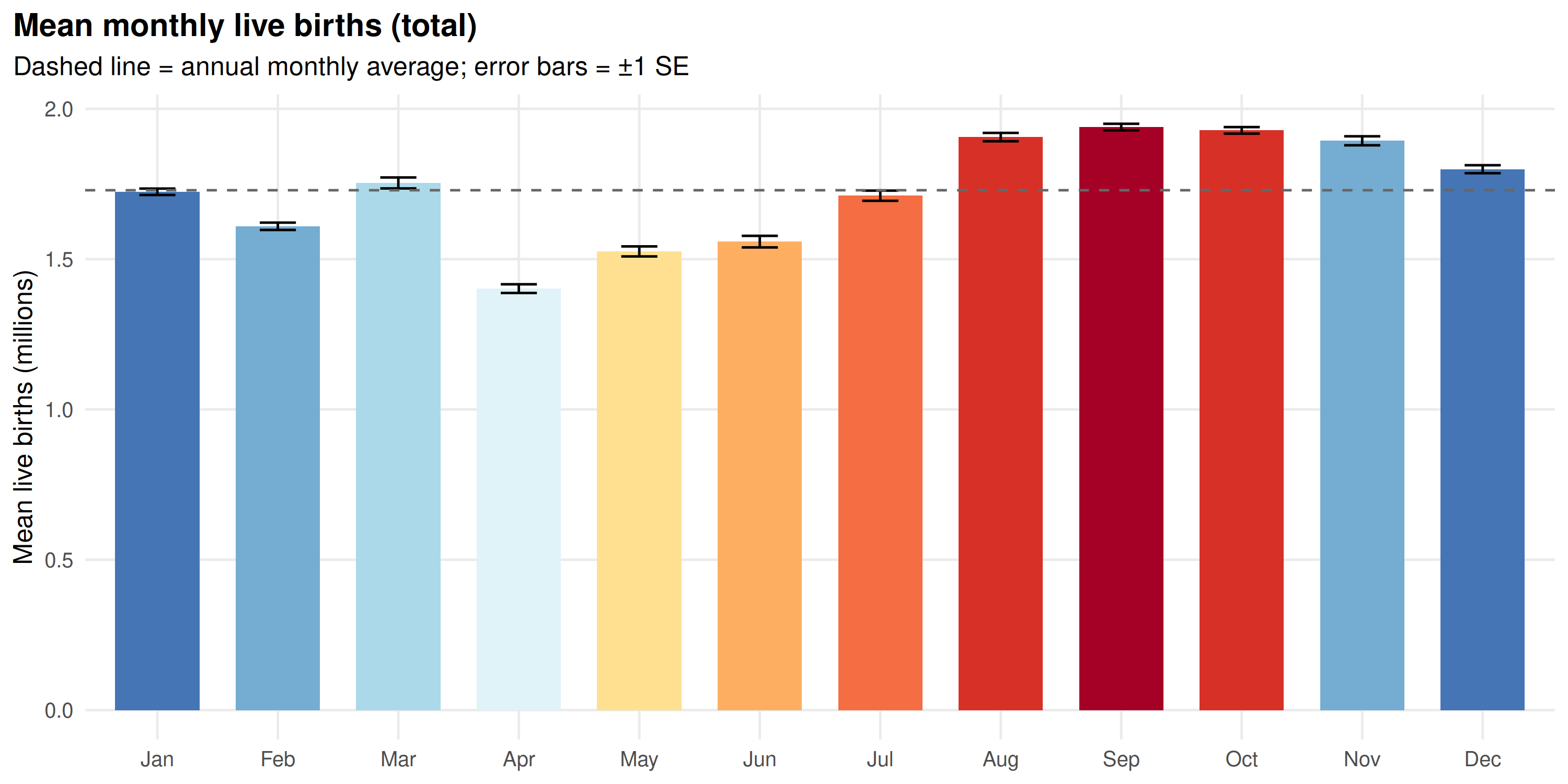
Heatmap: share of annual births by month
Each cell shows that month’s share of annual births; 8.33% would be uniform.
births_pct <- births |>
  group_by(year) |>
  mutate(pct = total / sum(total, na.rm = TRUE) * 100) |>
  ungroup()

ggplot(births_pct, aes(factor(year), month, fill = pct)) +
  geom_tile(color = "white", linewidth = 0.3) +
  geom_text(aes(label = sprintf("%.1f", pct)), size = 2.5) +
  scale_fill_distiller(
    palette = "RdYlBu",
    direction = -1,
    name = "% of annual\nbirths"
  ) +
  scale_y_discrete(limits = rev) +
  labs(
    x = "Year",
    y = NULL,
    title = "Monthly share of annual live births"
  ) +
  theme_hmis() +
  theme(axis.text.x = element_text(angle = 45, hjust = 1))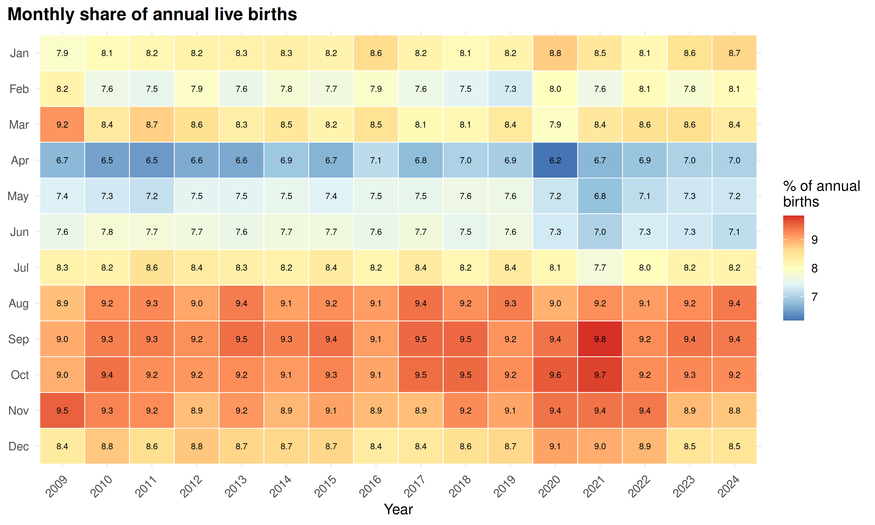
Male vs female birth seasonality
Both sexes follow the same annual cycle.
Monthly profiles by sex
sex_profile <- births |>
  select(month, month_num, male, female) |>
  pivot_longer(c(male, female), names_to = "sex", values_to = "births") |>
  group_by(sex, month, month_num) |>
  summarise(
    mean_births = mean(births, na.rm = TRUE),
    .groups     = "drop"
  ) |>
  mutate(sex = factor(sex,
    levels = c("male", "female"),
    labels = c("Male", "Female")
  ))

ggplot(sex_profile, aes(month, mean_births / 1e6, color = sex, group = sex)) +
  geom_line(linewidth = 1) +
  geom_point(size = 2.5) +
  scale_color_manual(
    values = c("Male" = "#0072B2", "Female" = "#D55E00"),
    name   = NULL
  ) +
  labs(
    x     = NULL,
    y     = "Mean live births (millions)",
    title = "Mean monthly live births by sex"
  ) +
  theme_hmis()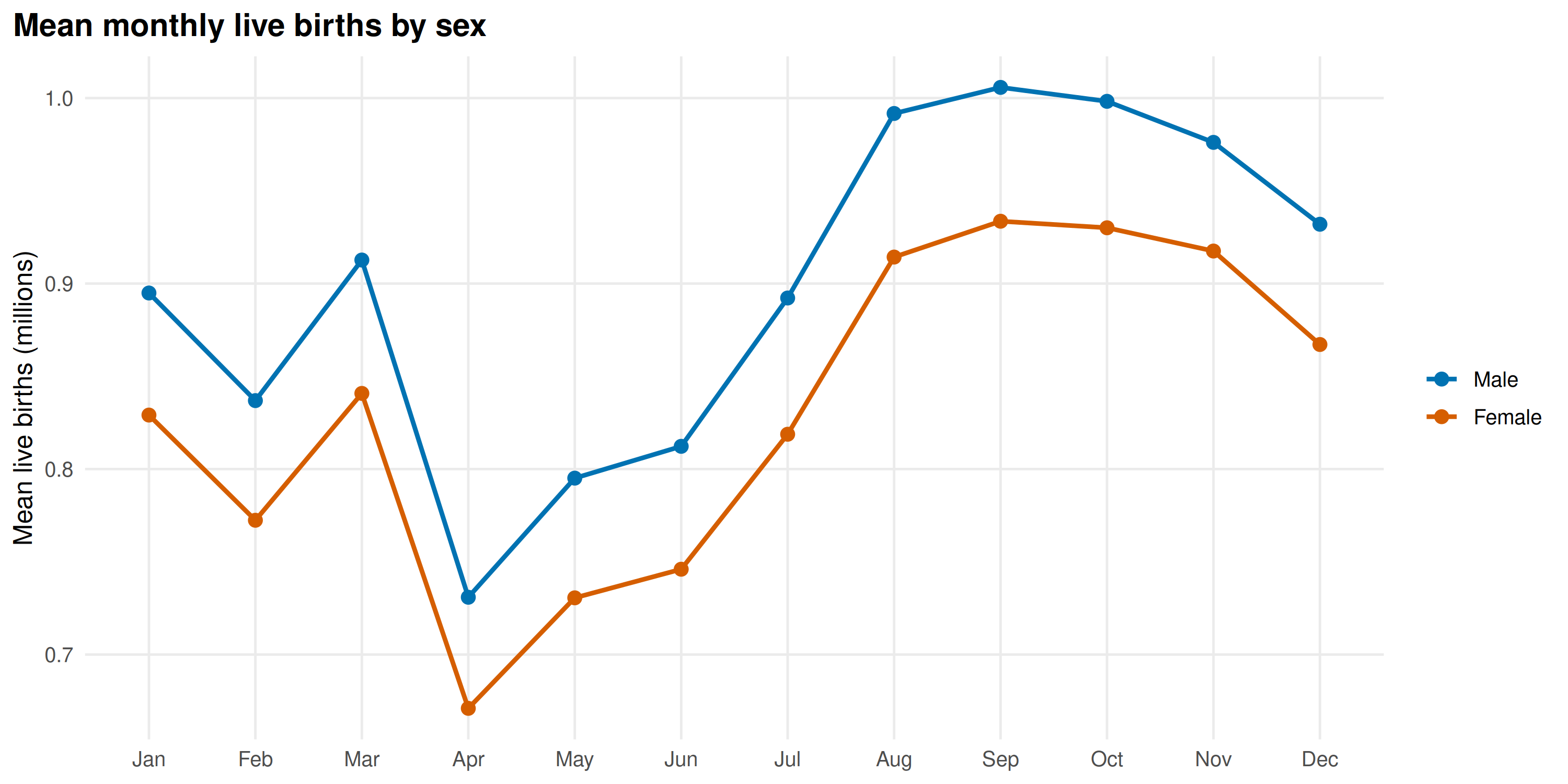
STL decomposition: peak and trough months
male_national <- male_births |>
  filter(!state %in% exclude_non_geo, setting == "Total") |>
  group_by(monyear) |>
  summarise(value = sum(value, na.rm = TRUE), .groups = "drop")

female_national <- female_births |>
  filter(!state %in% exclude_non_geo, setting == "Total") |>
  group_by(monyear) |>
  summarise(value = sum(value, na.rm = TRUE), .groups = "drop")

decomp_male <- decompose_series(male_national)
decomp_female <- decompose_series(female_national)
seasonal_profile <- function(decomp, label) {
  decomp |>
    mutate(month = factor(format(date, "%b"), levels = month.abb)) |>
    group_by(month) |>
    summarise(mean_seasonal = mean(seasonal, na.rm = TRUE), .groups = "drop") |>
    mutate(series = label)
}

sp_male <- seasonal_profile(decomp_male, "Male")
sp_female <- seasonal_profile(decomp_female, "Female")
sp_all <- bind_rows(sp_male, sp_female)
ggplot(sp_all, aes(month, mean_seasonal / 1e3, fill = series, group = series)) +
  geom_col(position = "dodge", width = 0.7) +
  geom_hline(yintercept = 0, color = "grey30") +
  scale_fill_manual(
    values = c("Male" = "#0072B2", "Female" = "#D55E00"),
    name   = NULL
  ) +
  labs(
    x = NULL,
    y = "Seasonal component (thousands)",
    title = "STL seasonal component by month",
    subtitle = "Positive = above-trend months; negative = below-trend"
  ) +
  theme_hmis()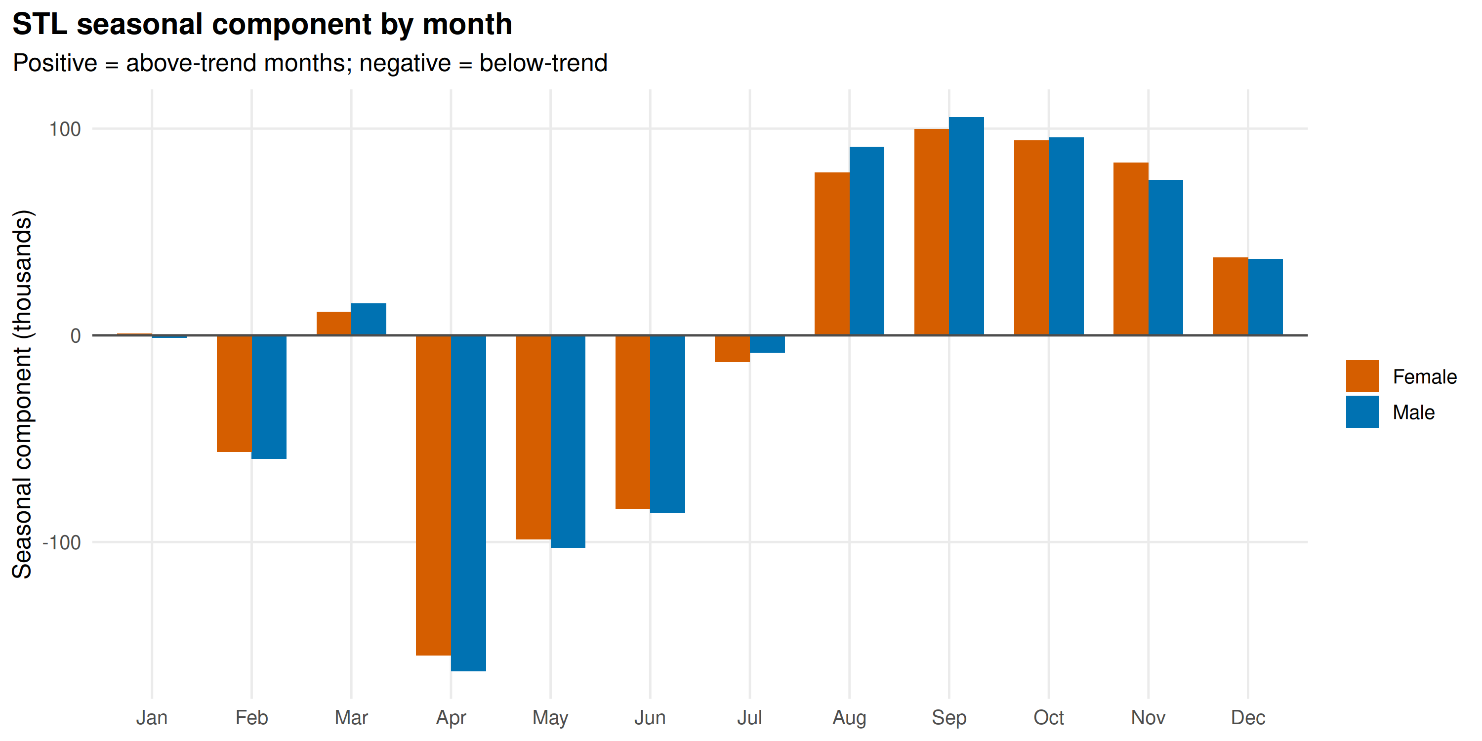
decomp_long <- bind_rows(
  decomp_male |> mutate(series = "Male"),
  decomp_female |> mutate(series = "Female")
) |>
  pivot_longer(
    cols      = c(observed, trend, seasonal, remainder),
    names_to  = "component",
    values_to = "val"
  ) |>
  mutate(
    component = factor(component,
      levels = c("observed", "trend", "seasonal", "remainder")
    )
  )

ggplot(decomp_long, aes(date, val / 1e6, color = series)) +
  geom_line(linewidth = 0.5) +
  facet_wrap(~component, ncol = 1, scales = "free_y") +
  scale_color_manual(
    values = c("Male" = "#0072B2", "Female" = "#D55E00"),
    name   = NULL
  ) +
  labs(
    x     = NULL,
    y     = "Births (millions)",
    title = "STL decomposition: male and female live births"
  ) +
  theme_hmis() +
  theme(
    strip.text  = element_text(face = "bold"),
    axis.text.x = element_text(angle = 45, hjust = 1)
  )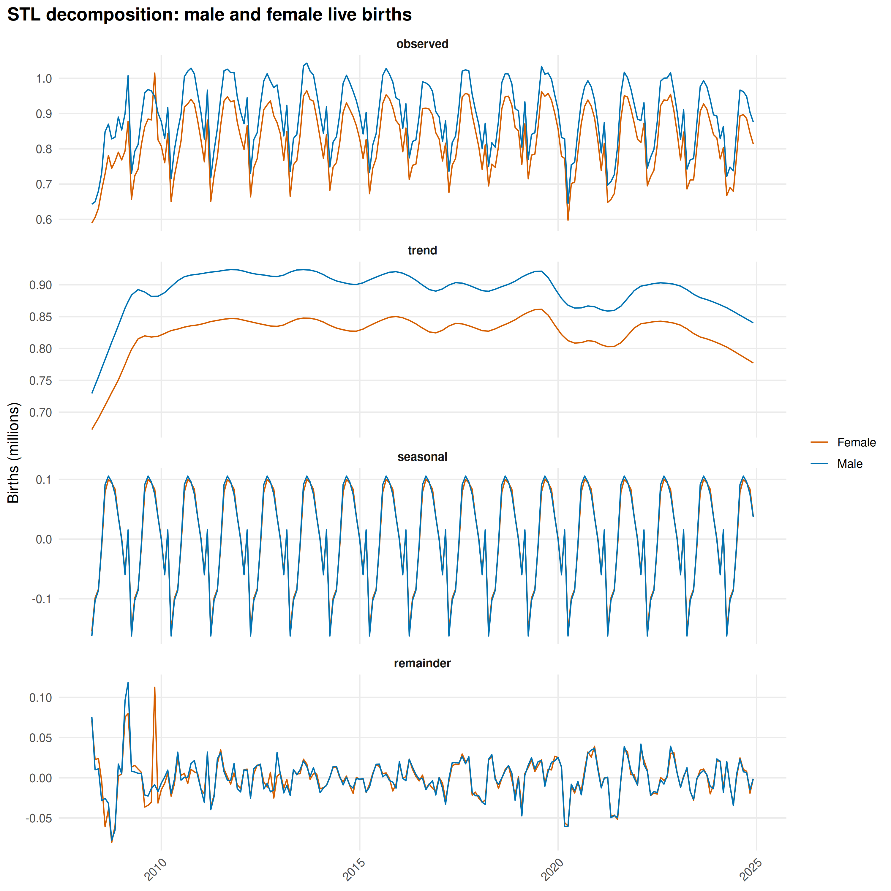
Both series rise from June, peak in September013October, and fall to a trough in April013May.
Sex ratio at birth: does it vary by month?
The fraction of births that are male could still vary seasonally, independent of total volume.
ggplot(births, aes(date, pct_male)) +
  geom_line(color = "grey70", linewidth = 0.4) +
  geom_point(aes(color = month), size = 1.5) +
  scale_color_manual(values = month_colors, name = "Month") +
  geom_hline(yintercept = 50, linetype = "dashed", color = "grey40") +
  scale_x_date(date_breaks = "2 years", date_labels = "%Y") +
  labs(
    x = NULL,
    y = "Male births (%)",
    title = "Percentage of live births that are male",
    subtitle = "Dashed line = 50%"
  ) +
  theme_hmis() +
  theme(axis.text.x = element_text(angle = 45, hjust = 1))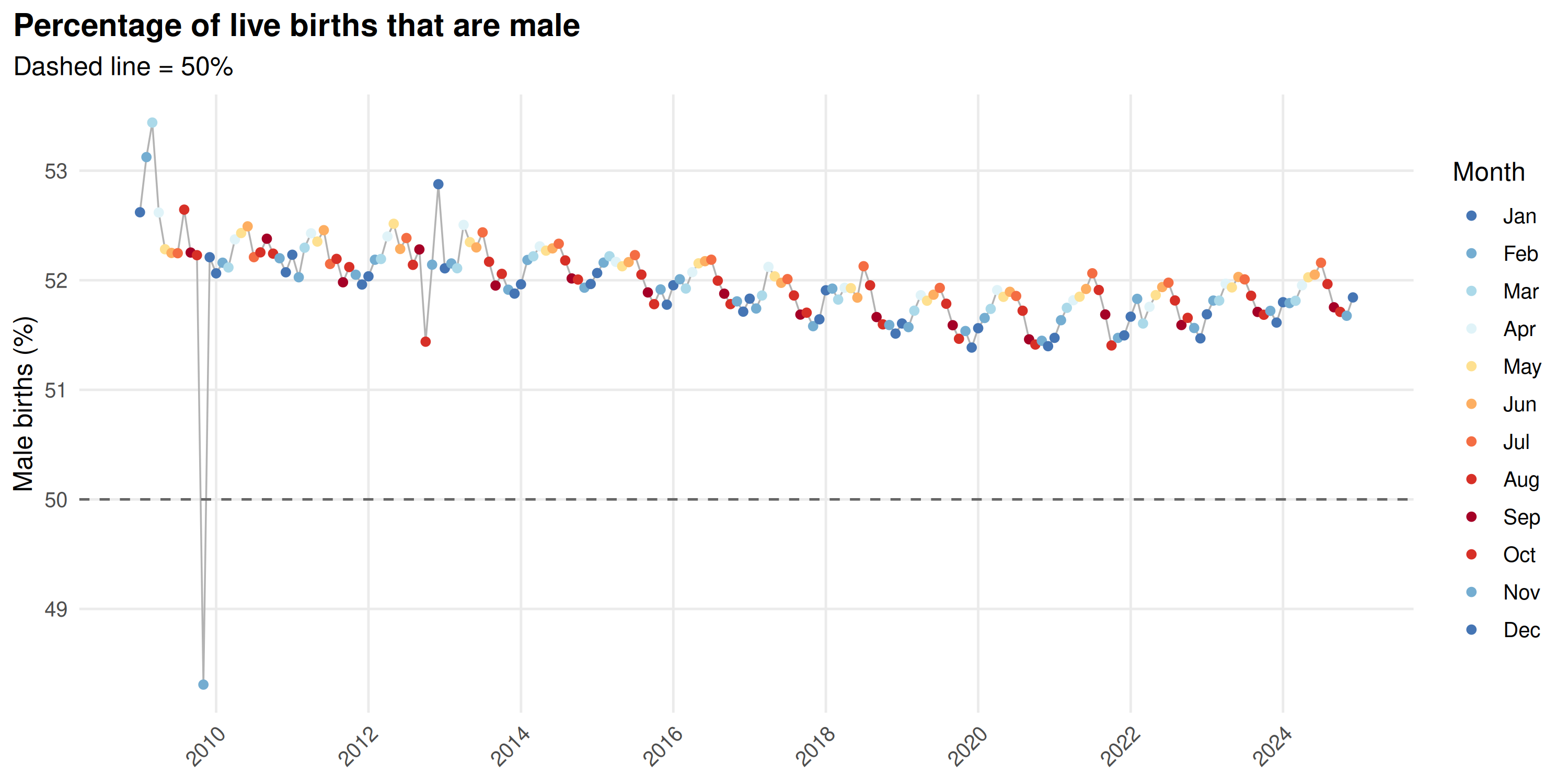
pct_male_profile <- births |>
  group_by(month, month_num) |>
  summarise(
    mean_pct = mean(pct_male, na.rm = TRUE),
    se       = sd(pct_male, na.rm = TRUE) / sqrt(n()),
    .groups  = "drop"
  )

ggplot(pct_male_profile, aes(month, mean_pct, fill = month)) +
  geom_col(width = 0.7) +
  geom_errorbar(
    aes(ymin = mean_pct - se, ymax = mean_pct + se),
    width = 0.3
  ) +
  geom_hline(
    yintercept = mean(pct_male_profile$mean_pct),
    linetype = "dashed", color = "grey40"
  ) +
  scale_fill_manual(values = month_colors, guide = "none") +
  coord_cartesian(ylim = c(51, 52)) +
  labs(
    x        = NULL,
    y        = "Male births (%)",
    title    = "Mean percentage male by month",
    subtitle = "Dashed line = annual average; y-axis clipped to show variation"
  ) +
  theme_hmis()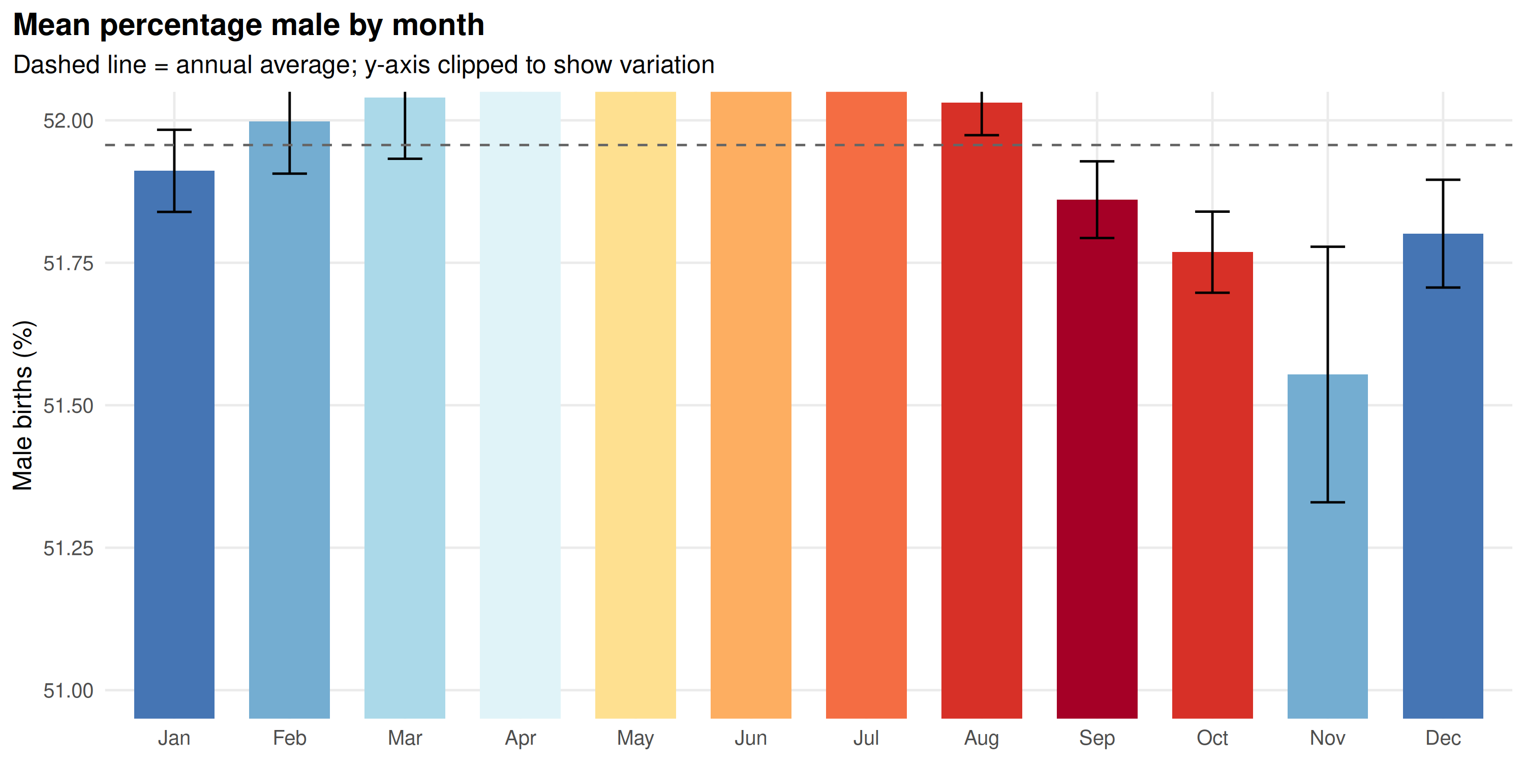
The male fraction stays near 51.5% all year, with month-to-month variation under 0.3 percentage points.
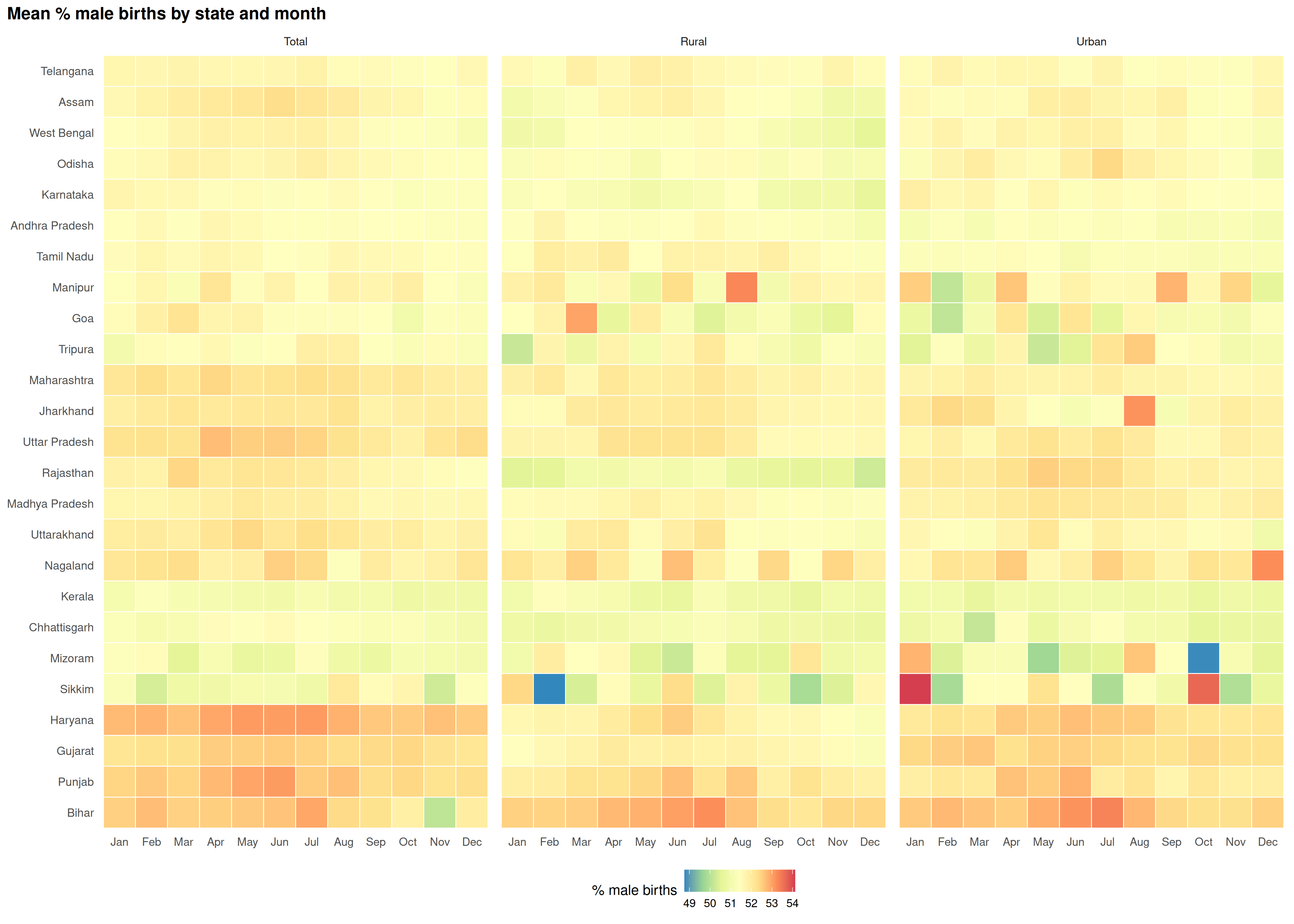
State-level patterns in % male and % female births
The national average masks state-level variation. Union territories are excluded here due to small population sizes and noisy estimates.
exclude_states <- c(
  exclude_non_geo, union_territories,
  "Himachal Pradesh", "Meghalaya", "Arunachal Pradesh"
)

# Per-state monthly % male and % female births by setting (Total, Rural, Urban)
state_births <- inner_join(
  male_births |>
    filter(!state %in% exclude_states) |>
    select(state, monyear, setting, male = value),
  female_births |>
    filter(!state %in% exclude_states) |>
    select(state, monyear, setting, female = value),
  by = c("state", "monyear", "setting")
) |>
  mutate(
    total = male + female,
    pct_male = male / total * 100,
    pct_female = female / total * 100,
    date = parse_monyear(monyear),
    year = as.integer(format(date, "%Y")),
    month = factor(format(date, "%b"), levels = month.abb),
    setting = factor(setting, levels = c("Total", "Rural", "Urban"))
  ) |>
  filter(year %in% complete_years)

avg_male <- state_births |>
  group_by(state, month, setting) |>
  summarise(value = mean(pct_male, na.rm = TRUE), .groups = "drop")

avg_female <- state_births |>
  group_by(state, month, setting) |>
  summarise(value = mean(pct_female, na.rm = TRUE), .groups = "drop")
plot_state_month_heatmap(
  avg_male,
  fill_col   = "value",
  title      = "Mean % male births by state and month",
  fill_label = "% male births",
  palette    = "Spectral",
  facet_col  = "setting"
)
plot_state_month_heatmap(
  avg_female,
  fill_col   = "value",
  title      = "Mean % female births by state and month",
  fill_label = "% female births",
  palette    = "Spectral",
  facet_col  = "setting"
)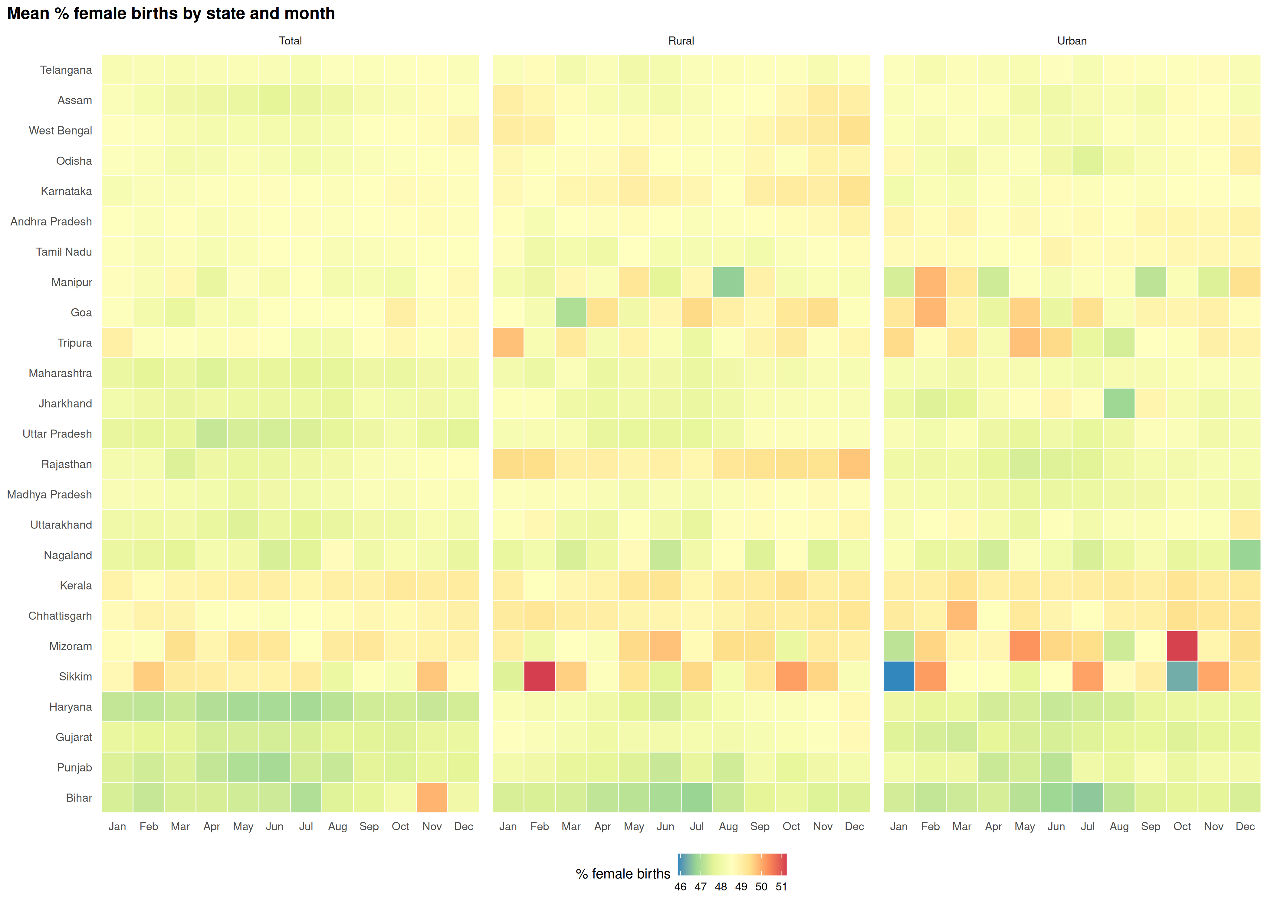
States cluster by peak month for male births. The Rural and Urban panels show whether the pattern holds across settings.
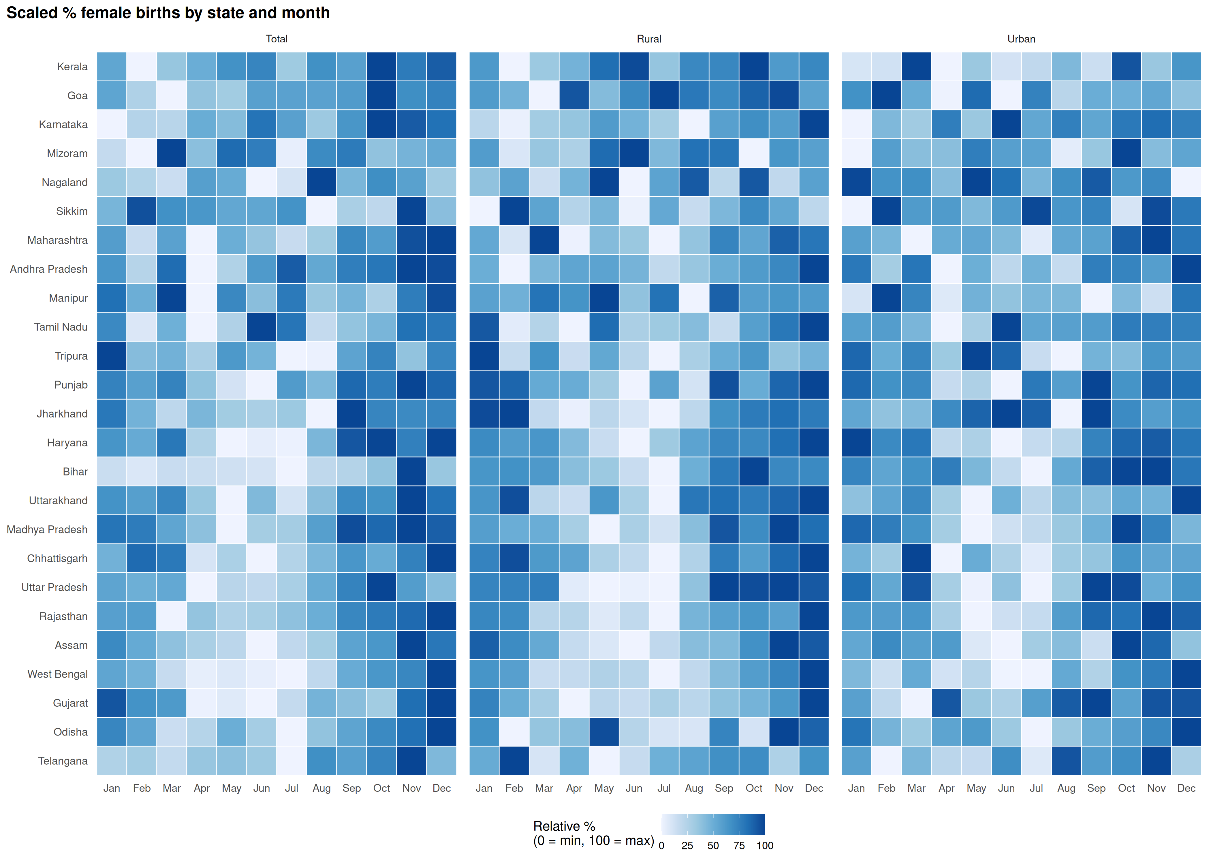
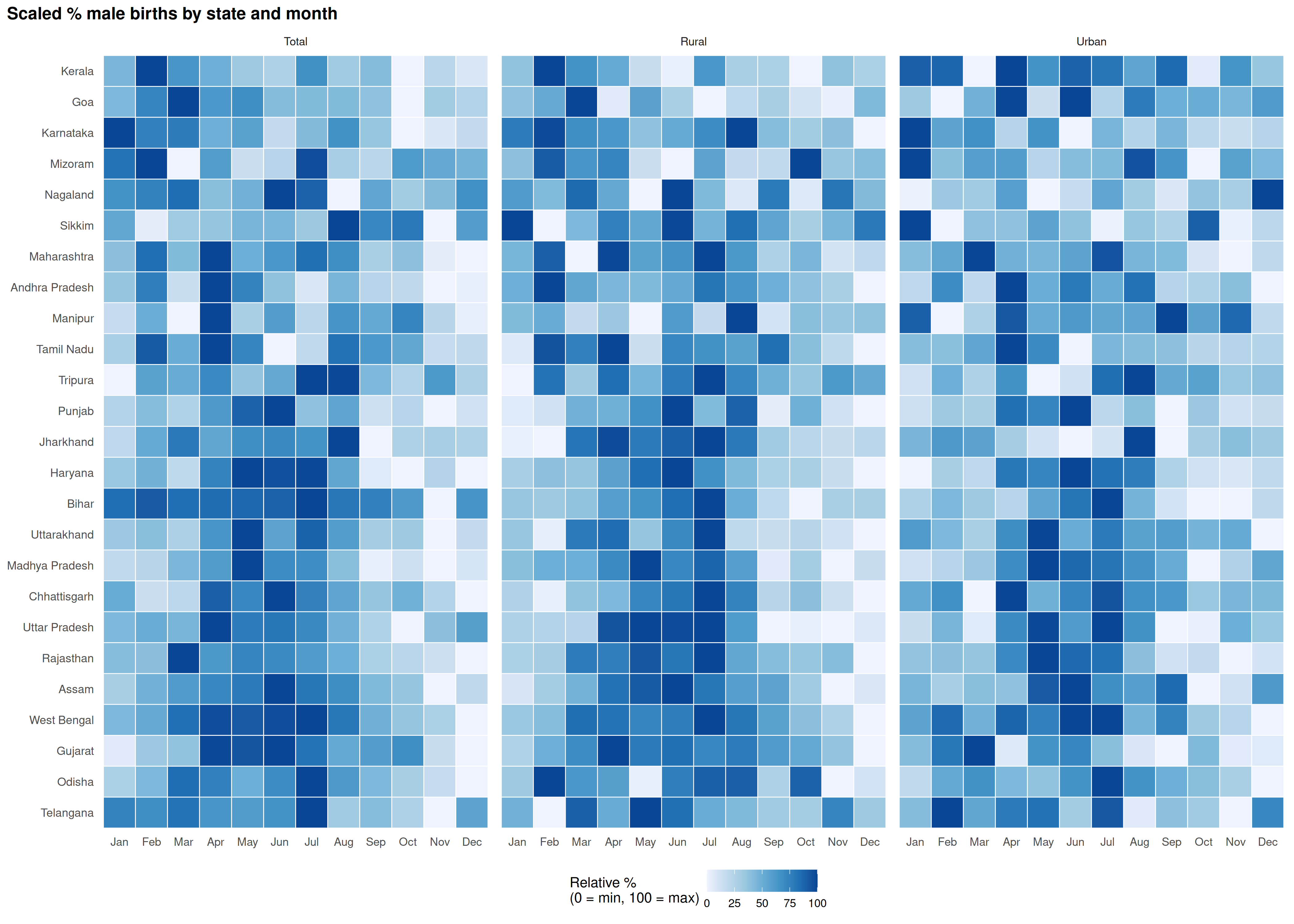
Scaled heatmaps
Scaling each state to its own 0-100 range (min to max) within each type removes the baseline sex ratio and shows only the within-state seasonal shape.
scale_01 <- function(x) {
  r <- range(x, na.rm = TRUE)
  if (r[2] == r[1]) {
    return(rep(50, length(x)))
  }
  100 * (x - r[1]) / (r[2] - r[1])
}

avg_male_scaled <- avg_male |>
  group_by(state, setting) |>
  mutate(value = scale_01(value)) |>
  ungroup()

avg_female_scaled <- avg_female |>
  group_by(state, setting) |>
  mutate(value = scale_01(value)) |>
  ungroup()
plot_state_month_heatmap(
  avg_male_scaled,
  fill_col   = "value",
  title      = "Scaled % male births by state and month",
  fill_label = "Relative %\n(0 = min, 100 = max)",
  palette    = "Blues",
  direction  = 1,
  facet_col  = "setting"
)
plot_state_month_heatmap(
  avg_female_scaled,
  fill_col   = "value",
  title      = "Scaled % female births by state and month",
  fill_label = "Relative %\n(0 = min, 100 = max)",
  palette    = "Blues",
  direction  = 1,
  facet_col  = "setting"
)