# Define non-state entities and UTs
exclude_states <- c(
  "All India", "M/O Defence", "M/O Railways", "Chandigarh",
  "A & N Islands", "Andaman & Nicobar Islands", "Lakshadweep",
  "The Dadra And Nagar Haveli And Daman And Diu", "DNHDD",
    "Dadra & Nagar Haveli and Daman & Diu",
  "Jammu And Kashmir", "Jammu & Kashmir",
  "Ladakh", "Puducherry", "Goa", "Telangana"
)
# Subset of regions
north_states <- c(
  "Uttar Pradesh", "Bihar", "Jharkhand", "Rajasthan",
  "Madhya Pradesh", "Haryana", "Punjab", "Uttarakhand",
  "Himachal Pradesh", "Delhi"
)
south_states <- c(
  "Karnataka", "Kerala", "Tamil Nadu",
  "Andhra Pradesh", "Telangana"
)
north_eastern_states = c("Arunachal Pradesh", "Assam", "Manipur", "West Bengal", "Jharkhand", "Sikkim")

# Monsoon window (June = 6, September = 9)
monsoon_rect <- annotate(
  "rect",
  xmin = 6 - 0.5, xmax = 9 + 0.5,
  ymin = -Inf,     ymax = Inf,
  fill = "#4DA6FF", alpha = 0.12
)
monsoon_label <- annotate(
  "text",
  x = 7.5, y = Inf,
  vjust = 1.5, size = 3,
  color = "black",
  label = "Monsoon"
)

# Monsoon vary in different parts of India
Neonatal deaths
#  Neonatal deaths
deaths_old <- bind_rows(
  # 24hr deaths (no cause) — included in total pre-2017
  get_hmis(
    "Number of cases of Infant deaths within 24 hrs of birth",
    sector = "Total",
    to     = "Mar 2017"
  ),
  # Cause-specific deaths 24hr–4wk
  get_hmis(
    "24 hours to 4 weeks",
    match    = "regex",
    sector   = "Total",
    category = "Total",
    to       = "Mar 2017"
  )
) |> add_calendar_vars()

deaths_new <- bind_rows(
  get_hmis("Infant Deaths up to 4 weeks due to Asphyxia",
           sector = "Total", from = "Apr 2017"),
  get_hmis("Infant Deaths up to 4 weeks due to Sepsis",
           sector = "Total", from = "Apr 2017"),
  get_hmis("Infant Deaths up to 4 weeks due to Other causes",
           sector = "Total", from = "Apr 2017")
  # Prematurity: Apr 2023 onwards only
) |> add_calendar_vars()

d_collapsed <- bind_rows(deaths_old, deaths_new) |>
  filter(!state %in% exclude_states) |>
  group_by(state, monyear, cal_year, month, month_num) |>
  summarise(deaths = sum(as.numeric(value), na.rm = TRUE), .groups = "drop")
Live births
#Live births
births_old <- get_hmis(
  "Total number of male and female live births",
  sector = "Total",
  to     = "Mar 2017"
) |> add_calendar_vars()

births_new <- bind_rows(
  get_hmis("Number of male live births",   sector = "Total", from = "Apr 2017"),
  get_hmis("Number of female live births", sector = "Total", from = "Apr 2017")
) |> add_calendar_vars()

b_collapsed <- bind_rows(births_old, births_new) |>
  filter(!state %in% exclude_states) |>
  group_by(state, monyear, cal_year, month, month_num) |>
  summarise(births = sum(as.numeric(value), na.rm = TRUE), .groups = "drop")
Calculate NMR
Neonatal mortality is defined as neonatal deaths per 1000 live births occurring within the first 28 days of life.
nmr_data <- d_collapsed |>
  inner_join(b_collapsed,
             by = c("state", "monyear", "cal_year", "month", "month_num")) |>
  mutate(nmr = (as.numeric(deaths) / as.numeric(births)) * 1000)
  nmr_national_annual <- nmr_data |>
    group_by(cal_year) |>
    summarise(
      deaths = sum(deaths, na.rm = TRUE),
      births = sum(births, na.rm = TRUE),
      nmr    = (deaths / births) * 1000,
      .groups = "drop"
    )

  nmr_national_monthly <- nmr_data |>
    group_by(cal_year, month, month_num) |>
    summarise(
      deaths = sum(deaths, na.rm = TRUE),
      births = sum(births, na.rm = TRUE),
      nmr    = (deaths / births) * 1000,
      .groups = "drop"
    )

  nmr_states_seasonal <- nmr_data |>
    group_by(state, month, month_num) |>
    summarise(med_nmr = median(nmr, na.rm = TRUE), .groups = "drop")
National NMR trend (2008–2025)
How has India’s NMR changed over 15 years?
ggplot(nmr_national_annual, aes(cal_year, nmr)) +
  geom_line(color = "steelblue", linewidth = 1) +
  geom_vline(xintercept = 2017, linetype = "dotted",
             color = "grey40", linewidth = 0.7) +
  annotate(geom = "label", x = 2015, y = max(nmr_national_annual$nmr) * 0.97,
           hjust = 0, size = 3.2, color = "grey4",
           label = "Apr 2017 indicator\nrename") +
  scale_x_continuous(breaks = seq(2009, 2024, 2)) +
  scale_y_continuous(limits = c(0, NA), labels = number_format(accuracy = 0.1)) +
  labs(
    title   = "National Neonatal Mortality: All India (2008–2025)",
    caption = "Data: HMIS via {hmisindia} R package",
    x = NULL, y = "NMR (per 1,000 live births)"
  ) +
  theme_hmis() +
  theme(
        axis.text = element_text(face = "bold")) +
    labs_hmis()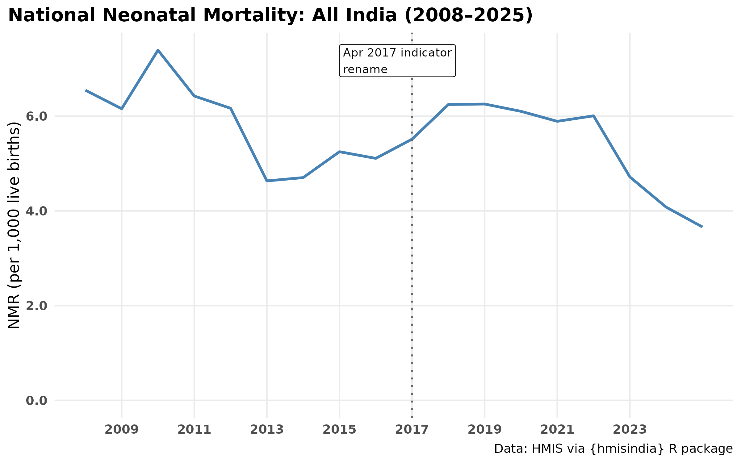
Seasonal profile — individual years and average
Each grey line is one calendar year. The orange line is the cross-year average.
ggplot(nmr_national_monthly,
       aes(x = month_num, y = nmr, group = cal_year)) +
  geom_line(alpha = 0.25, color = "grey60", linewidth = 0.65) +
  stat_summary(
    aes(group = 1),
    fun     = mean,
    geom    = "line",
    color   = "#E69F00",
    linewidth = 1
  ) +
    monsoon_label +
    monsoon_rect +
  scale_x_continuous(breaks = 1:12, labels = month.abb) +  # month.abb, built-in constant in R
  scale_y_continuous(labels = number_format(accuracy = 0.1)) +
  labs(
    title    = "NMR seasonal profile: All India (2008–2025)",
    caption  = "Data: HMIS via hmisindia R package",
    x = NULL, y = "NMR (per 1,000 live births)"
  ) +
  theme_hmis() +
  theme(axis.text = element_text(face = "bold")) +
    labs_hmis()
Is the seasonality Bimodal?
ggplot(nmr_national_monthly, aes(x=month_num, y=nmr)) +
  stat_summary(fun=median, geom="line", linewidth =1, color="steelblue") +
  scale_x_continuous(breaks=1:12, labels=month.abb) +
  labs(
       title="Median NMR across months (2008–2025)",
       x=NULL, y="NMR per 1,000 live births") +
  theme_hmis() +
  theme(
        axis.text = element_text(face = "bold")) +
    labs_hmis()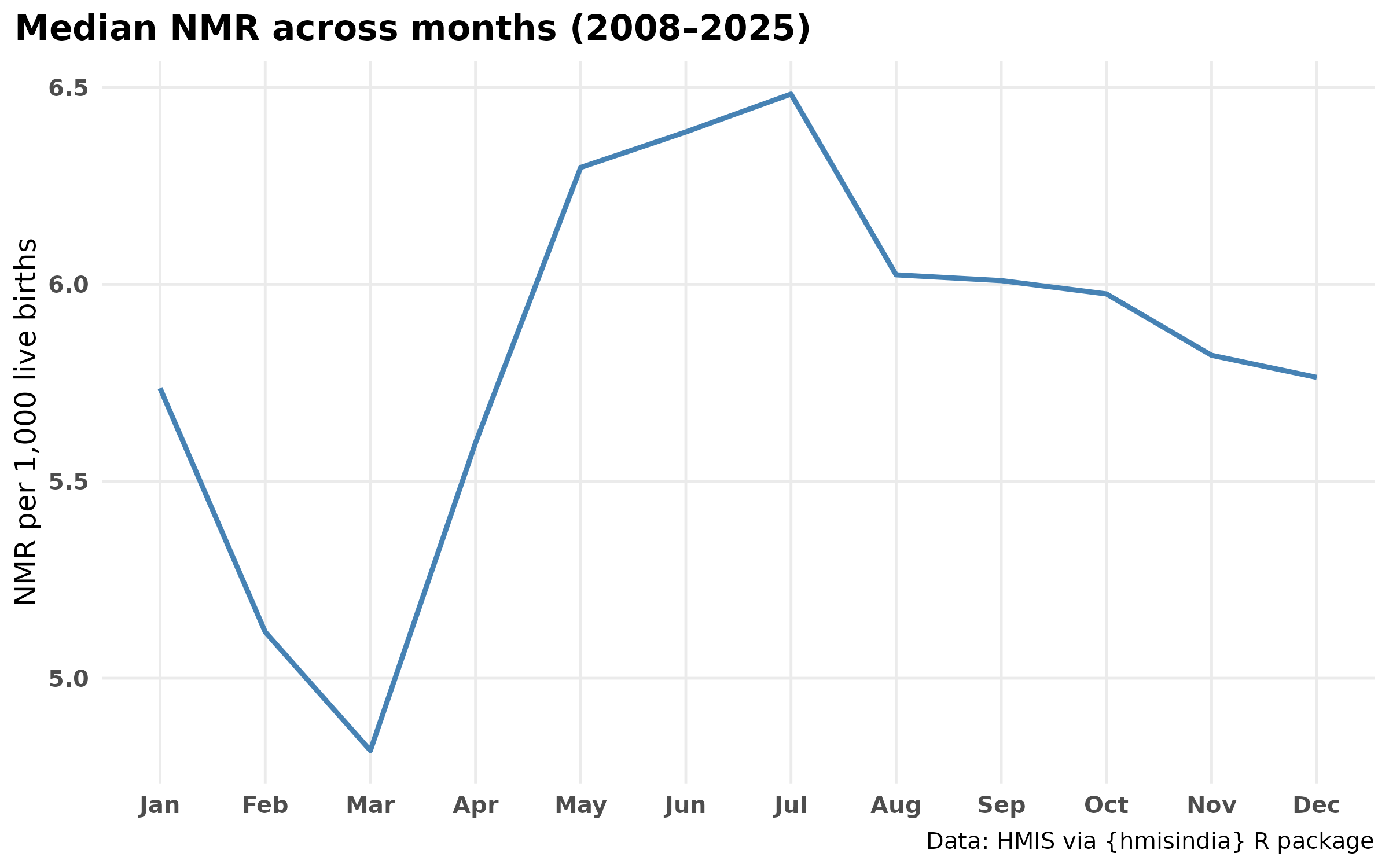
Which month peaks most often?
peak_summary <- nmr_national_monthly |>
  group_by(cal_year) |>
  slice_max(nmr, n = 1, with_ties = FALSE) |>
  ungroup() |>
  count(month, sort = TRUE, name = "Number of Years") |> # name argument replaces rename()
  rename(`Peak Month` = month)

# Create gt table
peak_summary |>
  gt() |>
  tab_header(
    title = "Frequency of months recording the highest NMR (2008–2025)"
  ) |>
  opt_align_table_header(align = "left") |>
  tab_options(
    table.width = px(400),
    column_labels.font.weight = "bold",
    heading.title.font.size = px(18)
) | Frequency of months recording the highest NMR (2008–2025) | |
| Peak Month | Number of Years |
|---|---|
| Jun | 5 |
| Jul | 5 |
| May | 3 |
| Jan | 2 |
| Feb | 1 |
| Apr | 1 |
| Sep | 1 |
Within-year heatmap (year × month)
Each row is independently scaled 0–1 so the long-run declining trend does not mask the seasonal shape within years.
nmr_heat_norm <- nmr_national_monthly |>
  mutate(month = factor(month, levels = month.abb)) |>
  group_by(cal_year) |>
  mutate(
    rng      = max(nmr, na.rm = TRUE) - min(nmr, na.rm = TRUE),
    nmr_norm = if_else(rng == 0, 0.5, (nmr - min(nmr, na.rm = TRUE)) / rng)
  ) |>
  ungroup()
plot_heatmap(
  data = nmr_heat_norm,
  x = "month",
  y_var = "cal_year",
  fill = "nmr_norm",
  palette = "viridis",
  legend_title = "Relative NMR",
  title = "When does neonatal mortality peak in India?"
) +
  theme(
    plot.title          = element_text(face = "bold"),
    plot.subtitle       = element_text(color = "grey40"),
    axis.text.x         = element_text(hjust = 1),
   axis.text = element_text(face = "bold"),
    legend.position     = "top"
  ) +
    guides(
    fill = guide_colorbar(
      barwidth = 12,
      barheight = 0.55
    )
  ) +
    labs_hmis()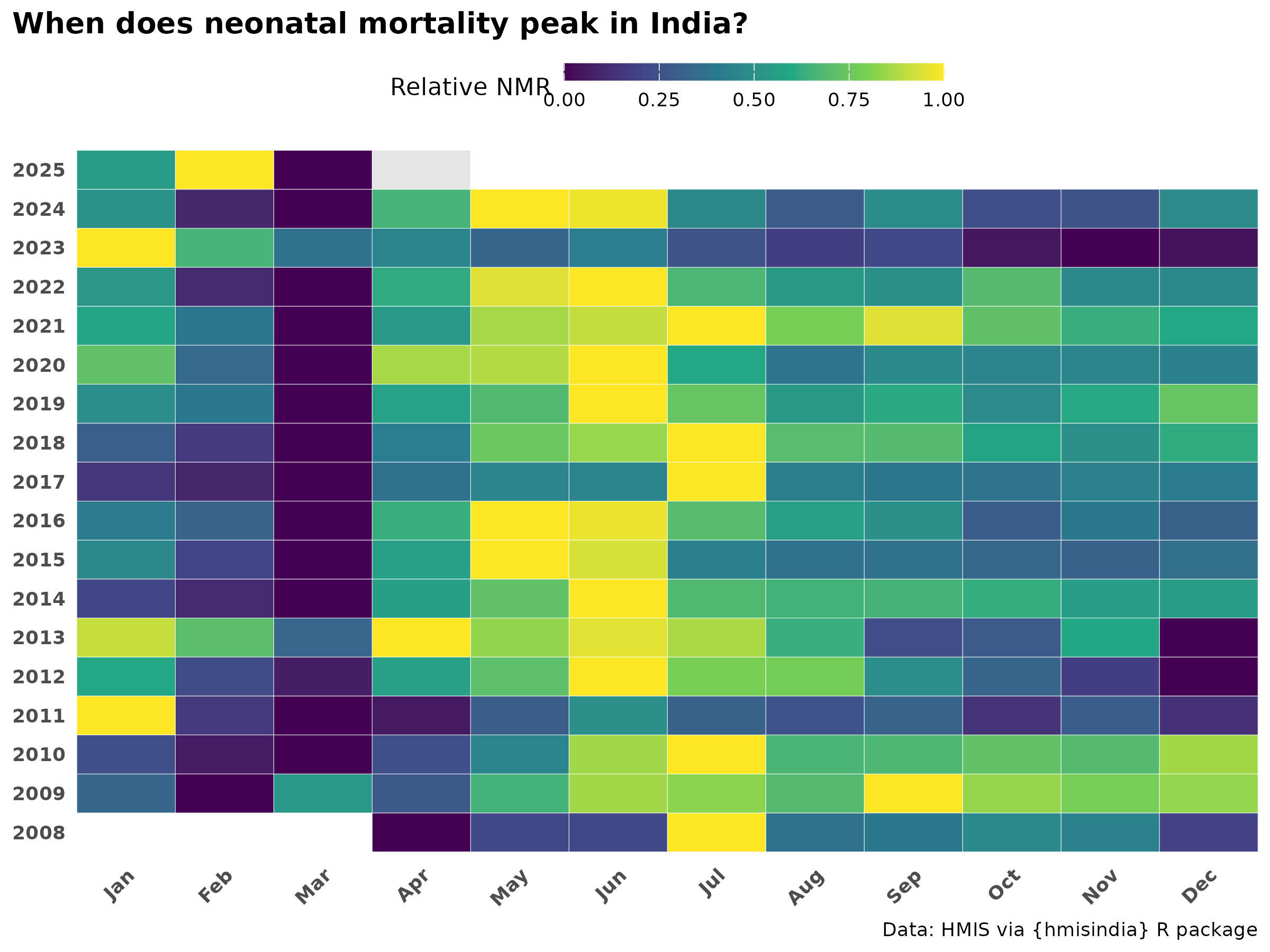
State-level NMR seasonality
Min-max normalised heatmap (peak timing)
Each state’s 12 monthly median NMR values are independently scaled 0–1. This reveals when each state peaks, removing the effect of overall burden level. States ordered by peak month.
nmr_states_seasonal <- nmr_data |>
  dplyr::filter(!state %in% exclude_states) |>
  dplyr::group_by(state, month, month_num) |>
  dplyr::summarise(
    med_nmr = median(nmr, na.rm = TRUE),
    .groups = "drop"
  ) |>
  dplyr::mutate(month = factor(month, levels = month.abb))

# Min-max normalization
nmr_states_minmax <- nmr_states_seasonal |>
  dplyr::group_by(state) |>
  dplyr::mutate(
    s_min    = min(med_nmr, na.rm = TRUE),
    s_max    = max(med_nmr, na.rm = TRUE),
    nmr_norm = dplyr::if_else(
      s_max > s_min,
      (med_nmr - s_min) / (s_max - s_min),
      0.5   #
    )
  ) |>
  dplyr::ungroup() |>
  dplyr::select(-s_min, -s_max)

# Order states by peak month (Jan-peak at top, Dec-peak at bottom)
peak_order_minmax <- nmr_states_minmax |>
  dplyr::group_by(state) |>
  dplyr::slice_max(nmr_norm, n = 1, with_ties = FALSE) |>
  dplyr::arrange(as.integer(month)) |>
  dplyr::pull(state)

nmr_states_minmax <- nmr_states_minmax |>
  dplyr::mutate(state = factor(state, levels = peak_order_minmax))
# Min-max heatmap
ggplot(nmr_states_minmax,
                    aes(x = month, y = state, fill = nmr_norm)) +
  geom_tile(color = "white", linewidth = 0.3) +
  scale_fill_distiller(
    palette   = "YlOrBr",
    direction = 1,
    name      = "Seasonal\nindex",
    limits    = c(0, 1),
    breaks    = c(0, 0.5, 1),
  ) +
scale_x_discrete(drop = FALSE, limits = month.abb) +
    theme_hmis() +
  theme(
    plot.title          = element_text(face = "bold"),
    plot.title.position = "plot",
    plot.subtitle       = element_text(color = "grey40"),
    panel.grid          = element_blank(),
    axis.text.x         = element_text(hjust = 1),
    axis.text         = element_text(face = "bold"),
    legend.position     = "top"
  ) +
  guides(fill = guide_colorbar(barheight  = unit(0.7, "lines"),
                                barwidth = unit(10,  "lines"))) +
      labs(
    title    = "NMR Seasonal Pattern: All States (Min-Max Normalised)",
    x = NULL, y = NULL) +
        labs_hmis()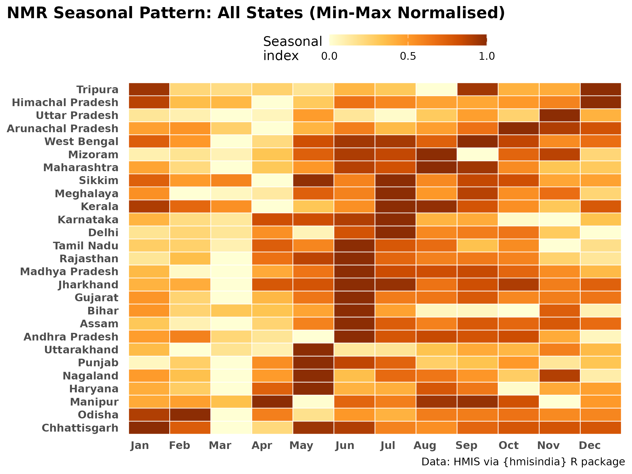
Z-score deviation heatmap
Z-score normalisation (using median and MAD) shows how far each month deviates from a state’s typical NMR. Blue = below-average mortality month, orange = above-average. Unlike min-max, this preserves information about the amplitude of seasonal deviation.
# Z-score normalization (median / MAD)
# For each state, compute how far each month's NMR deviates from that
# state's median NMR, measured in MAD units.
# Capped at ±3

nmr_states_z <- nmr_states_seasonal |>
  dplyr::group_by(state) |>
  dplyr::mutate(
    state_med = median(med_nmr, na.rm = TRUE),
    state_mad = mad(med_nmr,    na.rm = TRUE),
    z         = dplyr::if_else(
      state_mad == 0, 0,
      (med_nmr - state_med) / state_mad
    )
  ) |>
  dplyr::ungroup() |>
  # Cap extremes — states with near-zero variance get huge z-scores otherwise
  dplyr::mutate(z = pmin(pmax(z, -3), 3))

nmr_states_z <- nmr_states_z |>
  dplyr::mutate(state = factor(state, levels = peak_order_minmax))
# Z-score heatmap
ggplot(nmr_states_z, aes(x = month, y = state, fill = z)) +
  geom_tile(color = "white", linewidth = 0.3) +
    scale_fill_distiller(
      palette   = "PuOr",
      direction = 1
    ) +
    labs(
    title    = "NMR Seasonal Deviation by State",
    x = NULL, y = NULL
  ) +
  theme_hmis() +
  theme(
    plot.subtitle       = element_text(color = "grey40"),
    panel.grid          = element_blank(),
    axis.text.x         = element_text(hjust = 1),
    axis.text        = element_text(face = "bold"),
    legend.position     = "top"
  ) +
  guides(fill = guide_colorbar(barheight  = unit(0.7, "lines"),
                                barwidth = unit(10,  "lines"))) +
    labs_hmis()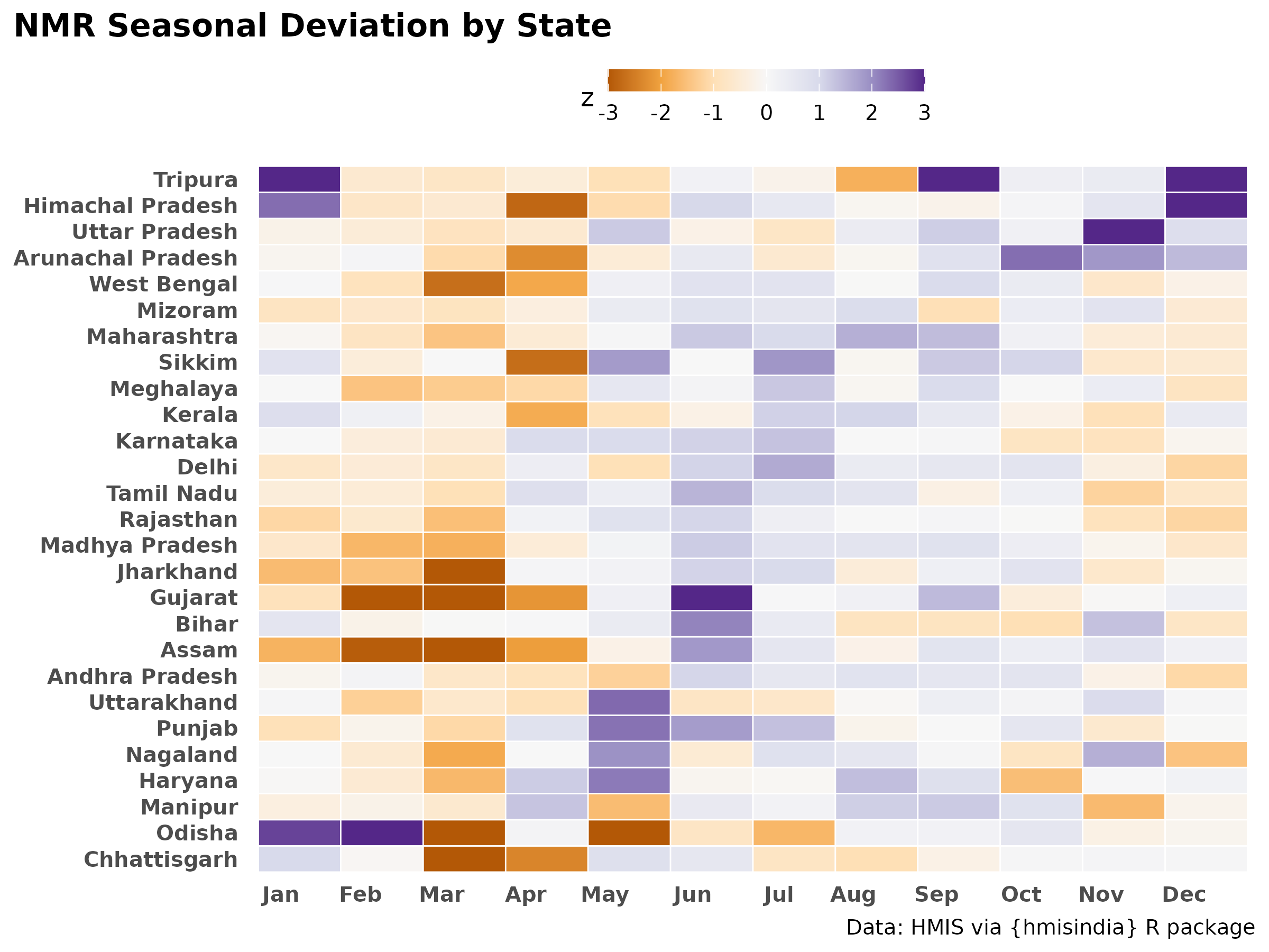
Seasonal amplitude by state
The dumbbell plot shows each state’s minimum and maximum seasonal NMR (across months). The horizontal span = seasonal amplitude. States with a wide gap have strong seasonal risk variation; states with a narrow gap have relatively flat seasonality.
nmr_states_seasonal |>
      filter(!state %in% exclude_states) %>%
  plot_seasonal_range(
    state_col = "state",
    value_col = "med_nmr"
  ) +
  labs(x = "NMR (per 1,000 live births)",
    caption = "States ordered by median NMR"
  ) +
    theme_hmis() +
    #theme(axis.text = element_text(face = "bold"), legend.title = "Median NMR")
    labs_hmis()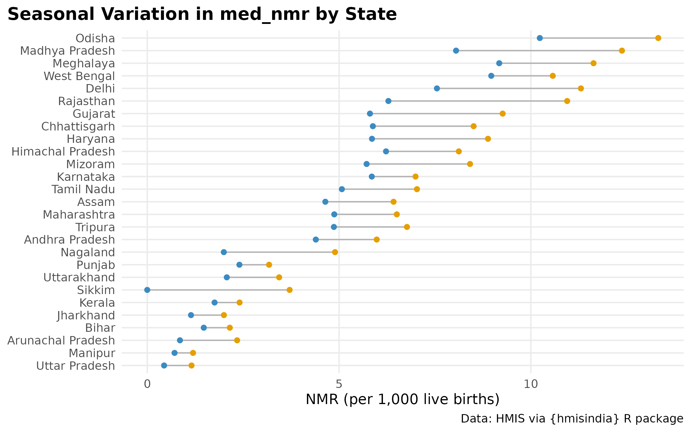
#Sikkim blue dot is at 0 or negative — likely a data quality issue for a small stateNMR by subset & regional burden
nmr_data_plot <- nmr_data %>%
  filter(!state %in% exclude_states)

ggplot(nmr_data_plot, aes(x = reorder(state, nmr, FUN = median, na.rm = TRUE), y = nmr)) +
  geom_boxplot(fill = "snow", alpha = 0.6, outlier.size = 0.5) +
  coord_flip() +
  theme_hmis() +
  labs(
    title = "NMR Distribution by State",
    caption = "Ordered by median burden",
    x = NULL,
    y = "NMR (per 1,000 live births)"
  ) +
    labs_hmis()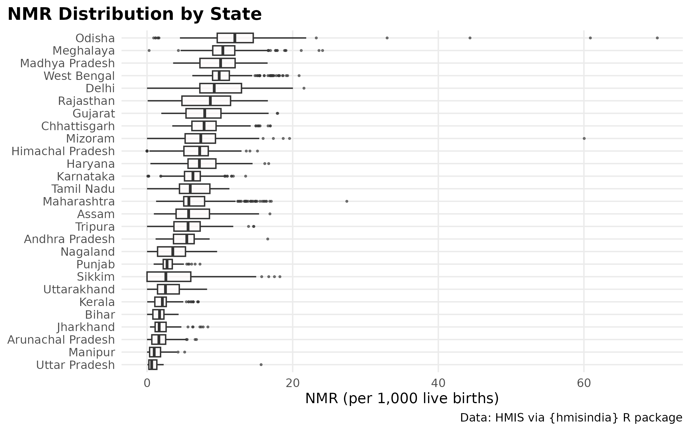
High burden regions.
High burden as per report: Uttar Pradesh, Bihar, Assam, and West Bengal, Madhya Pradesh, Chhattisgarh, Jharkhand, Odisha, and Rajasthan
# Define high-burden states
high_burden_states <- c(
  "Uttar Pradesh","Bihar","Assam","West Bengal",
  "Madhya Pradesh","Chhattisgarh","Jharkhand",
  "Odisha","Rajasthan"
)

nmr_box_plot <- nmr_data %>%
  filter(!state %in% exclude_states,
         state %in% high_burden_states)

ggplot(nmr_box_plot, aes(x = reorder(state, nmr, FUN = median, na.rm = TRUE), y = nmr)) +
  geom_boxplot(fill = "snow", alpha = 0.6, outlier.size = 0.5) +
  coord_flip() +
  theme_hmis() +
  labs(
    title = "NMR Distribution by State",
    caption = "Ordered by median burden",
    x = NULL,
    y = "NMR (per 1,000 live births)"
  ) +
    labs_hmis()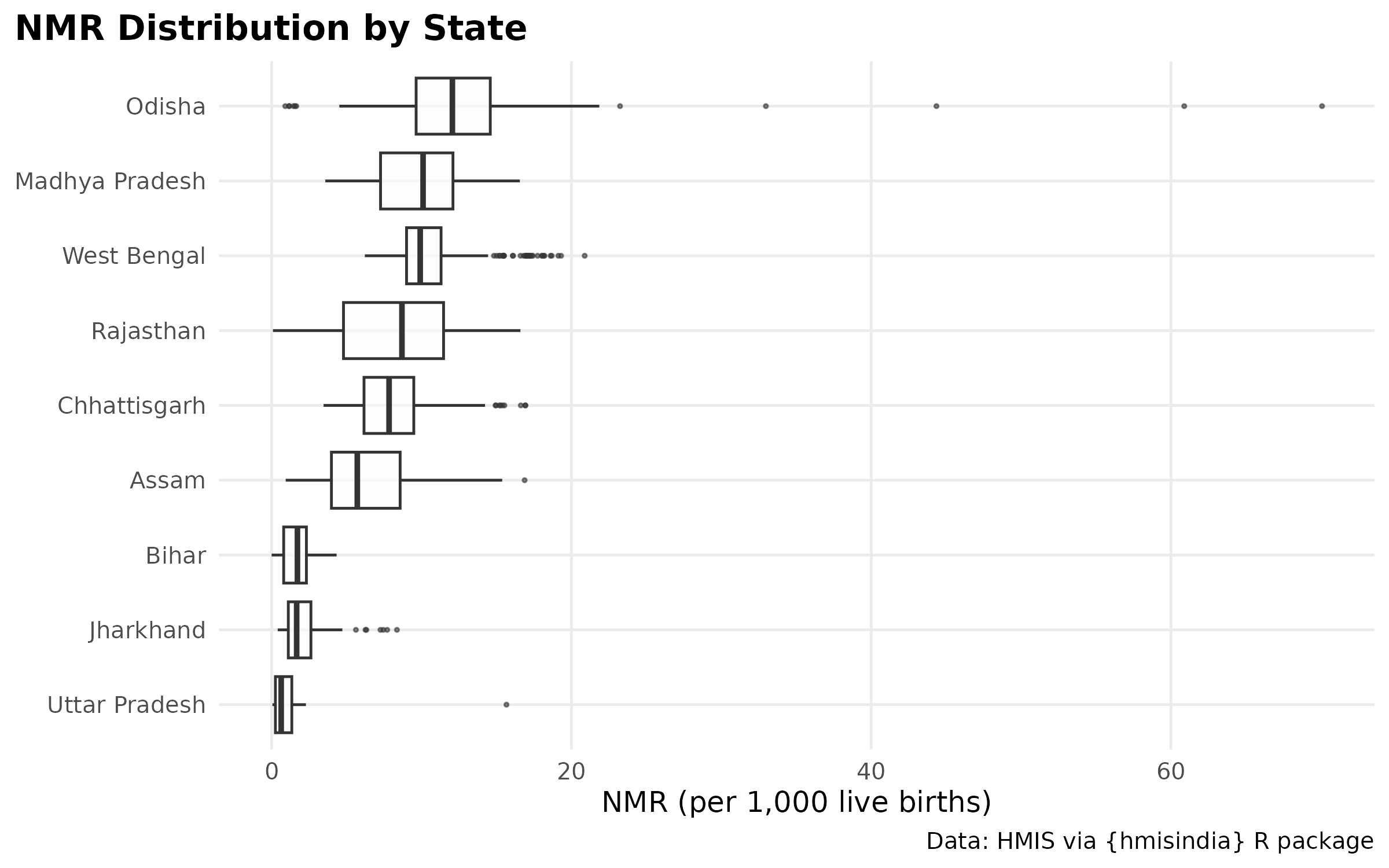
# Odisha has extreme outliers going to 60+ NMR — likely a data quality issue (very few births in some months giving extreme NMR). Consider filtering months where births < 1000 before computing NMR, or capping at a reasonable value.Periodicity
# Periodicity comparison: full series vs new series

# Full series (2008-2025)
national_ts_full <- nmr_national_monthly %>%
  arrange(cal_year, month_num) %>%
  mutate(monyear = paste(month, cal_year))

# New series only (2018-2025) — consistent indicators, no structural break
national_ts_new <- nmr_national_monthly %>%
  filter(cal_year >= 2018, cal_year <= 2024) %>%
  arrange(cal_year, month_num) %>%
  mutate(monyear = paste(month, cal_year))

nat_period_full <- detect_periodicity_ls(
  national_ts_full,
  value_col  = "nmr",
  time_col   = "monyear",
  detrend    = TRUE,
  period_max = 24
)

nat_period_new <- detect_periodicity_ls(
  national_ts_new,
  value_col  = "nmr",
  time_col   = "monyear",
  detrend    = TRUE,
  period_max = 24
)

# Plot both side by side
p_full <- plot(nat_period_full) +
  labs(title = "National NMR periodicity — full series (2008-2025)",
       subtitle = paste0("Periodic: ", nat_period_full$is_periodic,
                         " | T = ", round(nat_period_full$dominant_period, 1),
                         " mo | FAP = ", signif(nat_period_full$fap, 3)))

p_new <- plot(nat_period_new) +
  labs(title = "National NMR periodicity — new series only (2018-2024)",
       subtitle = paste0("Periodic: ", nat_period_new$is_periodic,
                         " | T = ", round(nat_period_new$dominant_period, 1),
                         " mo | FAP = ", signif(nat_period_new$fap, 3)))

# Combine using patchwork
p_full / p_new +
    theme_hmis() +
    labs_hmis()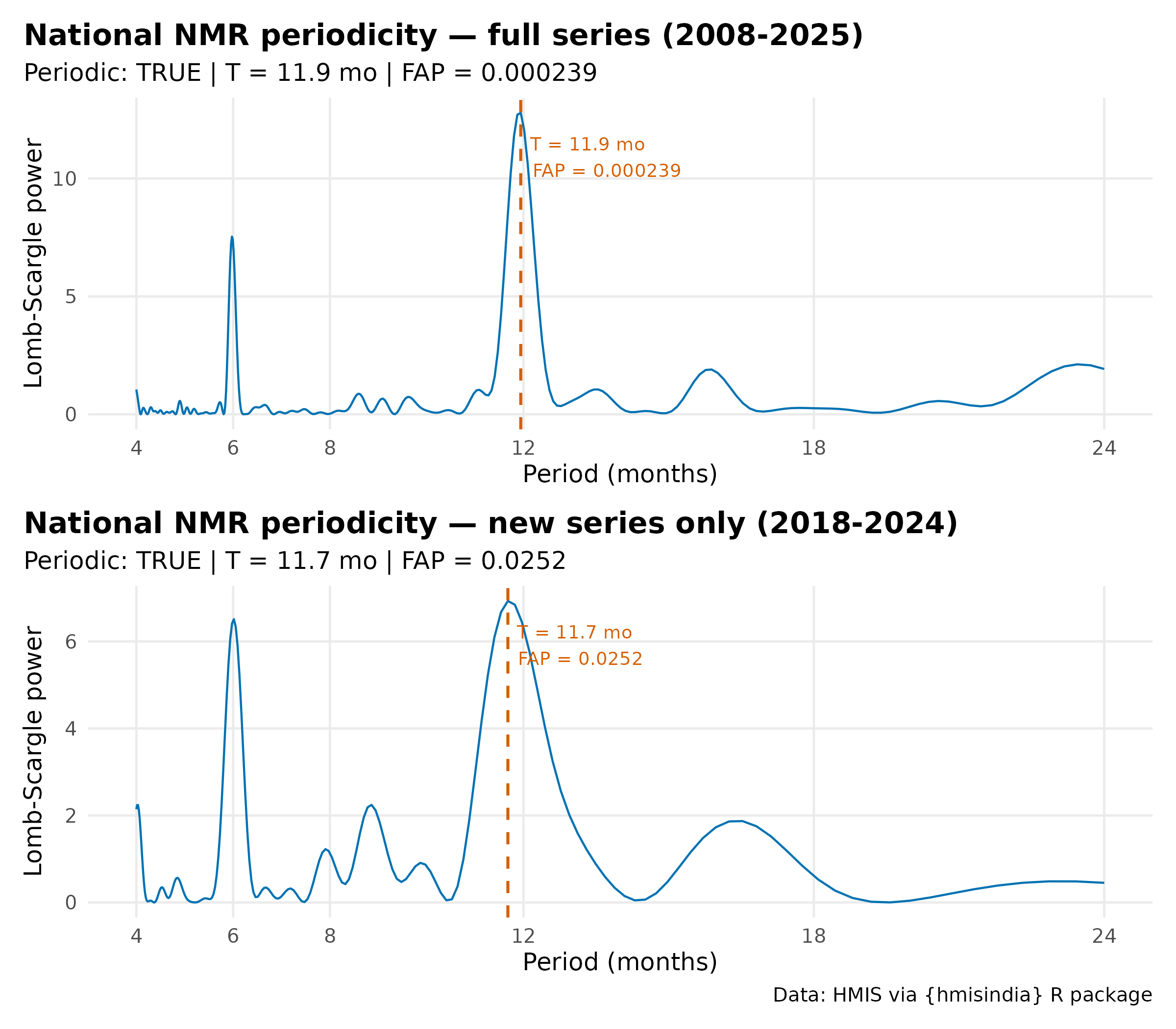
North & South subsets
nmr_regional <- nmr_data |>
  mutate(
    region = case_when(
      state %in% north_states ~ "North India",
      state %in% south_states ~ "South India",
      TRUE                    ~ NA_character_
    )
  ) |>
  filter(!is.na(region)) |>
  group_by(region, month, month_num) |>
  summarise(
    deaths = sum(deaths, na.rm = TRUE),
    births = sum(births, na.rm = TRUE),
    nmr    = (deaths / births) * 1000,
    .groups = "drop"
  )

ggplot(
  nmr_regional,
  aes(x = month_num, y = nmr,
      color = region, group = region)
) +
  monsoon_rect +
  monsoon_label +
  geom_line(linewidth = 1) +
  scale_x_continuous(breaks = 1:12, labels = month.abb) +
  scale_color_manual(
    values = c("North India" = "#0072B2", "South India" = "#D55E00"),
    name   = NULL
  ) +
  labs(
    title    = "NMR seasonal profile: North vs South India (2008–2025)",
    x = NULL, y = "NMR (per 1,000 live births)"
  ) +
  theme_hmis() +
  theme(
    legend.position = "top",
    axis.text       = element_text(face = "bold")
  ) +
  labs_hmis()
Key findings:
- The seasonal profile shows a bimodal pattern — a primary peak during monsoon months (June–August) and a secondary peak in winter (January–February). The monsoon peak indicates sepsis and infection-driven deaths; the winter peak aligns with cold stress which suggests deeper analysis on this part.
- State-level patterns diverge substantially — north India peaks in monsoon months, south India earlier; Kerala remains a persistent outlier with a winter-dominant pattern.
Limitations:
- HMIS captures facility-reported deaths only. National NMR estimates from HMIS are substantially lower than survey-based estimates (NFHS, SRS) which include community deaths. HMIS data is most reliable for tracking relative trends and seasonal patterns rather than absolute mortality levels.
- States with low variation and low NMR may reflect under-reporting or data gaps, rather than true low burden. Inconsistencies in low & high burden region and dot plots for - U.P., Bihar and Jharkhand etc.
- From Apr 2023, HMIS introduced facility and community split reporting for neonatal deaths. This series is not included in the main analysis as it covers only 25 months and lacks cause attribution. It indicates community deaths account for approximately X% of total neonatal deaths in 2023–2025.