Cause-specific mortality trends in India's HMIS
Source:vignettes/cause-specific-mortality.Rmd
cause-specific-mortality.Rmd
library(hmisindia)
library(dplyr)
library(ggplot2)
library(tidyr)
library(DT)

data_available <- tryCatch(
  {
    pq <- hmisindia::get_parquet_path()
    nzchar(pq) && file.exists(pq)
  },
  error = function(e) FALSE
)
knitr::opts_chunk$set(eval = data_available)
HMIS records cause-of-death data across four age groups: adults/adolescents (6+ years), children (1-5 years), infants (1-12 months), and neonates (0-4 weeks). Maternal deaths are tracked separately. The indicator names changed in both 2017 and 2023 form revisions.
1. Unifying adult cause-of-death indicators across periods
Three naming conventions exist for adult/adolescent deaths:
- Apr 2008 - Mar 2017: “Number of cases of Adolescent or Adult deaths (age 6 years & above) with the probable cause being …”
- Apr 2017 - Mar 2023: “Number of Adolescent /Adult deaths due to …”
- Apr 2023 - Mar 2025: “Number of deaths due to …”
Cause suffixes extracted from each naming convention and mapped to unified labels:
# Query all three periods
# category = "Total" matches both pre-2017 "4. Total" and post-2017 "TOTAL"
pre2017 <- get_hmis(
  "Adolescent or Adult deaths",
  category = "Total", sector = "Total",
  to = "Mar 2017"
)

post2017 <- get_hmis(
  "Adolescent /Adult deaths due to",
  category = "Total", sector = "Total",
  from = "Apr 2017", to = "Mar 2023"
)

# Post-2023 adult cause-of-death indicators (filter to the 24-month ones)
post2023_all <- get_hmis(
  "Number of deaths due to",
  category = "Total", sector = "Total",
  from = "Apr 2023", to = "Dec 2024"
)
adult_causes_post2023 <- c(
  "Accidents", "Animal bites", "Diarrhoeal", "Heart disease",
  "HIV", "Known Acute", "Known Chronic", "Neurological",
  "Other Causes", "Other Fever", "Respiratory", "Suicide",
  "Tuberculosis", "Cancer"
)
post2023 <- post2023_all |>
  filter(grepl(paste(adult_causes_post2023, collapse = "|"), indicator))

# Extract cause from each naming convention
extract_cause_pre2017 <- function(x) {
  sub(".*with the probable cause being\\s*", "", x)
}

extract_cause_post2017 <- function(x) {
  sub(".*Adult deaths due to\\s*", "", x)
}

extract_cause_post2023 <- function(x) {
  sub("^Number of deaths due to\\s*", "", x)
}

# Build mapping from raw cause strings to unified labels
cause_map <- tribble(
  ~raw_cause, ~cause_label,
  # Pre-2017 causes
  "Trauma or Accidents or Burn cases", "Accidents/Burns",
  "Animal bites and stings", "Animal bites",
  "Diarrhoeal diseases", "Diarrhoea",
  "other Fever related", "Fever",
  "Heart disease or related to Hypertension", "Heart disease/Hypertension",
  "HIV/AIDS", "HIV/AIDS",
  "Known Acute disease", "Known Acute",
  "Known Chronic disease", "Known Chronic",
  "Malaria", "Malaria",
  "Neurological disease including strokes", "Neurological/Stroke",
  "Respiratory diseases including infections", "Respiratory (non-TB)",
  "suicide", "Suicide",
  "Tuberculosis", "Tuberculosis",
  "[cause was not known]", "Unknown cause",
  # Post-2017 causes
  "Accidents/Burn cases", "Accidents/Burns",
  "Cancer", "Cancer",
  "Causes not known", "Unknown cause",
  "Other Fever Related", "Fever",
  "Heart disease/Hypertension related", "Heart disease/Hypertension",
  "Known Acute Disease", "Known Acute",
  "Known Chronic Disease", "Known Chronic",
  "Respiratory diseases including infections (other than TB)", "Respiratory (non-TB)",
  "Suicide", "Suicide",
  # Post-2023 causes (same as post-2017 after extraction)
  "Accidents/ Burn Cases", "Accidents/Burns",
  "Causes Not Known", "Unknown cause",
  "Heart Disease/Hypertension Related", "Heart disease/Hypertension",
  "Known Acute Diseases", "Known Acute",
  "Known Chronic Diseases", "Known Chronic",
  "Neurological Disease Including Strokes", "Neurological/Stroke",
  "Other fever related", "Fever",
  "Respiratory Diseases Including Infections (Other Than TB)", "Respiratory (non-TB)"
)

# Tag each row with its period and extract cause
pre2017_tagged <- pre2017 |>
  mutate(
    period = "Pre-2017",
    raw_cause = extract_cause_pre2017(indicator)
  )

post2017_tagged <- post2017 |>
  mutate(
    period = "Post-2017",
    raw_cause = extract_cause_post2017(indicator)
  )

post2023_tagged <- post2023 |>
  mutate(
    period = "Post-2023",
    raw_cause = extract_cause_post2023(indicator)
  )

# Join to unified labels
join_causes <- function(df) {
  df |>
    left_join(cause_map, by = "raw_cause") |>
    filter(!is.na(cause_label))
}

adult_deaths <- bind_rows(
  join_causes(pre2017_tagged),
  join_causes(post2017_tagged),
  join_causes(post2023_tagged)
)
# Show the mapping
mapping_display <- adult_deaths |>
  distinct(period, canonical_name, cause_label) |>
  arrange(cause_label, period) |>
  select(
    `Unified cause` = cause_label,
    Period = period,
    `Original indicator name` = canonical_name
  )

datatable(mapping_display,
  filter = "top",
  options = list(pageLength = 15, scrollX = TRUE),
  rownames = FALSE,
  caption = "Mapping of HMIS adult death indicator names to unified cause labels"
)
2. National adult mortality time series by cause
Monthly national totals per cause, summed across all states.
national_adult <- adult_deaths |>
  group_by(cause_label, monyear) |>
  summarise(value = sum(value, na.rm = TRUE), .groups = "drop") |>
  mutate(date = parse_monyear(monyear))
cb_palette <- c(
  "#E69F00", "#56B4E9", "#009E73", "#CC79A7",
  "#0072B2", "#D55E00", "#F0E442", "#999999"
)

ggplot(national_adult, aes(date, value)) +
  geom_line(color = "#0072B2", linewidth = 0.5) +
  facet_wrap(~cause_label, ncol = 3, scales = "free_y") +
  scale_x_date(date_labels = "%Y", date_breaks = "3 years") +
  scale_y_continuous(labels = scales::comma) +
  labs(
    x = NULL, y = "Monthly deaths",
    title = "National adult/adolescent deaths by cause (all periods combined)"
  ) +
  theme_minimal(base_size = 11) +
  theme(
    plot.title = element_text(face = "bold"),
    plot.title.position = "plot",
    strip.text = element_text(face = "bold", size = 9),
    axis.text.x = element_text(angle = 45, hjust = 1),
    panel.grid.minor = element_blank()
  )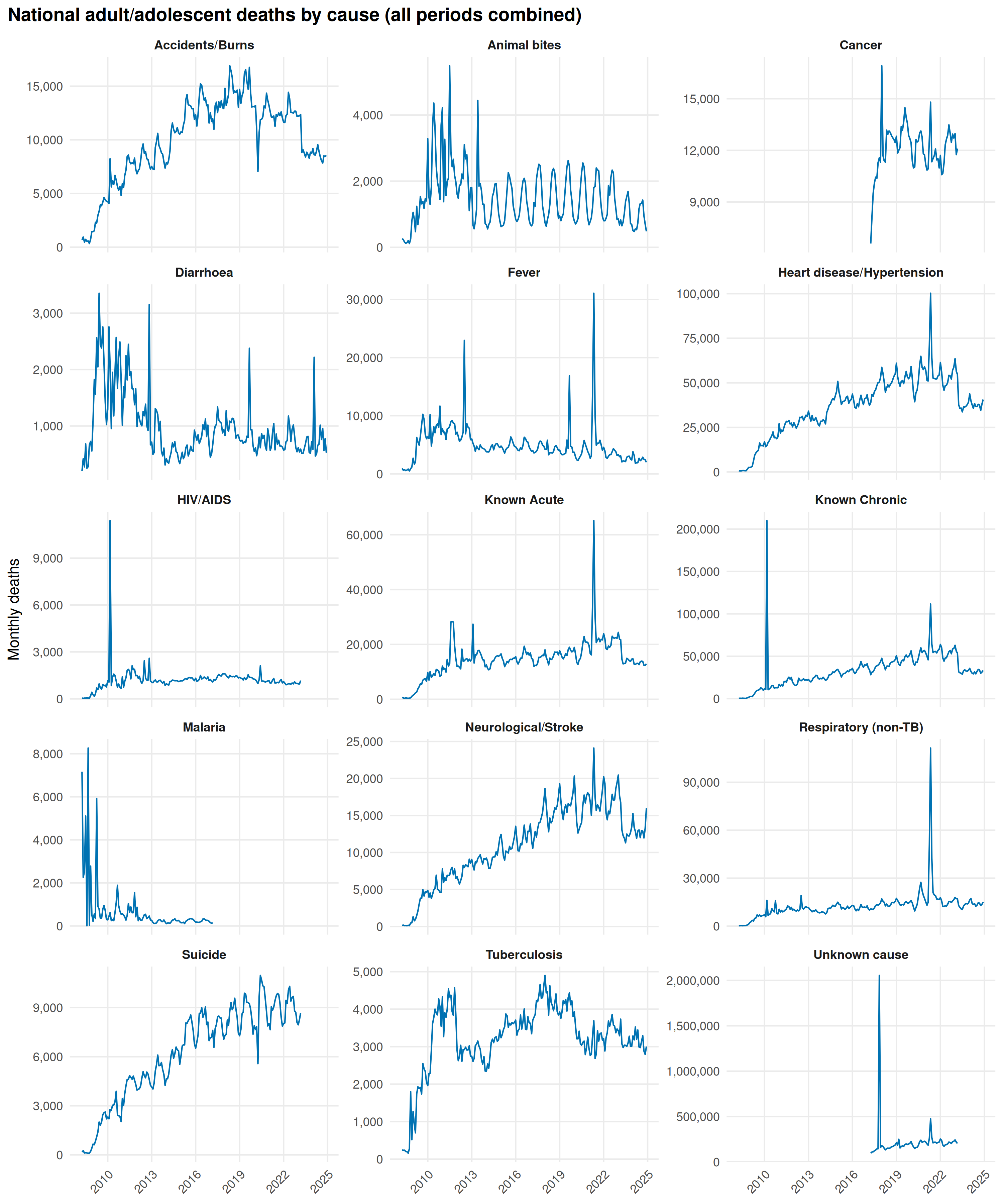
The Delta wave (April-June 2021) spikes Fever, Respiratory (non-TB), Heart disease/Hypertension, Known Acute, and Known Chronic. Without a dedicated COVID-19 code, HMIS absorbs pandemic deaths into these categories. Accidents/Burns dips during lockdown.
3. COVID-19 excess mortality (Delta wave)
Eight high-coverage states from the BMJ excess mortality analysis: Andhra Pradesh, Chhattisgarh, Gujarat, Karnataka, Maharashtra, Odisha, Tamil Nadu, West Bengal.
For each cause, total deaths in April-June 2021 are compared against the April-June average of 2018 and 2019.
bmj_states <- c(
  "Andhra Pradesh", "Chhattisgarh", "Gujarat", "Karnataka",
  "Maharashtra", "Odisha", "Tamil Nadu", "West Bengal"
)

# Use post-2017 data only (both periods share the same indicator set)
adult_bmj <- adult_deaths |>
  filter(
    state %in% bmj_states,
    period %in% c("Post-2017", "Post-2023")
  ) |>
  mutate(date = parse_monyear(monyear))

# Tag pandemic vs baseline months
adult_bmj <- adult_bmj |>
  mutate(
    month_num = as.integer(format(date, "%m")),
    year = as.integer(format(date, "%Y")),
    wave_period = case_when(
      year == 2021 & month_num %in% 4:6 ~ "Delta (Apr-Jun 2021)",
      year %in% c(2018, 2019) & month_num %in% 4:6 ~ "Baseline (Apr-Jun 2018-19)",
      TRUE ~ NA_character_
    )
  ) |>
  filter(!is.na(wave_period))

# Aggregate: total deaths per cause per period
excess_df <- adult_bmj |>
  group_by(cause_label, wave_period) |>
  summarise(total_deaths = sum(value, na.rm = TRUE), .groups = "drop") |>
  pivot_wider(names_from = wave_period, values_from = total_deaths) |>
  rename(
    baseline = `Baseline (Apr-Jun 2018-19)`,
    delta = `Delta (Apr-Jun 2021)`
  ) |>
  mutate(
    # Baseline is sum of two years; average to one year
    baseline_avg = baseline / 2,
    excess_pct = ((delta - baseline_avg) / baseline_avg) * 100
  ) |>
  filter(!is.na(excess_pct), is.finite(excess_pct))

# COVID-19 relatedness grouping
relatedness_map <- tribble(
  ~cause_label, ~covid_group,
  "Respiratory (non-TB)", "Highly related",
  "Fever", "Highly related",
  "Known Acute", "Highly related",
  "Known Chronic", "Highly related",
  "Heart disease/Hypertension", "Highly related",
  "Neurological/Stroke", "Highly related",
  "Diarrhoea", "Less related",
  "HIV/AIDS", "Less related",
  "Cancer", "Less related",
  "Accidents/Burns", "Not related",
  "Suicide", "Not related",
  "Tuberculosis", "Not related",
  "Animal bites", "Not related",
  "Unknown cause", "Not related"
)

excess_df <- excess_df |>
  left_join(relatedness_map, by = "cause_label") |>
  filter(!is.na(covid_group)) |>
  mutate(
    cause_label = reorder(cause_label, excess_pct),
    covid_group = factor(covid_group,
      levels = c("Highly related", "Less related", "Not related")
    )
  )
group_colors <- c(
  "Highly related" = "#D55E00",
  "Less related" = "#E69F00",
  "Not related" = "#56B4E9"
)

ggplot(excess_df, aes(excess_pct, cause_label, fill = covid_group)) +
  geom_col(width = 0.7) +
  geom_vline(xintercept = 0, color = "grey30", linewidth = 0.5) +
  scale_fill_manual(values = group_colors, name = "COVID-19 relatedness") +
  labs(
    x = "Excess mortality (%) vs. 2018-19 baseline",
    y = NULL,
    title = "Cause-specific excess mortality during the Delta wave (Apr-Jun 2021)",
    subtitle = "8 high-coverage states: AP, CG, GJ, KA, MH, OD, TN, WB"
  ) +
  theme_minimal(base_size = 12) +
  theme(
    plot.title = element_text(face = "bold"),
    plot.title.position = "plot",
    axis.text.x = element_text(angle = 45, hjust = 1),
    panel.grid.minor = element_blank(),
    panel.grid.major.y = element_blank(),
    legend.position = "bottom"
  )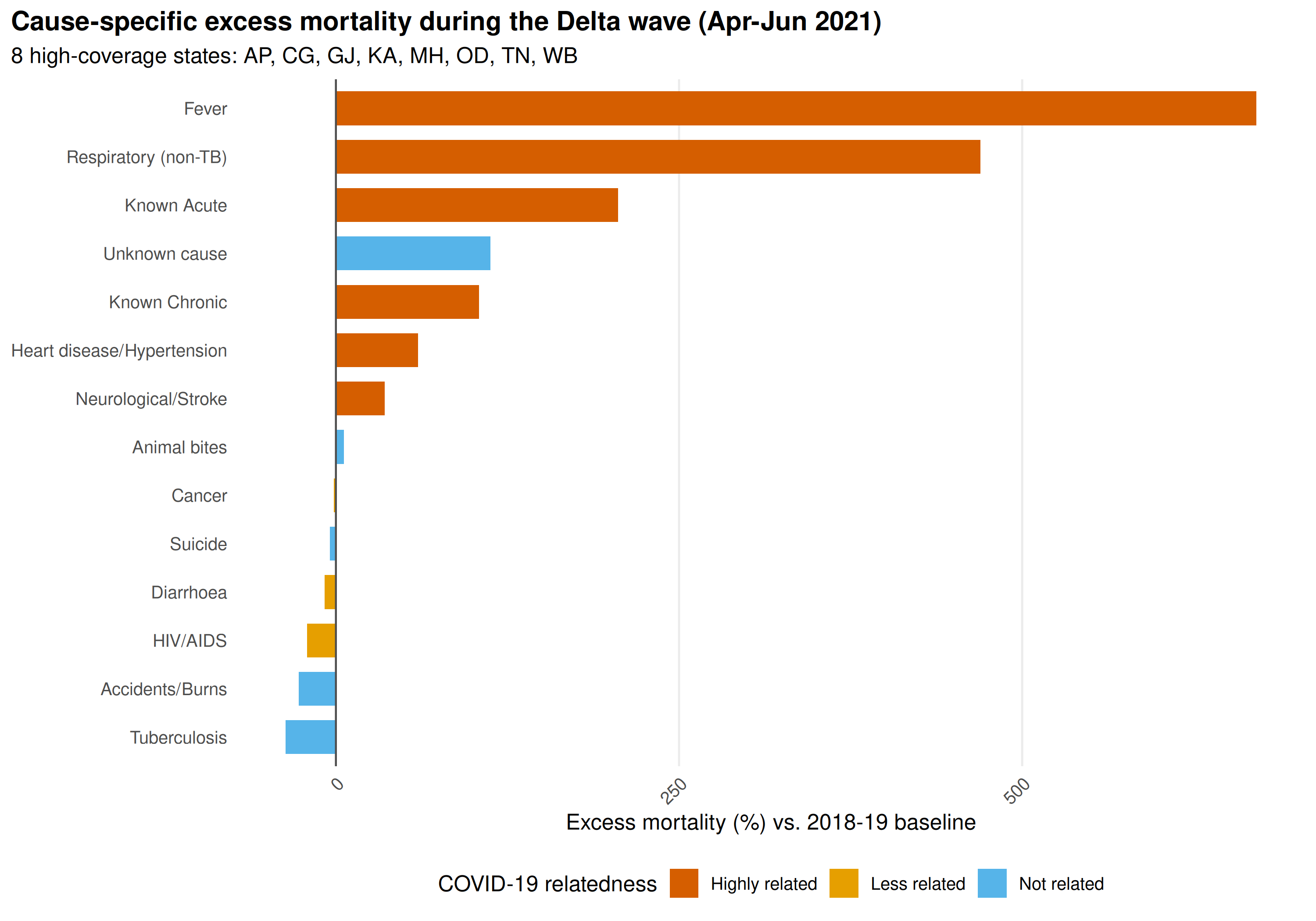
Fever and Respiratory show the largest excess. Accidents/Burns and Suicide are negative or near-zero, reflecting lockdown rather than pandemic mortality.
4. State-level heatmaps for top causes
The four highest-volume adult death causes across the post-2017 period.
top_causes <- adult_deaths |>
  filter(period %in% c("Post-2017", "Post-2023")) |>
  group_by(cause_label) |>
  summarise(total = sum(value, na.rm = TRUE), .groups = "drop") |>
  slice_max(total, n = 4) |>
  pull(cause_label)
heatmap_adult <- adult_deaths |>
  filter(
    cause_label %in% top_causes,
    period %in% c("Post-2017", "Post-2023")
  ) |>
  group_by(cause_label, state, monyear) |>
  summarise(value = sum(value, na.rm = TRUE), .groups = "drop") |>
  mutate(date = parse_monyear(monyear))
ggplot(heatmap_adult, aes(date, reorder(state, value, FUN = median), fill = value)) +
  geom_tile(color = "white", linewidth = 0.1) +
  facet_wrap(~cause_label, ncol = 2, scales = "free") +
  scale_fill_viridis_c(option = "inferno", name = "Monthly\ndeaths") +
  scale_x_date(date_labels = "%Y", date_breaks = "2 years") +
  labs(
    x = NULL, y = NULL,
    title = "State-level monthly adult deaths: top 4 causes (Apr 2017 - Dec 2024)"
  ) +
  theme_minimal(base_size = 10) +
  theme(
    plot.title = element_text(face = "bold"),
    plot.title.position = "plot",
    strip.text = element_text(face = "bold"),
    axis.text.x = element_text(angle = 45, hjust = 1),
    axis.text.y = element_text(size = 7),
    panel.grid = element_blank()
  )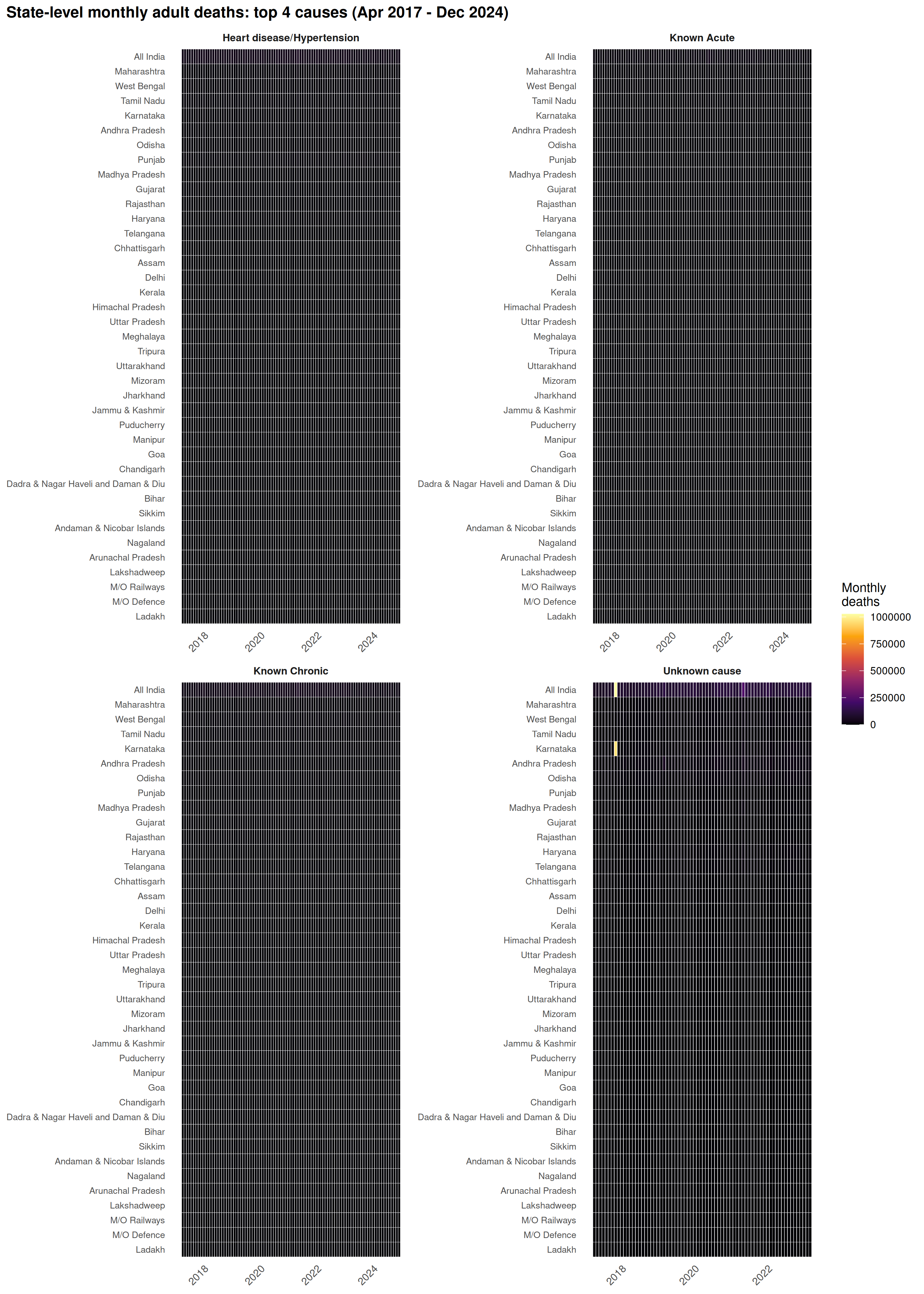
Mid-2021 Delta wave band visible across most large states. Uttar Pradesh, Maharashtra, and Tamil Nadu dominate the scale. Some states stay elevated through 2022 (delayed reporting or continued pandemic mortality).
5. Child mortality (1-5 years)
Five cause-specific indicators for child deaths aged 1-5 years, available from April 2017 onward.
child_deaths <- get_hmis(
  "Number of Child Deaths (1 - 5 years) due to",
  category = "Total", sector = "Total",
  from = "Apr 2017", to = "Dec 2024"
)

child_deaths <- child_deaths |>
  mutate(
    cause = sub(".*due to\\s*", "", indicator),
    date = parse_monyear(monyear)
  )
national_child <- child_deaths |>
  group_by(cause, monyear) |>
  summarise(value = sum(value, na.rm = TRUE), .groups = "drop") |>
  mutate(date = parse_monyear(monyear))
ggplot(national_child, aes(date, value, color = cause)) +
  geom_line(linewidth = 0.6) +
  facet_wrap(~cause, ncol = 2, scales = "free_y") +
  scale_color_manual(values = cb_palette) +
  scale_x_date(date_labels = "%b %Y", date_breaks = "1 year") +
  scale_y_continuous(labels = scales::comma) +
  labs(
    x = NULL, y = "Monthly deaths",
    title = "National child deaths (1-5 years) by cause"
  ) +
  theme_minimal(base_size = 11) +
  theme(
    plot.title = element_text(face = "bold"),
    plot.title.position = "plot",
    strip.text = element_text(face = "bold"),
    axis.text.x = element_text(angle = 45, hjust = 1),
    panel.grid.minor = element_blank(),
    legend.position = "none"
  )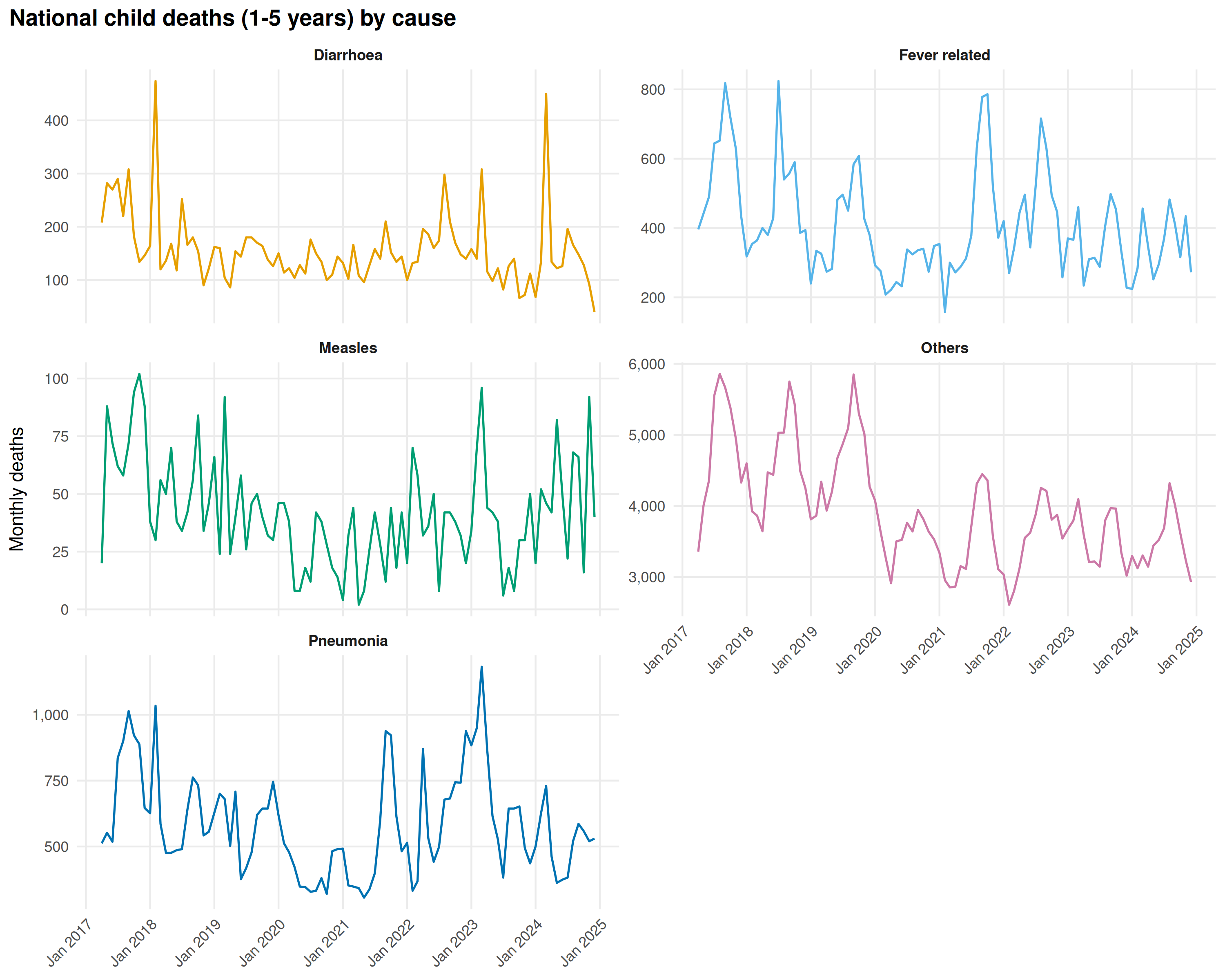
Pneumonia and Diarrhoea lead among specific causes. Pneumonia peaks in winter, Diarrhoea tracks the monsoon. “Others” dominates numerically, limiting what cause coding can tell us in this age group. The 2021 COVID spike is less pronounced than in adults.
6. Infant mortality (1-12 months)
Same five causes as child deaths, but for infants aged 1-12 months.
infant_deaths <- get_hmis(
  "Number of Infant Deaths (1 - 12 months) due to",
  category = "Total", sector = "Total",
  from = "Apr 2017", to = "Dec 2024"
)

infant_deaths <- infant_deaths |>
  mutate(
    cause = sub(".*due to\\s*", "", indicator),
    date = parse_monyear(monyear)
  )
national_infant <- infant_deaths |>
  group_by(cause, monyear) |>
  summarise(value = sum(value, na.rm = TRUE), .groups = "drop") |>
  mutate(date = parse_monyear(monyear))
ggplot(national_infant, aes(date, value, color = cause)) +
  geom_line(linewidth = 0.6) +
  facet_wrap(~cause, ncol = 2, scales = "free_y") +
  scale_color_manual(values = cb_palette) +
  scale_x_date(date_labels = "%b %Y", date_breaks = "1 year") +
  scale_y_continuous(labels = scales::comma) +
  labs(
    x = NULL, y = "Monthly deaths",
    title = "National infant deaths (1-12 months) by cause"
  ) +
  theme_minimal(base_size = 11) +
  theme(
    plot.title = element_text(face = "bold"),
    plot.title.position = "plot",
    strip.text = element_text(face = "bold"),
    axis.text.x = element_text(angle = 45, hjust = 1),
    panel.grid.minor = element_blank(),
    legend.position = "none"
  )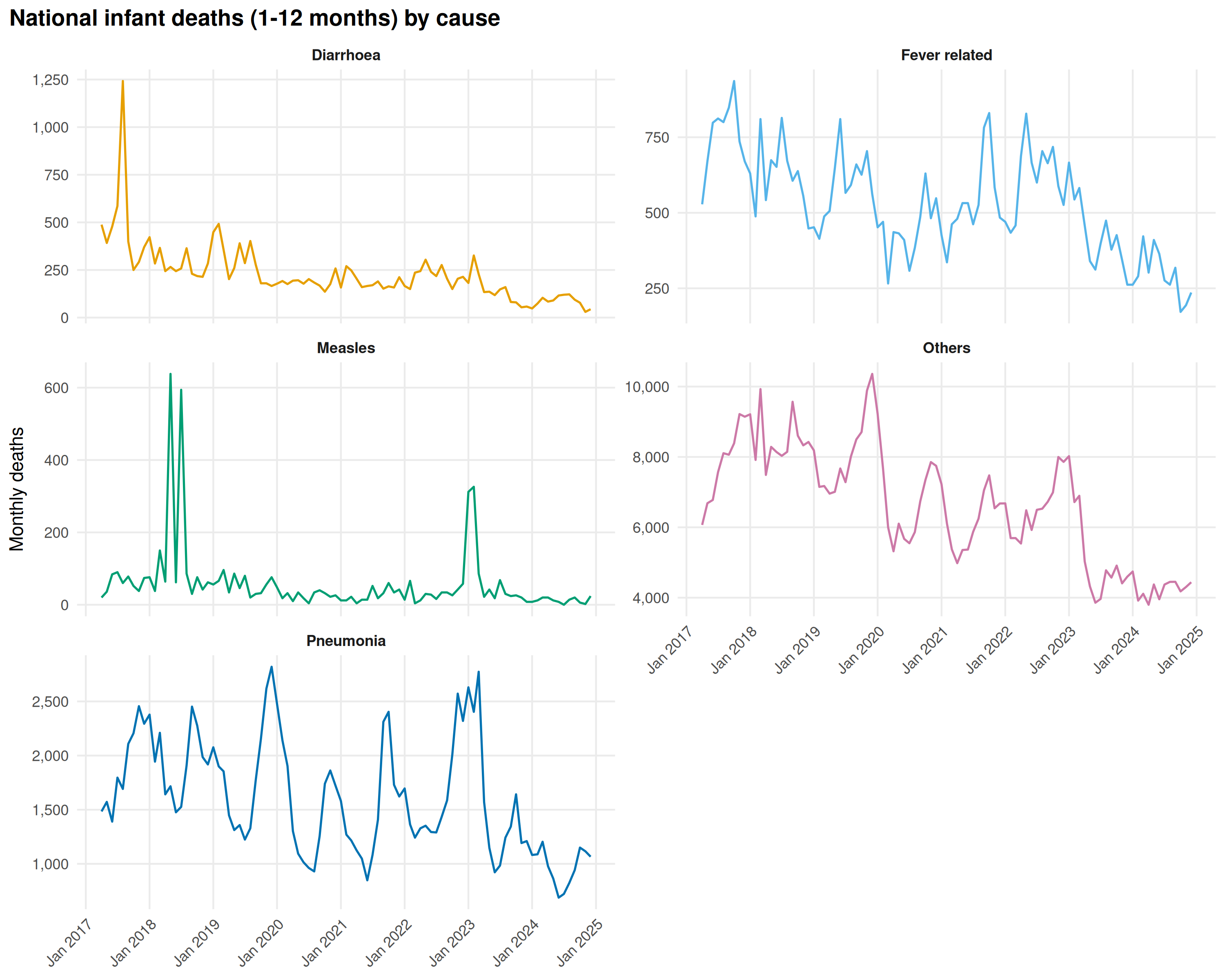
The cause mix resembles the 1-5 age group, but absolute numbers are higher. Pneumonia and Fever peak in winter.
7. Neonatal mortality
Three cause categories for deaths in the first four weeks of life: Asphyxia, Sepsis, and Other causes.
neonatal_deaths <- get_hmis(
  "Infant Deaths up to 4 weeks due to",
  category = "Total", sector = "Total",
  from = "Apr 2017", to = "Dec 2024"
)

neonatal_deaths <- neonatal_deaths |>
  mutate(
    cause = sub(".*due to\\s*", "", indicator),
    date = parse_monyear(monyear)
  )
national_neonatal <- neonatal_deaths |>
  group_by(cause, monyear) |>
  summarise(value = sum(value, na.rm = TRUE), .groups = "drop") |>
  mutate(date = parse_monyear(monyear))
ggplot(national_neonatal, aes(date, value, color = cause)) +
  geom_line(linewidth = 0.7) +
  scale_color_manual(values = cb_palette[1:3], name = "Cause") +
  scale_x_date(date_labels = "%b %Y", date_breaks = "1 year") +
  scale_y_continuous(labels = scales::comma) +
  labs(
    x = NULL, y = "Monthly deaths",
    title = "National neonatal deaths (0-4 weeks) by cause"
  ) +
  theme_minimal(base_size = 12) +
  theme(
    plot.title = element_text(face = "bold"),
    plot.title.position = "plot",
    axis.text.x = element_text(angle = 45, hjust = 1),
    panel.grid.minor = element_blank(),
    legend.position = "bottom"
  )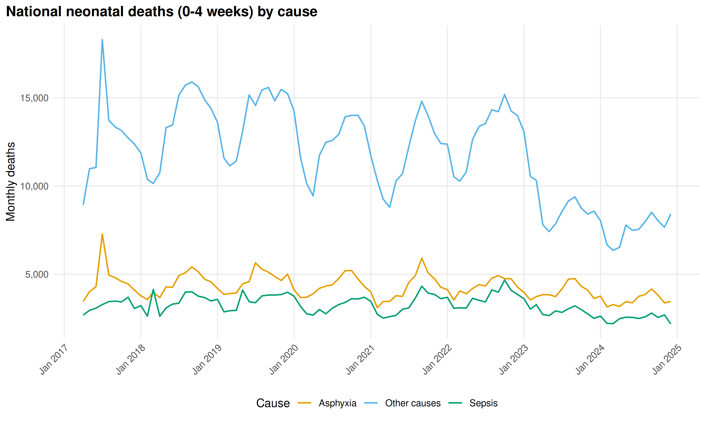
Asphyxia leads, Sepsis second. Both decline 2017-2024 as facility-based newborn care improved. Neonatal deaths arise from intrapartum and peripartum events rather than environmental exposures, so seasonal variation is modest.
Cause composition over time
Each cause as a percentage of total neonatal deaths per month:
neonatal_pct <- national_neonatal |>
  group_by(date) |>
  mutate(
    total = sum(value),
    pct = value / total * 100
  ) |>
  ungroup()

ggplot(neonatal_pct, aes(date, pct, fill = cause)) +
  geom_area(alpha = 0.85) +
  scale_fill_manual(
    values = c("Asphyxia" = "#0072B2", "Sepsis" = "#D55E00", "Other causes" = "#999999"),
    name = "Cause"
  ) +
  scale_x_date(date_labels = "%b %Y", date_breaks = "1 year") +
  scale_y_continuous(labels = function(x) paste0(x, "%")) +
  labs(
    x = NULL, y = "Share of neonatal deaths",
    title = "Neonatal death cause composition (% of monthly total)"
  ) +
  theme_minimal(base_size = 12) +
  theme(
    plot.title = element_text(face = "bold"),
    plot.title.position = "plot",
    axis.text.x = element_text(angle = 45, hjust = 1),
    panel.grid.minor = element_blank(),
    legend.position = "bottom"
  )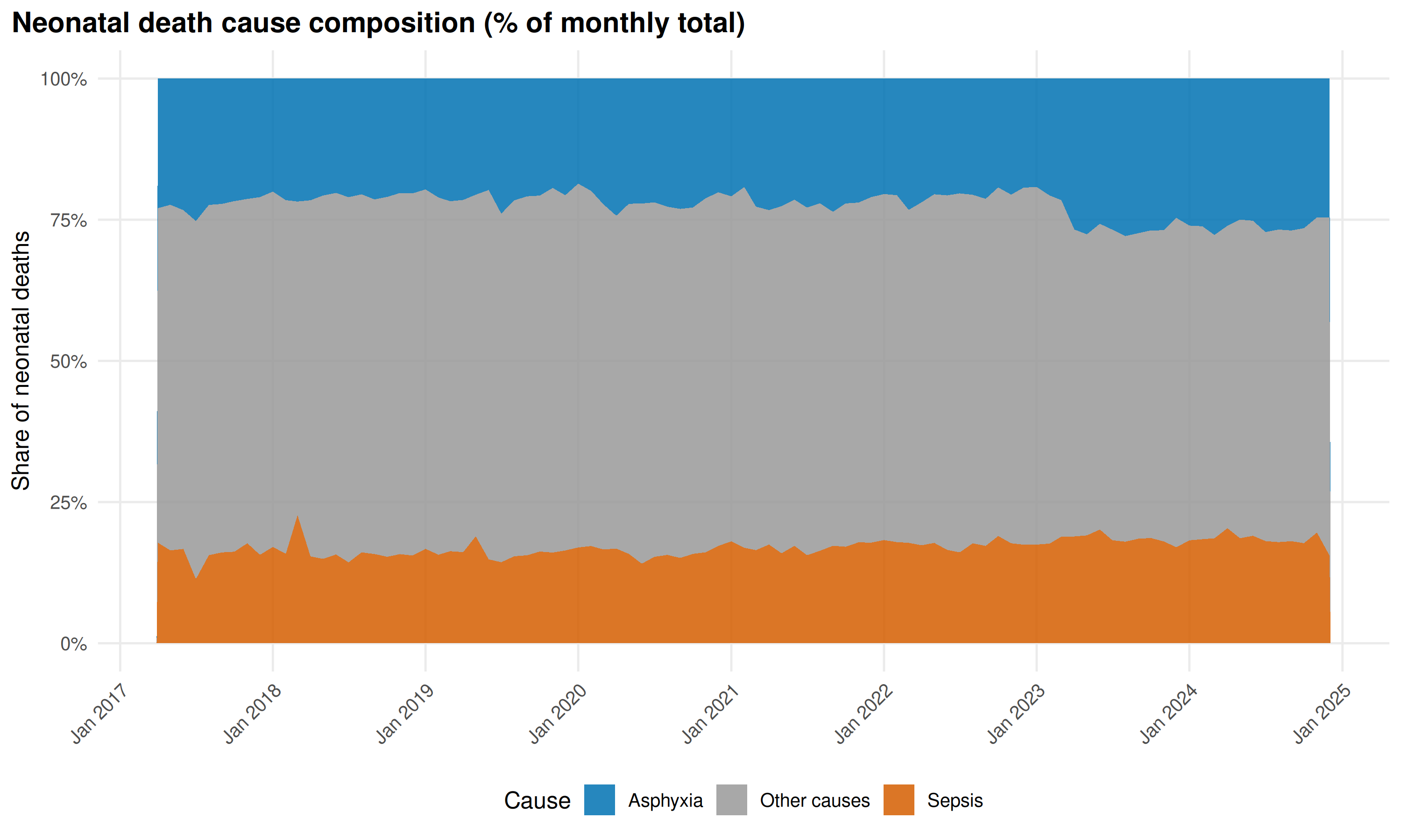
Asphyxia’s share is stable. “Other causes” has grown as absolute counts fell, suggesting reclassification out of Asphyxia and Sepsis rather than a genuine shift.
8. Maternal mortality
Maternal death indicators changed names in 2017. Unified time series across both periods:
# Pre-2017 maternal deaths
maternal_pre <- get_hmis(
  "Maternal deaths (age 15 - 49 years) with the probable cause",
  category = "Total", sector = "Total",
  from = "Apr 2008", to = "Mar 2017"
)

# Post-2017 maternal deaths
maternal_post <- get_hmis(
  "Number of Maternal Deaths due to",
  category = "Total", sector = "Total",
  from = "Apr 2017", to = "Dec 2024"
)

# Extract causes
maternal_cause_map <- tribble(
  ~raw_cause, ~cause_label,
  # Pre-2017
  "Abortion", "Abortion",
  "Bleeding", "Haemorrhage",
  "High Fever", "High fever/Sepsis",
  "Obstructed or prolonged labour", "Obstructed labour",
  "Severe hypertension or fits", "Hypertension/Eclampsia",
  "other causes", "Other causes",
  # Post-2017
  "High fever", "High fever/Sepsis",
  "Obstructed/prolonged labour", "Obstructed labour",
  "Other Causes", "Other causes",
  "Severe hypertension/fits", "Hypertension/Eclampsia"
)

maternal_pre_tagged <- maternal_pre |>
  mutate(
    period = "Pre-2017",
    raw_cause = sub(".*with the probable cause being\\s*", "", indicator)
  )

maternal_post_tagged <- maternal_post |>
  mutate(
    period = "Post-2017",
    raw_cause = sub(".*Deaths due to\\s*", "", indicator)
  )

maternal_all <- bind_rows(
  maternal_pre_tagged |>
    left_join(maternal_cause_map, by = "raw_cause") |>
    filter(!is.na(cause_label)),
  maternal_post_tagged |>
    left_join(maternal_cause_map, by = "raw_cause") |>
    filter(!is.na(cause_label))
)
national_maternal <- maternal_all |>
  group_by(cause_label, monyear) |>
  summarise(value = sum(value, na.rm = TRUE), .groups = "drop") |>
  mutate(date = parse_monyear(monyear))
ggplot(national_maternal, aes(date, value, color = cause_label)) +
  geom_line(linewidth = 0.6) +
  facet_wrap(~cause_label, ncol = 2, scales = "free_y") +
  scale_color_manual(values = cb_palette) +
  scale_x_date(date_labels = "%Y", date_breaks = "3 years") +
  scale_y_continuous(labels = scales::comma) +
  labs(
    x = NULL, y = "Monthly deaths",
    title = "National maternal deaths by cause (unified across periods)"
  ) +
  theme_minimal(base_size = 11) +
  theme(
    plot.title = element_text(face = "bold"),
    plot.title.position = "plot",
    strip.text = element_text(face = "bold"),
    axis.text.x = element_text(angle = 45, hjust = 1),
    panel.grid.minor = element_blank(),
    legend.position = "none"
  )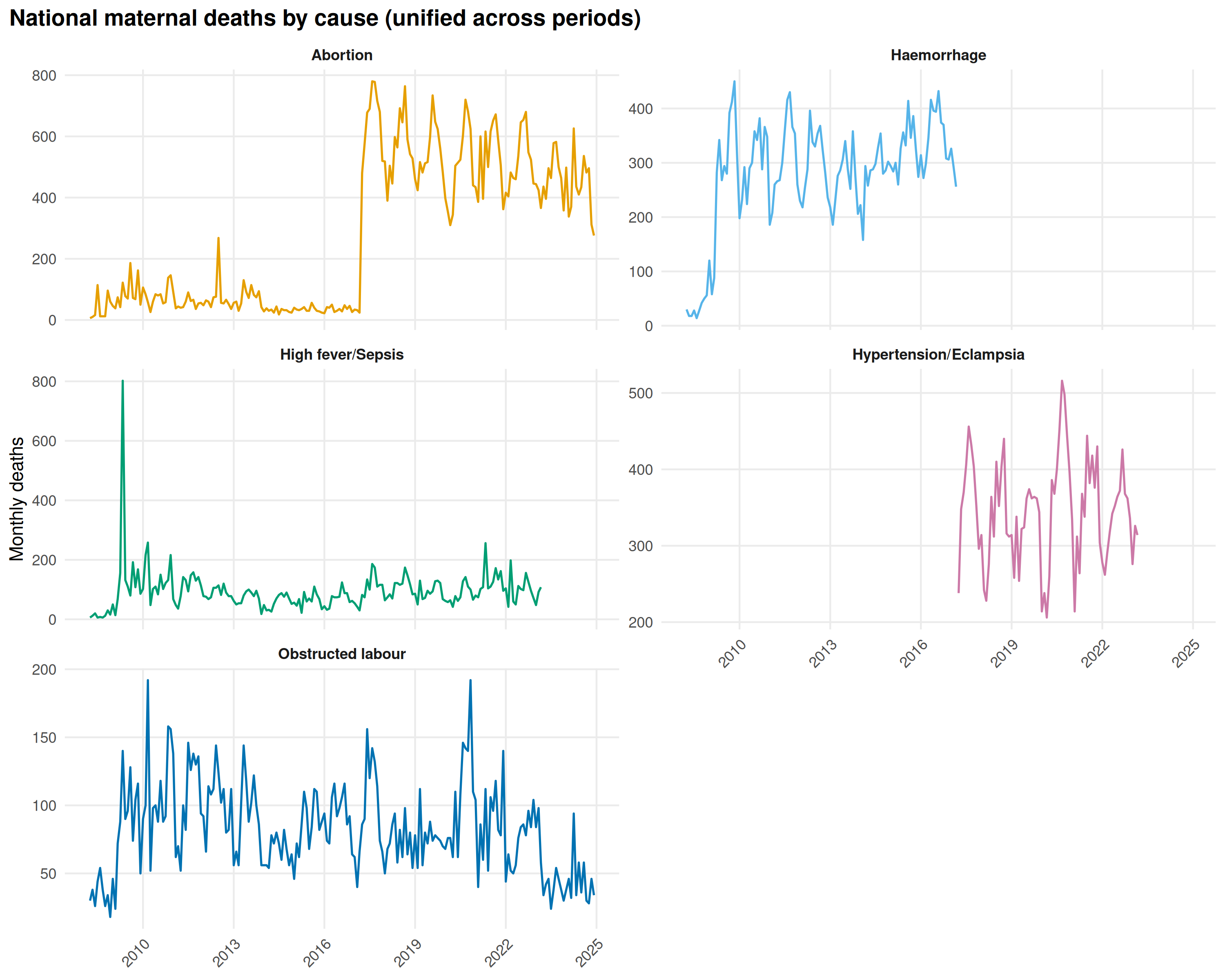
Haemorrhage and Hypertension/Eclampsia lead throughout. Post-2017 counts are lower than pre-2017 for most causes, partly from genuine declines, partly from reporting changes at the form transition. “High fever/Sepsis” spikes during the Delta wave, same pattern as adult deaths.
9. Abortions and abortion-related mortality
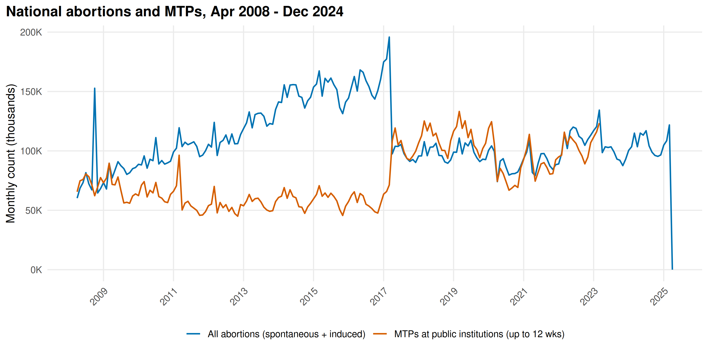
Abortion data covers 2008-2024: total abortions (spontaneous + induced), MTPs at public institutions, abortion-related maternal deaths, and post-abortion complications.
abortions <- get_hmis("Number of Abortions (spontaneous or induced)",
  category = "Total", sector = "Total"
)

mtps_public <- get_hmis("Number of MTPs conducted at Public Institutions up to 12 weeks",
  category = "Total", sector = "Total"
)

abortion_deaths <- get_hmis("Maternal Deaths due to Abortion",
  category = "Total", sector = "Total",
  from = "Apr 2017", to = "Dec 2024"
)

abortion_complications <- get_hmis("Post Abortion/MTP Complications Identified",
  category = "Total", sector = "Total",
  from = "Apr 2017", to = "Dec 2024"
)
national_abortions <- abortions |>
  group_by(monyear) |>
  summarise(value = sum(value, na.rm = TRUE), .groups = "drop") |>
  mutate(date = parse_monyear(monyear))

national_mtps <- mtps_public |>
  group_by(monyear) |>
  summarise(value = sum(value, na.rm = TRUE), .groups = "drop") |>
  mutate(date = parse_monyear(monyear))

combined_ab <- bind_rows(
  national_abortions |> mutate(series = "All abortions (spontaneous + induced)"),
  national_mtps |> mutate(series = "MTPs at public institutions (up to 12 wks)")
)

ggplot(combined_ab, aes(date, value / 1000, color = series)) +
  geom_line(linewidth = 0.7) +
  scale_color_manual(
    values = c("#0072B2", "#D55E00"),
    name = NULL
  ) +
  scale_x_date(date_labels = "%Y", date_breaks = "2 years") +
  scale_y_continuous(labels = scales::comma_format(suffix = "K")) +
  labs(
    x = NULL, y = "Monthly count (thousands)",
    title = "National abortions and MTPs, Apr 2008 - Dec 2024"
  ) +
  theme_minimal(base_size = 12) +
  theme(
    plot.title = element_text(face = "bold"),
    plot.title.position = "plot",
    axis.text.x = element_text(angle = 45, hjust = 1),
    panel.grid.minor = element_blank(),
    legend.position = "bottom"
  )
ab_prd <- detect_periodicity(national_abortions)
cat("Abortion periodicity:\n")
#> Abortion periodicity:
print(ab_prd)
#> Periodicity analysis (n = 205 observations)
#>   Detrended: TRUE
#>   Dominant period: 43.2 observations
#>   Spectral power concentration: 17.6 %
#>   ACF at dominant lag: -0.106 (threshold: 0.137 )
#>
#> Top frequencies:
#>  period    power
#>    43.2 3.44e+09
#>    36.0 1.14e+09
#>    30.9 1.10e+09
#>    27.0 1.00e+09
#>    24.0 7.59e+08
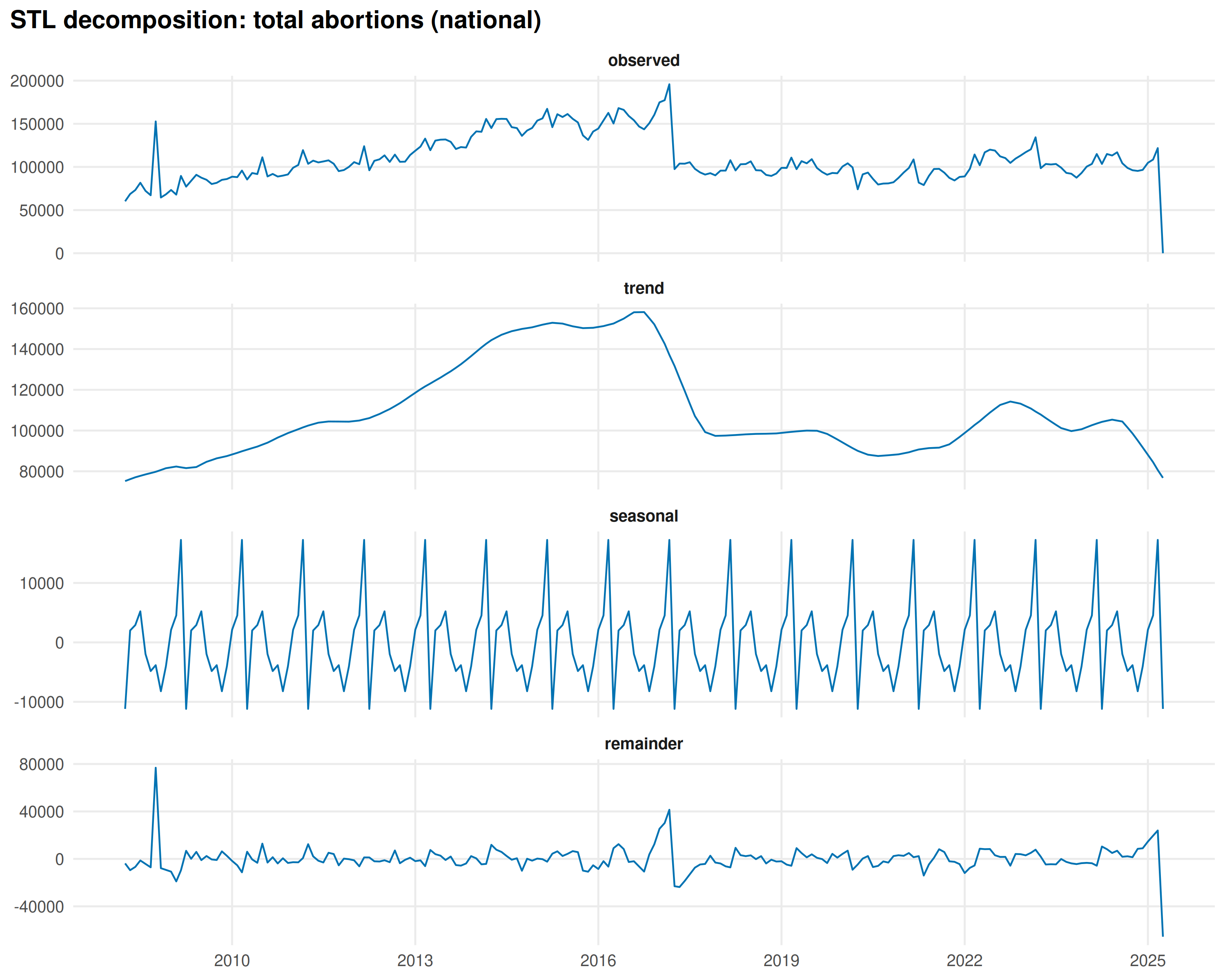
ab_decomp <- decompose_series(national_abortions)

ab_decomp_long <- ab_decomp |>
  pivot_longer(
    cols = c(observed, trend, seasonal, remainder),
    names_to = "component", values_to = "val"
  ) |>
  mutate(component = factor(component,
    levels = c("observed", "trend", "seasonal", "remainder")
  ))

ggplot(ab_decomp_long, aes(date, val)) +
  geom_line(color = "#0072B2", linewidth = 0.5) +
  facet_wrap(~component, ncol = 1, scales = "free_y") +
  scale_x_date(date_labels = "%Y", date_breaks = "3 years") +
  labs(
    x = NULL, y = NULL,
    title = "STL decomposition: total abortions (national)"
  ) +
  theme_minimal(base_size = 12) +
  theme(
    strip.text = element_text(face = "bold"),
    panel.grid.minor = element_blank(),
    plot.title = element_text(face = "bold"),
    plot.title.position = "plot"
  )
The seasonal profile by month:
ab_decomp_monthly <- ab_decomp |>
  mutate(month_num = as.numeric(format(date, "%m"))) |>
  group_by(month_num) |>
  summarise(seasonal = mean(seasonal), .groups = "drop")

ggplot(ab_decomp_monthly, aes(month_num, seasonal)) +
  geom_col(
    fill = ifelse(ab_decomp_monthly$seasonal > 0, "#0072B2", "#D55E00"),
    width = 0.7
  ) +
  geom_hline(yintercept = 0, color = "grey30") +
  scale_x_continuous(breaks = 1:12, labels = month.abb) +
  labs(
    x = NULL, y = "Seasonal deviation from trend",
    title = "Abortion seasonality: March peak, April trough"
  ) +
  theme_minimal(base_size = 12) +
  theme(
    plot.title = element_text(face = "bold"),
    plot.title.position = "plot",
    panel.grid.minor = element_blank(),
    panel.grid.major.x = element_blank()
  )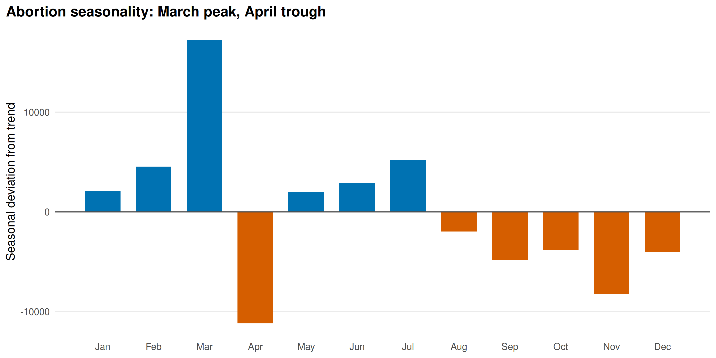
March peaks sharply (+17,000 above trend), April drops (-11,000). This coincides with India’s fiscal year-end on March 31: facilities rush to report pending cases before the year closes. The April trough is the reporting hangover. Not a biological signal.
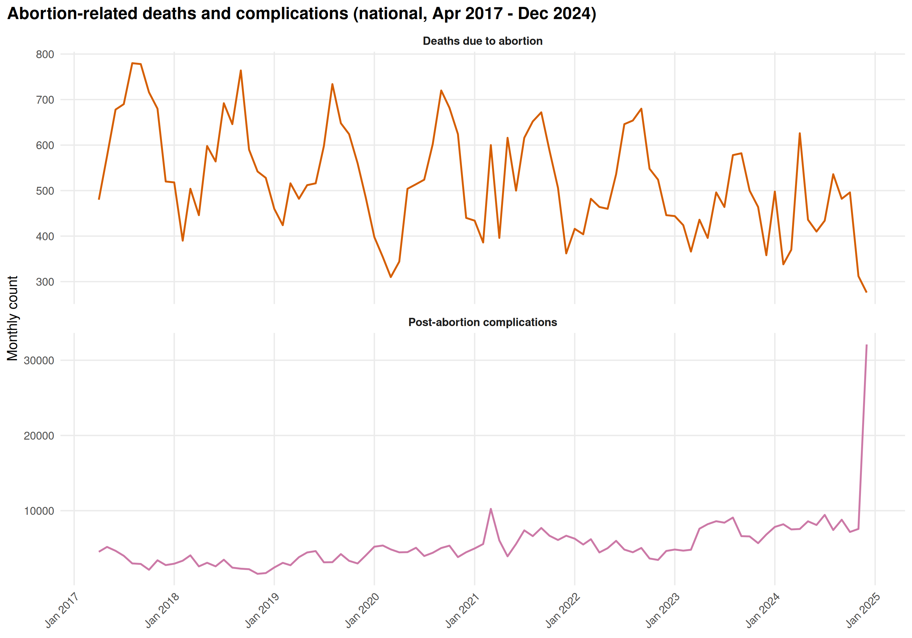
Abortion-related deaths and complications
national_ab_deaths <- abortion_deaths |>
  group_by(monyear) |>
  summarise(value = sum(value, na.rm = TRUE), .groups = "drop") |>
  mutate(date = parse_monyear(monyear), series = "Deaths due to abortion")

national_ab_comp <- abortion_complications |>
  group_by(monyear) |>
  summarise(value = sum(value, na.rm = TRUE), .groups = "drop") |>
  mutate(date = parse_monyear(monyear), series = "Post-abortion complications")

combined_ab_outcomes <- bind_rows(national_ab_deaths, national_ab_comp)

ggplot(combined_ab_outcomes, aes(date, value, color = series)) +
  geom_line(linewidth = 0.7) +
  facet_wrap(~series, ncol = 1, scales = "free_y") +
  scale_color_manual(values = c("#D55E00", "#CC79A7")) +
  scale_x_date(date_labels = "%b %Y", date_breaks = "1 year") +
  labs(
    x = NULL, y = "Monthly count",
    title = "Abortion-related deaths and complications (national, Apr 2017 - Dec 2024)"
  ) +
  theme_minimal(base_size = 11) +
  theme(
    plot.title = element_text(face = "bold"),
    plot.title.position = "plot",
    strip.text = element_text(face = "bold"),
    axis.text.x = element_text(angle = 45, hjust = 1),
    panel.grid.minor = element_blank(),
    legend.position = "none"
  )
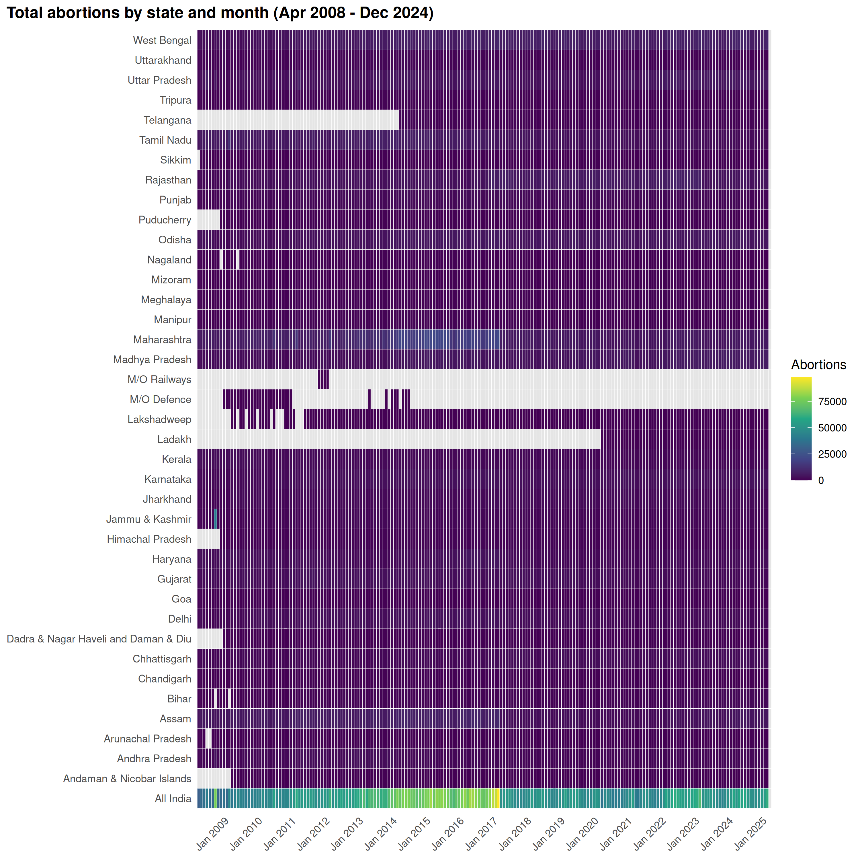
State-level abortion heatmap
plot_heatmap(
  abortions,
  title = "Total abortions by state and month (Apr 2008 - Dec 2024)",
  legend_title = "Abortions"
)
10. Seasonality of cause-specific mortality
Periodicity test for each adult death cause, post-2017, using the national monthly series.
adult_post2017 <- adult_deaths |>
  filter(period %in% c("Post-2017", "Post-2023"))

causes <- unique(adult_post2017$cause_label)

seasonality_results <- lapply(causes, function(cl) {
  national_ts <- adult_post2017 |>
    filter(cause_label == cl) |>
    group_by(monyear) |>
    summarise(value = sum(value, na.rm = TRUE), .groups = "drop") |>
    mutate(date = parse_monyear(monyear))

  if (nrow(national_ts) < 24) {
    return(NULL)
  }

  tryCatch(
    {
      prd <- detect_periodicity(national_ts)
      data.frame(
        Cause = cl,
        n_months = prd$n,
        is_periodic = prd$is_periodic,
        dominant_period = round(prd$dominant_period, 1),
        acf_peak = round(prd$acf_peak, 3),
        acf_threshold = round(prd$acf_threshold, 3),
        stringsAsFactors = FALSE
      )
    },
    error = function(e) NULL
  )
})

season_table <- do.call(rbind, Filter(Negate(is.null), seasonality_results)) |>
  as_tibble() |>
  arrange(desc(is_periodic), desc(acf_peak))
datatable(season_table,
  options = list(pageLength = 20, scrollX = TRUE),
  rownames = FALSE,
  caption = "Periodicity test results for adult cause-specific deaths (post-2017, national level)"
)
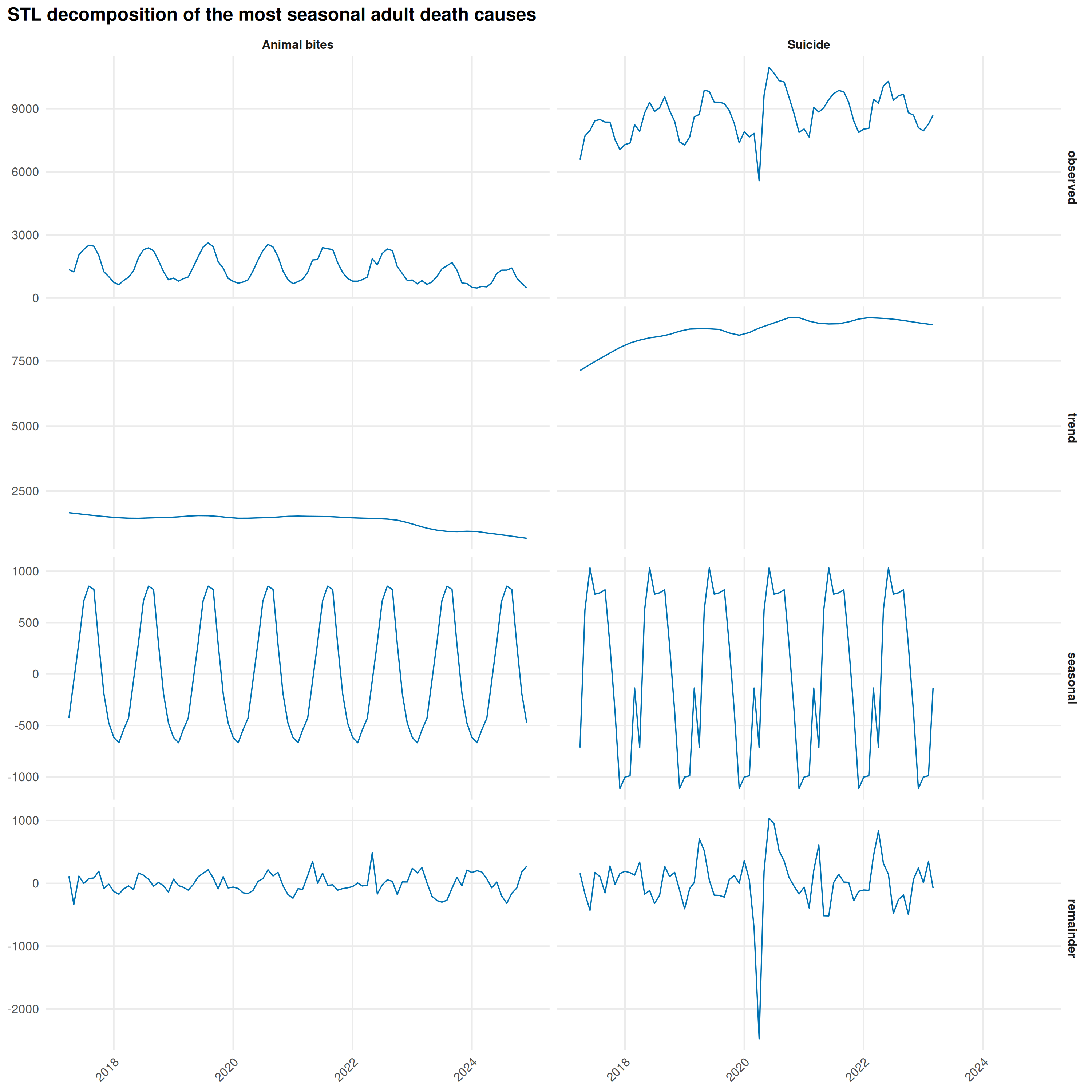
# STL decomposition for the most seasonal causes
seasonal_causes <- season_table |>
  filter(is_periodic) |>
  slice_max(acf_peak, n = 4) |>
  pull(Cause)

if (length(seasonal_causes) > 0) {
  decomp_list <- lapply(seasonal_causes, function(cl) {
    ts_data <- adult_post2017 |>
      filter(cause_label == cl) |>
      group_by(monyear) |>
      summarise(value = sum(value, na.rm = TRUE), .groups = "drop") |>
      mutate(date = parse_monyear(monyear))

    tryCatch(
      {
        decomp <- decompose_series(ts_data)
        decomp |>
          pivot_longer(
            cols = c(observed, trend, seasonal, remainder),
            names_to = "component", values_to = "val"
          ) |>
          mutate(
            cause = cl,
            component = factor(component,
              levels = c("observed", "trend", "seasonal", "remainder")
            )
          )
      },
      error = function(e) NULL
    )
  })

  decomp_all <- bind_rows(Filter(Negate(is.null), decomp_list))

  ggplot(decomp_all, aes(date, val)) +
    geom_line(color = "#0072B2", linewidth = 0.4) +
    facet_grid(component ~ cause, scales = "free_y") +
    scale_x_date(date_labels = "%Y", date_breaks = "2 years") +
    labs(
      x = NULL, y = NULL,
      title = "STL decomposition of the most seasonal adult death causes"
    ) +
    theme_minimal(base_size = 10) +
    theme(
      plot.title = element_text(face = "bold"),
      plot.title.position = "plot",
      strip.text = element_text(face = "bold", size = 8),
      axis.text.x = element_text(angle = 45, hjust = 1),
      panel.grid.minor = element_blank()
    )
}
Decomposing Fever deaths shows the Delta wave isolated in the STL remainder:
fever_ts <- adult_post2017 |>
  filter(cause_label == "Fever") |>
  group_by(monyear) |>
  summarise(value = sum(value, na.rm = TRUE), .groups = "drop") |>
  mutate(date = parse_monyear(monyear))

fever_decomp <- decompose_series(fever_ts)

fever_decomp_long <- fever_decomp |>
  pivot_longer(
    cols = c(observed, trend, seasonal, remainder),
    names_to = "component", values_to = "val"
  ) |>
  mutate(component = factor(component,
    levels = c("observed", "trend", "seasonal", "remainder")
  ))

ggplot(fever_decomp_long, aes(date, val)) +
  geom_line(color = "#D55E00", linewidth = 0.5) +
  facet_wrap(~component, ncol = 1, scales = "free_y") +
  scale_x_date(date_labels = "%b %Y", date_breaks = "1 year") +
  labs(
    x = NULL, y = NULL,
    title = "STL decomposition: Fever deaths (national, post-2017)"
  ) +
  theme_minimal(base_size = 11) +
  theme(
    strip.text = element_text(face = "bold"),
    panel.grid.minor = element_blank(),
    plot.title = element_text(face = "bold"),
    plot.title.position = "plot",
    axis.text.x = element_text(angle = 45, hjust = 1)
  )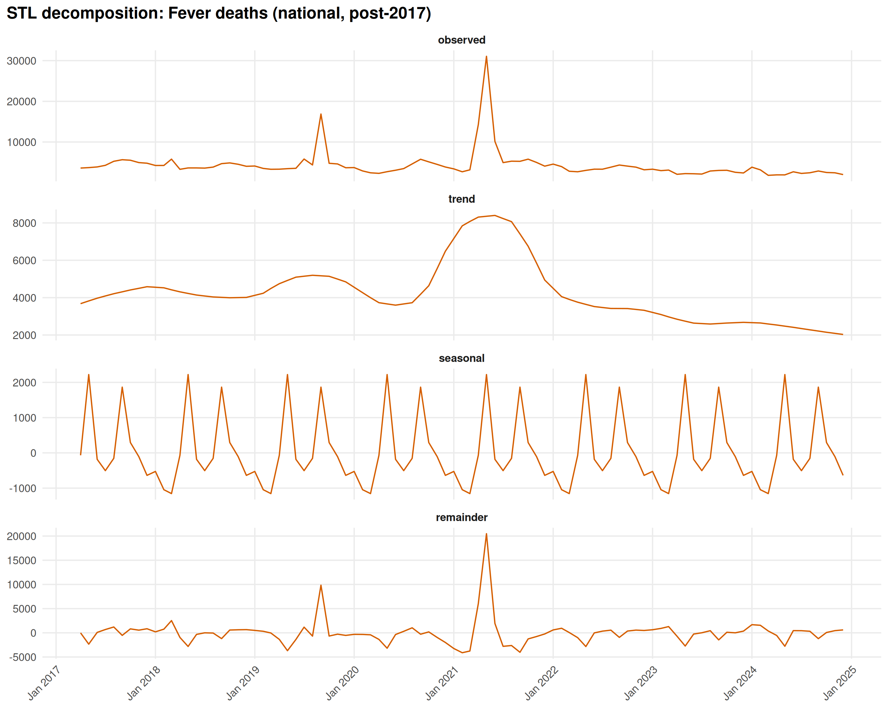
The remainder panel captures the April-June 2021 spike, separated from the regular seasonal cycle. It’s a one-off, not a recurring pattern.