Neonatal mortality and SNCU outcomes: seasonal patterns beyond birth volume
Source:vignettes/sncu-and-neonatal-mortality-seasonality.Rmd
sncu-and-neonatal-mortality-seasonality.Rmd
library(hmisindia)
library(dplyr)
library(tidyr)
library(ggplot2)
library(DT)
select <- dplyr::select  # pin: prevents DT masking dplyr::select

data_available <- tryCatch(
  {
    pq <- hmisindia::get_parquet_path()
    nzchar(pq) && file.exists(pq)
  },
  error = function(e) FALSE
)
knitr::opts_chunk$set(eval = data_available)

theme_hmis <- function(base_size = 12, ...) {
  hmisindia::theme_hmis(
    base_size = base_size,
    axis.text.x = element_text(angle = 45, hjust = 1), ...
  )
}

zscore <- function(x) (x - mean(x, na.rm = TRUE)) / sd(x, na.rm = TRUE)

add_month_cols <- function(df) {
  df |> mutate(
    month_num = as.integer(format(date, "%m")),
    month     = factor(month_num, levels = 1:12, labels = month.abb)
  )
}
male_births <- get_hmis("Number of male live births",
  category = "Total", sector = "Total",
  to = "Dec 2024"
)
female_births <- get_hmis("Number of female live births",
  category = "Total", sector = "Total",
  to = "Dec 2024"
)
sncu_deaths <- get_hmis("Number of deaths occurring at SNCU",
  category = "Total", sector = "Total",
  from = "Apr 2017", to = "Dec 2024"
)
lbw_raw <- get_hmis("Number of Newborns having weight less than 2.5 kg",
  category = "Total", sector = "Total"
)
weighed_raw <- get_hmis("Number of Newborns weighed at birth",
  category = "Total", sector = "Total"
)
preterm_raw <- get_hmis("Number of Pre term newborns",
  category = "Total", sector = "Total",
  from = "Apr 2017", to = "Dec 2024"
)
Live births in India follow a pronounced seasonal cycle, and SNCU deaths track birth volume. More births mechanically produce more deaths. Whether the neonatal mortality rate (deaths per 1,000 live births) itself is periodic is a different question: if the rate varies seasonally, that points to risk factors independent of birth volume, such as cold stress in winter or infection during the monsoon.
Sections 1-3 establish the birth baseline and compute the rate. Sections 4-5 test for periodicity and phase shift. Sections 6-7 examine low birth weight and pre-term births as potential mediators. Section 8 summarises state-level variation.
get_hmis()retrieves indicator data.detect_periodicity()tests for a 12-month cycle using autocorrelation.decompose_series()separates trend, seasonal, and remainder components via STL.
1. Birth seasonality baseline
Male and female live birth counts are summed to total monthly births.
births <- inner_join(
  male_births |> dplyr::select(state, monyear, male_births = value),
  female_births |> dplyr::select(state, monyear, female_births = value),
  by = c("state", "monyear")
) |>
  mutate(
    total_births = male_births + female_births,
    date         = parse_monyear(monyear)
  )
national_births <- births |>
  group_by(monyear) |>
  summarise(value = sum(total_births, na.rm = TRUE), .groups = "drop") |>
  mutate(date = parse_monyear(monyear))

ggplot(national_births, aes(date, value)) +
  geom_line(color = "#0072B2", linewidth = 0.6) +
  scale_x_date(date_labels = "%b %Y", date_breaks = "2 years") +
  scale_y_continuous(labels = scales::comma) +
  labs(
    x = NULL, y = "Total live births",
    title = "National monthly live births (male + female)",
    subtitle = "Clear annual oscillation superimposed on a declining trend"
  ) +
  theme_hmis()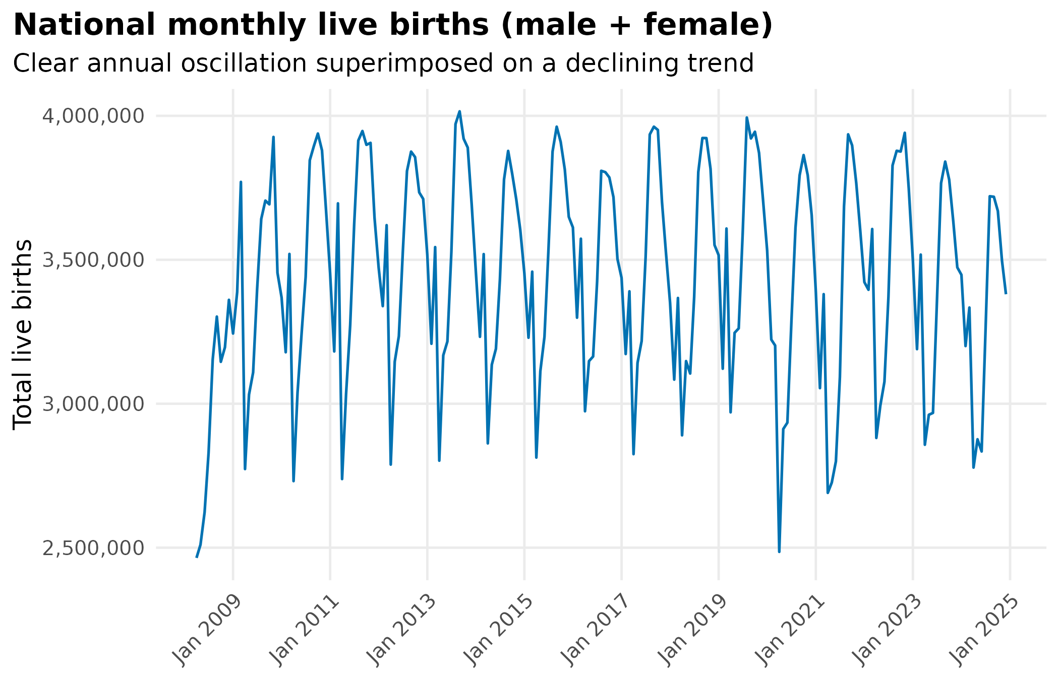
births_prd <- detect_periodicity(national_births)
print(births_prd)
#> Periodicity analysis (n = 201 observations)
#>   Detrended: TRUE
#>   Dominant period: 12 observations
#>   Spectral power concentration: 12.5 %
#>   ACF at dominant lag: 0.814 (threshold: 0.138 )
#>
#> Top frequencies:
#>  period    power
#>    12.0 1.69e+12
#>    11.4 1.66e+12
#>    12.7 1.65e+12
#>    13.5 1.61e+12
#>    10.8 1.58e+12
births_decomp <- decompose_series(national_births)

births_decomp |>
  pivot_longer(
    cols      = c(observed, trend, seasonal, remainder),
    names_to  = "component",
    values_to = "val"
  ) |>
  mutate(component = factor(component,
    levels = c("observed", "trend", "seasonal", "remainder")
  )) |>
  ggplot(aes(date, val)) +
  geom_line(color = "#0072B2", linewidth = 0.5) +
  facet_wrap(~component, ncol = 1, scales = "free_y") +
  labs(
    x = NULL, y = NULL,
    title = "STL decomposition of national live births",
    subtitle = "Seasonal component confirms a strong 12-month birth cycle"
  ) +
  theme_hmis(strip.text = element_text(face = "bold"))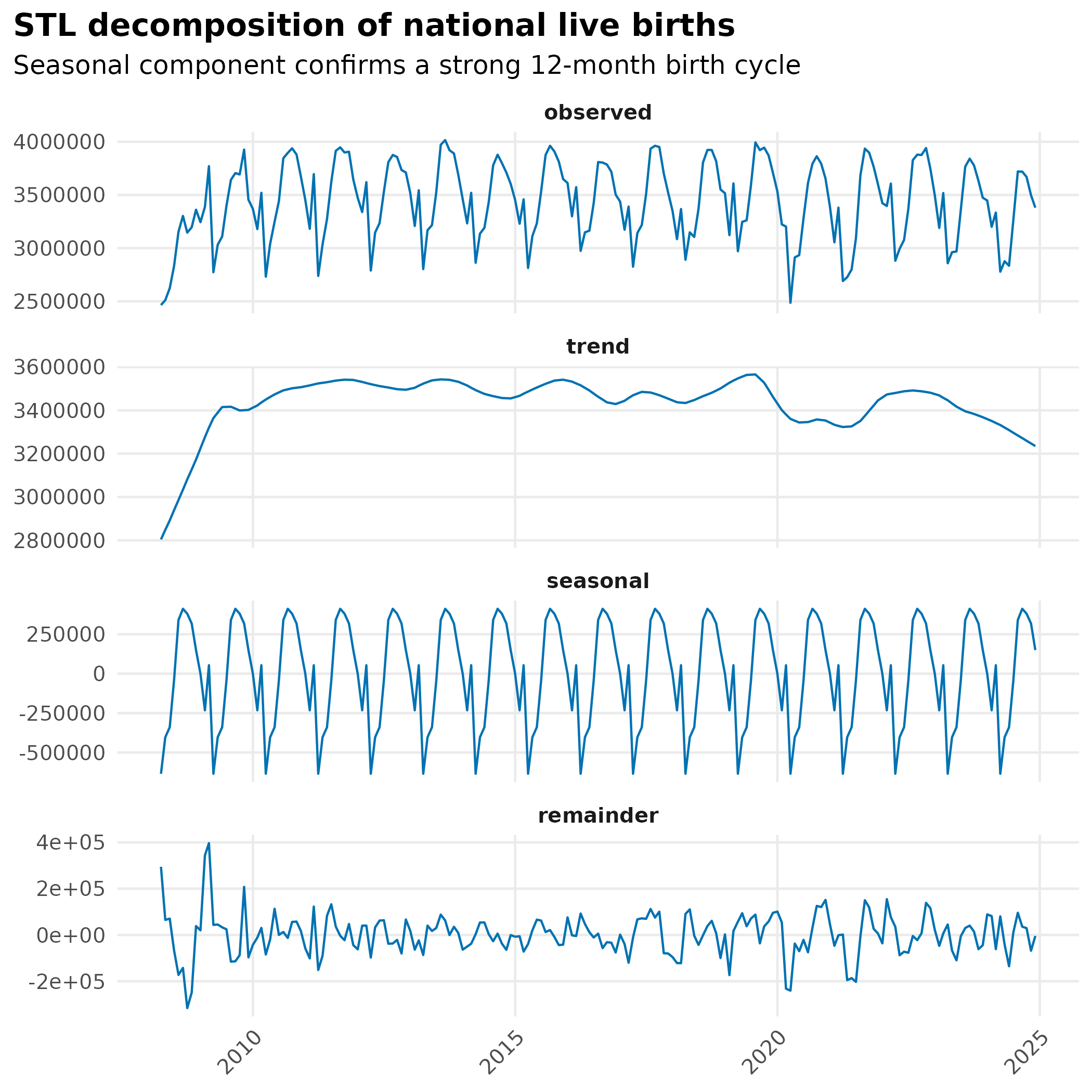
Live births have a strong 12-month cycle. Raw death count seasonality may simply reflect it.
2. SNCU deaths: raw counts
Raw monthly SNCU death counts at the national level.
national_sncu <- sncu_deaths |>
  group_by(monyear) |>
  summarise(value = sum(value, na.rm = TRUE), .groups = "drop") |>
  mutate(date = parse_monyear(monyear))

ggplot(national_sncu, aes(date, value)) +
  geom_line(color = "#D55E00", linewidth = 0.6) +
  scale_x_date(date_labels = "%b %Y", date_breaks = "1 year") +
  scale_y_continuous(labels = scales::comma) +
  labs(
    x = NULL, y = "SNCU deaths",
    title = "National monthly SNCU deaths",
    subtitle = "Raw counts are periodic. Does this reflect birth volume or true risk?"
  ) +
  theme_hmis()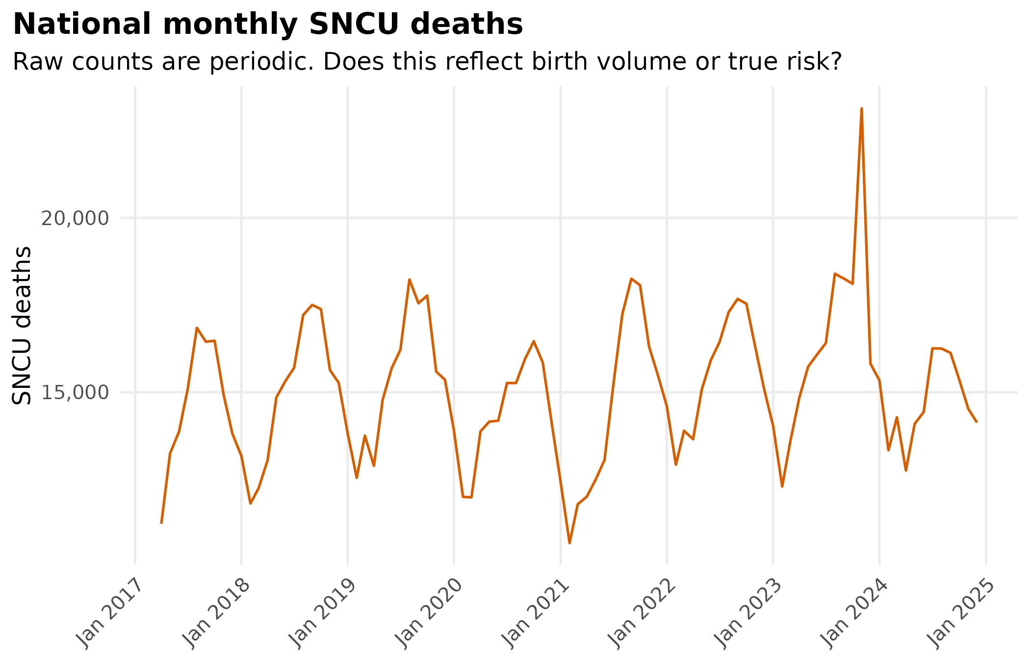
sncu_prd <- detect_periodicity(national_sncu)
print(sncu_prd)
#> Periodicity analysis (n = 93 observations)
#>   Detrended: TRUE
#>   Dominant period: 13.7 observations
#>   Spectral power concentration: 18.7 %
#>   ACF at dominant lag: 0.555 (threshold: 0.203 )
#>
#> Top frequencies:
#>  period    power
#>    13.7 35501807
#>    12.0 33714540
#>    10.7 32450012
#>    16.0 21684260
#>     9.6 16572181
Raw SNCU deaths are periodic, but that could be birth volume. Computing a rate removes that confound.
3. The mortality rate: removing birth volume
SNCU deaths per 1,000 live births, computed per state-month and aggregated nationally.
births_sncu_period <- births |>
  filter(
    date >= parse_monyear("Apr 2017"),
    date <= parse_monyear("Dec 2024")
  ) |>
  dplyr::select(state, monyear, total_births)

sncu_by_state <- sncu_deaths |>
  dplyr::select(state, monyear, sncu_deaths = value)

mortality_df <- inner_join(sncu_by_state, births_sncu_period,
  by = c("state", "monyear")
) |>
  filter(total_births > 0) |>
  mutate(
    sncu_rate = (sncu_deaths / total_births) * 1000,
    date      = parse_monyear(monyear)
  )
national_rate <- mortality_df |>
  group_by(monyear) |>
  summarise(
    total_deaths = sum(sncu_deaths, na.rm = TRUE),
    total_births = sum(total_births, na.rm = TRUE),
    .groups      = "drop"
  ) |>
  mutate(
    value = (total_deaths / total_births) * 1000,
    date  = parse_monyear(monyear)
  )

ggplot(national_rate, aes(date, value)) +
  geom_line(color = "#009E73", linewidth = 0.7) +
  geom_smooth(
    method    = "loess",
    se        = TRUE,
    color     = "#0072B2",
    fill      = "#56B4E9",
    alpha     = 0.2,
    linewidth = 0.5
  ) +
  scale_x_date(date_labels = "%b %Y", date_breaks = "1 year") +
  labs(
    x        = NULL,
    y        = "SNCU deaths per 1,000 live births",
    title    = "National SNCU mortality rate (deaths per 1,000 live births)",
    subtitle = "If periodicity persists after this normalisation, risk itself is seasonal"
  ) +
  theme_hmis()
peak_month_order <- mortality_df |>
  mutate(month = as.integer(format(date, "%m"))) |>
  group_by(state, month) |>
  summarise(mean_rate = mean(sncu_rate, na.rm = TRUE), .groups = "drop") |>
  group_by(state) |>
  slice_max(mean_rate, n = 1, with_ties = FALSE) |>
  arrange(month) |>
  pull(state)

mortality_df |>
  mutate(state = factor(state, levels = peak_month_order)) |>
  ggplot(aes(date, state, fill = sncu_rate)) +
  geom_tile(color = "white", linewidth = 0.1) +
  scale_fill_viridis_c(option = "inferno", name = "Deaths per\n1,000 births") +
  scale_x_date(date_labels = "%b %Y", date_breaks = "1 year") +
  labs(
    x = NULL, y = NULL,
    title = "SNCU mortality rate by state and month",
    subtitle = "States ordered by peak month. Vertical bands indicate months with elevated risk across states."
  ) +
  theme_hmis(base_size = 11, panel.grid = element_blank())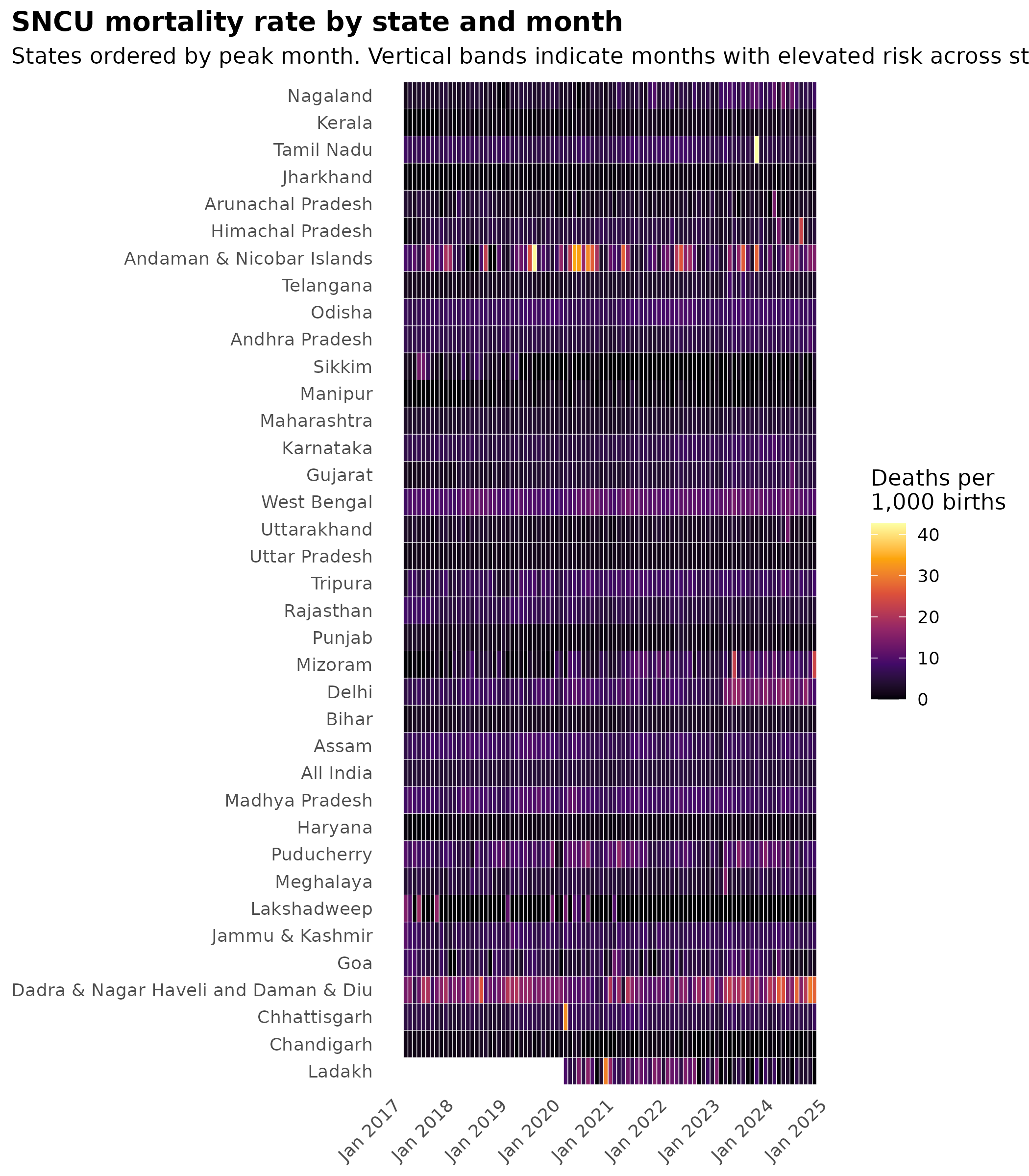
4. Periodicity in the mortality rate
After dividing out birth volume, does the mortality rate still cycle seasonally?
rate_prd <- detect_periodicity(national_rate)
print(rate_prd)
#> Periodicity analysis (n = 93 observations)
#>   Detrended: TRUE
#>   Dominant period: 13.7 observations
#>   Spectral power concentration: 11.3 %
#>   ACF at dominant lag: 0.42 (threshold: 0.203 )
#>
#> Top frequencies:
#>  period power
#>    13.7 1.178
#>    12.0 1.113
#>    10.7 1.066
#>    16.0 0.796
#>     9.6 0.566
rate_decomp <- decompose_series(national_rate)
rate_decomp_z <- rate_decomp |> mutate(z = zscore(seasonal))

rate_decomp |>
  pivot_longer(
    cols      = c(observed, trend, seasonal, remainder),
    names_to  = "component",
    values_to = "val"
  ) |>
  mutate(component = factor(component,
    levels = c("observed", "trend", "seasonal", "remainder")
  )) |>
  ggplot(aes(date, val)) +
  geom_line(color = "#009E73", linewidth = 0.5) +
  facet_wrap(~component, ncol = 1, scales = "free_y") +
  labs(
    x = NULL, y = NULL,
    title = "STL decomposition of national SNCU mortality rate",
    subtitle = "A persistent seasonal component confirms rate seasonality independent of births"
  ) +
  theme_hmis(strip.text = element_text(face = "bold"))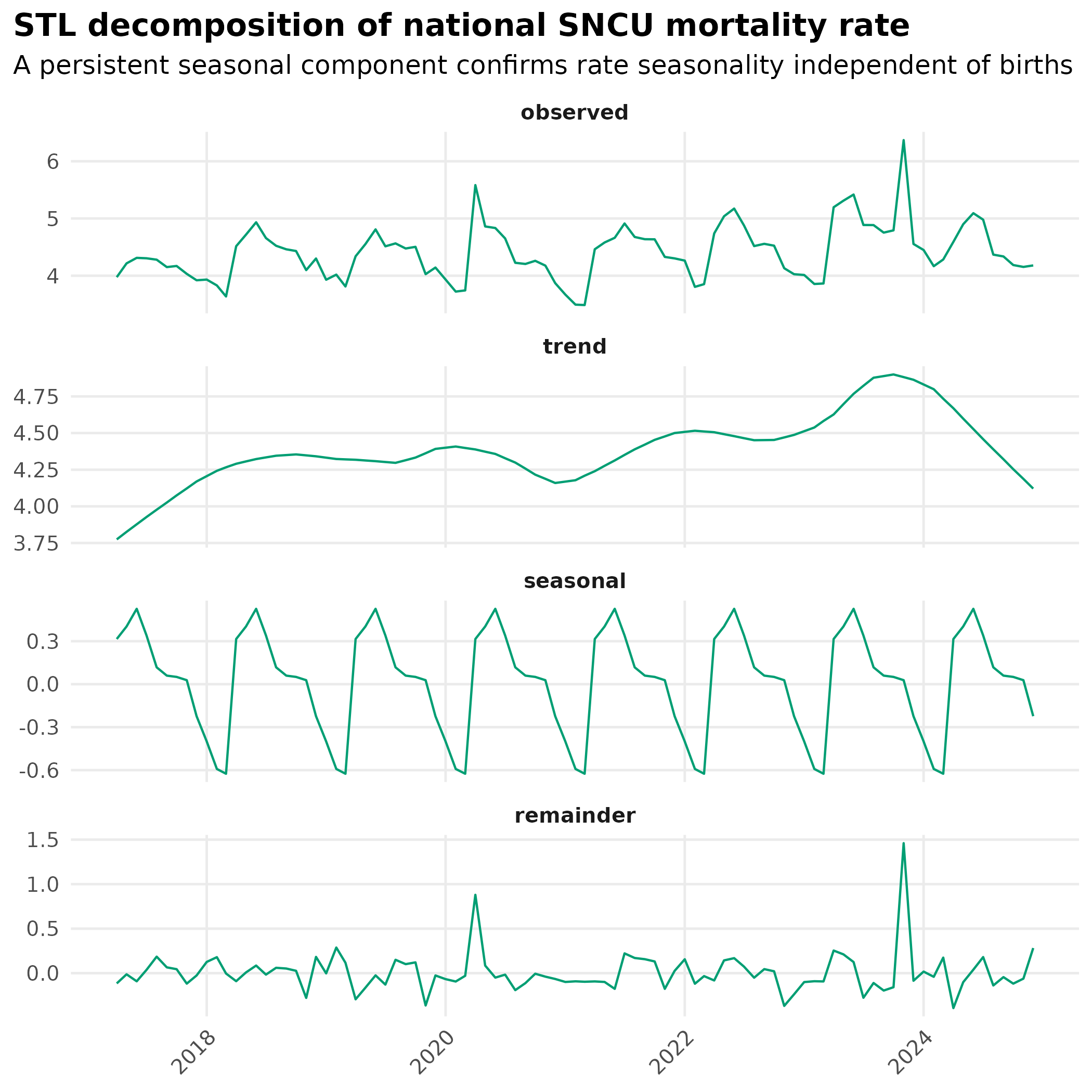
5. Phase shift: is mortality risk in phase with births?
If the mortality rate peaks at a different time of year than births, birth volume cannot explain it. The offset identifies an independent seasonal driver.
5a. Average seasonal profiles by calendar month
births_decomp_restricted <- births_decomp |>
  filter(date >= min(rate_decomp$date), date <= max(rate_decomp$date))

phase_df <- bind_rows(
  births_decomp_restricted |>
    add_month_cols() |>
    mutate(z = zscore(seasonal), series = "Live births") |>
    dplyr::select(month, month_num, z, series),
  rate_decomp_z |>
    add_month_cols() |>
    mutate(series = "SNCU mortality rate") |>
    dplyr::select(month, month_num, z, series)
) |>
  group_by(series, month, month_num) |>
  summarise(mean_z = mean(z, na.rm = TRUE), .groups = "drop")

ggplot(phase_df, aes(x = month, y = mean_z, color = series, group = series)) +
  geom_hline(yintercept = 0, linetype = "dashed", color = "grey60") +
  geom_line(linewidth = 1.2) +
  geom_point(size = 3) +
  scale_color_manual(
    values = c("Live births" = "#0072B2", "SNCU mortality rate" = "#D55E00"),
    name   = NULL
  ) +
  labs(
    x        = NULL,
    y        = "Mean seasonal component (z-score)",
    title    = "Average seasonal profile: birth volume vs SNCU mortality rate",
    subtitle = "A horizontal offset between curves indicates a phase shift and independent seasonal risk"
  ) +
  theme_hmis(legend.position = "bottom")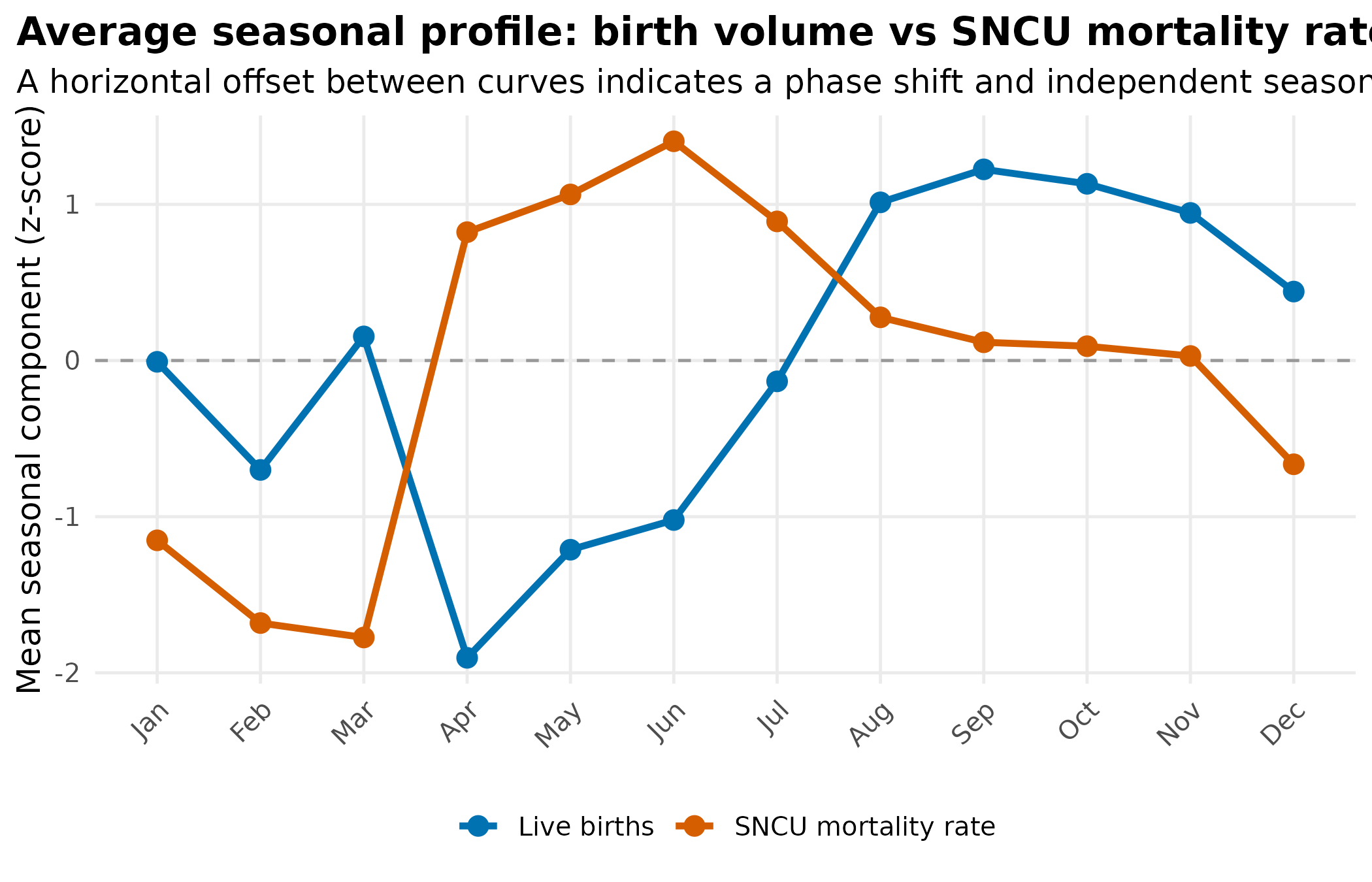
5b. Cross-correlation: quantifying the phase shift
- Negative lag: mortality rate leads births (peaks before birth peak)
- Positive lag: mortality rate lags births (peaks after birth peak)
- Lag = 0: both peak in the same month
births_seasonal <- births_decomp_restricted |>
  arrange(date) |>
  pull(seasonal)

rate_seasonal <- rate_decomp |>
  arrange(date) |>
  pull(seasonal)

ccf_result <- ccf(births_seasonal, rate_seasonal, lag.max = 6, plot = FALSE)

ccf_df <- data.frame(
  lag = as.integer(ccf_result$lag),
  acf = as.numeric(ccf_result$acf)
)

ci <- qnorm(0.975) / sqrt(length(births_seasonal))

ggplot(ccf_df, aes(x = lag, y = acf)) +
  geom_hline(yintercept = ci, linetype = "dashed", color = "grey60") +
  geom_hline(yintercept = -ci, linetype = "dashed", color = "grey60") +
  geom_hline(yintercept = 0, color = "grey40") +
  geom_col(fill = "#0072B2", width = 0.6) +
  scale_x_continuous(breaks = -6:6) +
  labs(
    x        = "Lag (months). Positive = mortality lags births",
    y        = "Cross-correlation",
    title    = "CCF: birth seasonal component vs SNCU mortality rate seasonal component",
    subtitle = "Peak lag = phase shift in months. Dashed lines = 95% CI"
  ) +
  theme_hmis()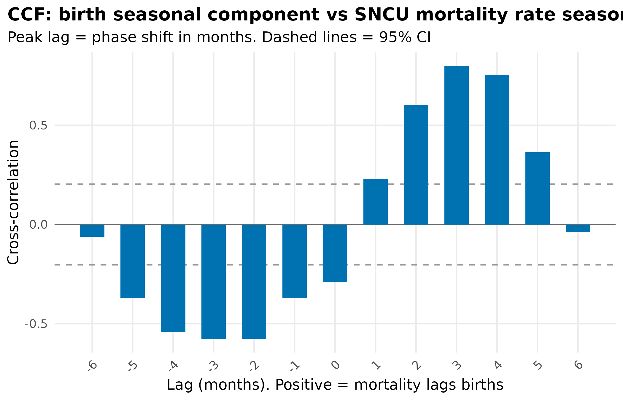
peak_lag <- ccf_df$lag[which.max(abs(ccf_df$acf))]
cat("Peak cross-correlation at lag:", peak_lag, "months\n")
#> Peak cross-correlation at lag: 3 months
overlay_df <- bind_rows(
  births_decomp_restricted |>
    mutate(z = zscore(seasonal), series = "Live births (seasonal component)") |>
    dplyr::select(date, z, series),
  rate_decomp_z |>
    mutate(series = "SNCU mortality rate (seasonal component)") |>
    dplyr::select(date, z, series)
)

ggplot(overlay_df, aes(date, z, color = series)) +
  geom_line(linewidth = 0.7) +
  geom_hline(yintercept = 0, linetype = "dashed", color = "grey50") +
  scale_color_manual(
    values = c(
      "Live births (seasonal component)"         = "#0072B2",
      "SNCU mortality rate (seasonal component)" = "#D55E00"
    ),
    name = NULL
  ) +
  scale_x_date(date_labels = "%b %Y", date_breaks = "1 year") +
  labs(
    x        = NULL,
    y        = "Seasonal component (z-score)",
    title    = "Seasonal components over time: birth volume vs SNCU mortality rate",
    subtitle = "A consistent offset between peaks indicates a stable phase shift"
  ) +
  theme_hmis(legend.position = "bottom")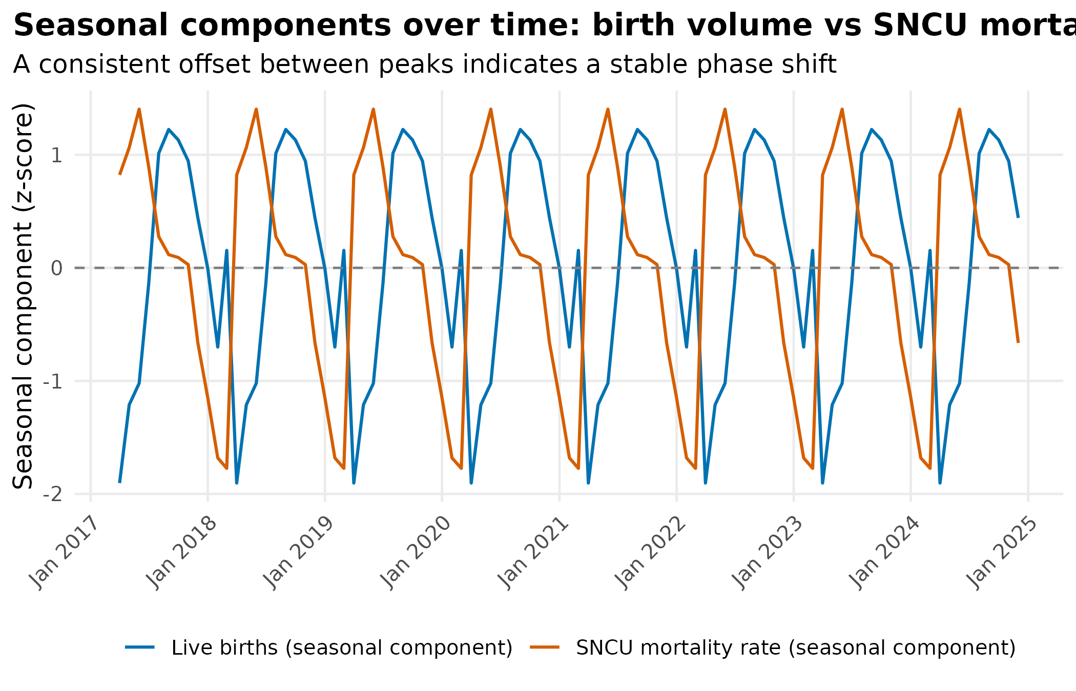
Positive lag (mortality follows births): infection-driven, with monsoon sepsis peaking weeks after delivery. Negative lag (mortality leads births): cold stress, prematurity, or antenatal factors. No lag: residual volume confounding or risk that amplifies during high-birth months.
6. Low birth weight as a mediator
lbw_df <- inner_join(
  lbw_raw |> dplyr::select(state, monyear, lbw_count = value),
  weighed_raw |> dplyr::select(state, monyear, weighed_count = value),
  by = c("state", "monyear")
) |>
  filter(weighed_count > 0) |>
  mutate(lbw_rate = (lbw_count / weighed_count) * 100)
national_lbw <- lbw_df |>
  group_by(monyear) |>
  summarise(
    total_lbw     = sum(lbw_count, na.rm = TRUE),
    total_weighed = sum(weighed_count, na.rm = TRUE),
    .groups       = "drop"
  ) |>
  mutate(
    value = (total_lbw / total_weighed) * 100,
    date = parse_monyear(monyear)
  )

ggplot(national_lbw, aes(date, value)) +
  geom_line(color = "#CC79A7", linewidth = 0.7) +
  scale_x_date(date_labels = "%b %Y", date_breaks = "1 year") +
  labs(
    x = NULL, y = "LBW rate (%)",
    title = "National low birth weight rate (% of weighed newborns < 2.5 kg)",
    subtitle = "If seasonal, LBW rate is a candidate mediator of seasonal mortality"
  ) +
  theme_hmis()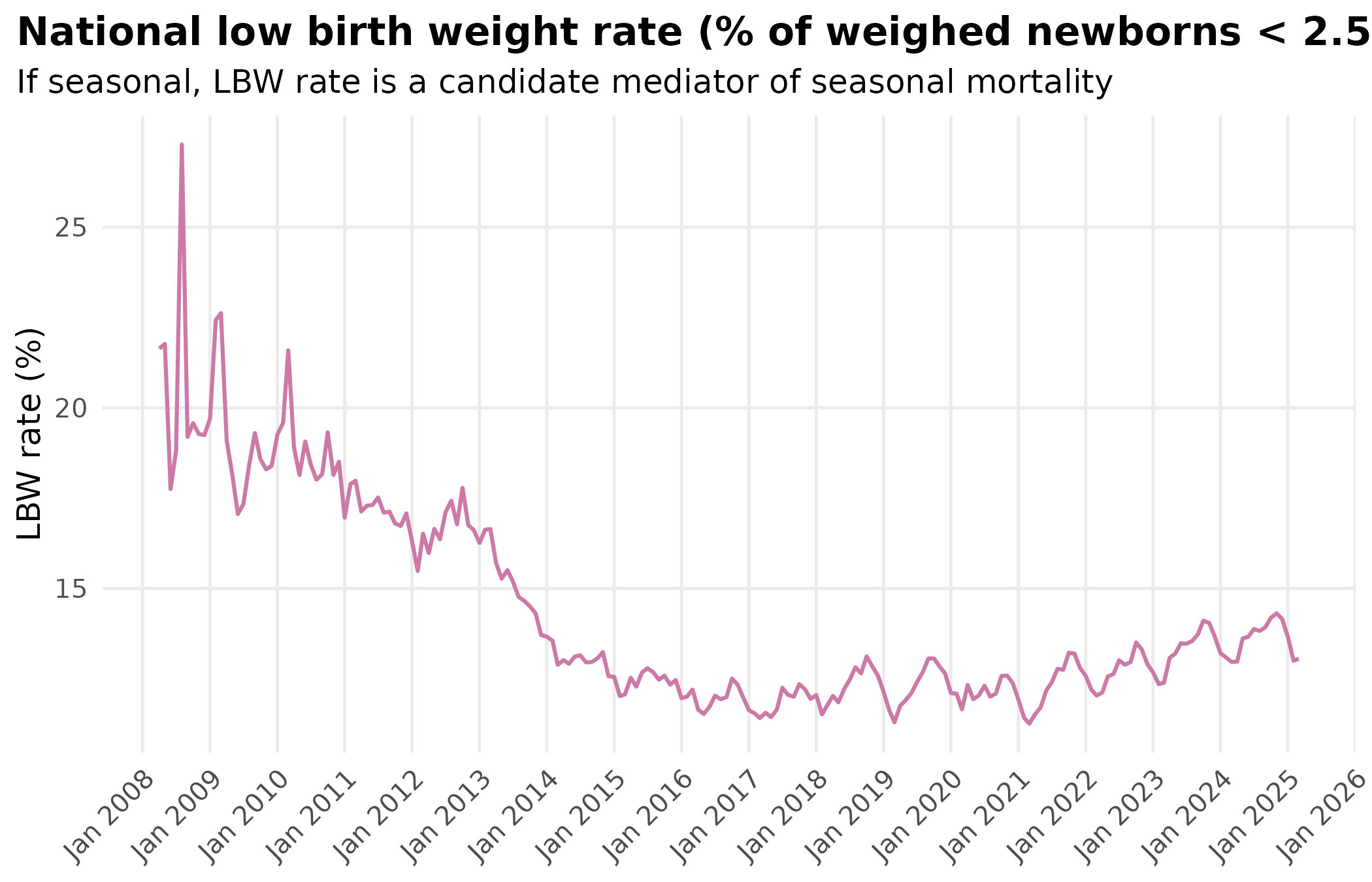
lbw_prd <- detect_periodicity(national_lbw)
print(lbw_prd)
#> Periodicity analysis (n = 204 observations)
#>   Detrended: TRUE
#>   Dominant period: 43.2 observations
#>   Spectral power concentration: 16.9 %
#>   ACF at dominant lag: 0.051 (threshold: 0.137 )
#>
#> Top frequencies:
#>  period power
#>    43.2  8.43
#>    36.0  4.77
#>    30.9  2.99
#>    27.0  1.91
#>    12.0  1.83
lbw_monthly <- national_lbw |>
  add_month_cols() |>
  group_by(month, month_num) |>
  summarise(mean_lbw = mean(value, na.rm = TRUE), .groups = "drop")

rate_monthly <- national_rate |>
  add_month_cols() |>
  group_by(month, month_num) |>
  summarise(mean_rate = mean(value, na.rm = TRUE), .groups = "drop")

monthly_joined <- inner_join(lbw_monthly, rate_monthly,
  by = c("month", "month_num")
)

ggplot(monthly_joined, aes(mean_lbw, mean_rate, color = month)) +
  geom_point(size = 4) +
  geom_text(aes(label = month), vjust = -0.8, size = 3.5, show.legend = FALSE) +
  scale_color_manual(
    values = setNames(
      colorRampPalette(RColorBrewer::brewer.pal(11, "Spectral"))(12),
      month.abb
    ),
    name = "Month"
  ) +
  labs(
    x        = "Mean LBW rate (%)",
    y        = "Mean SNCU deaths per 1,000 births",
    title    = "LBW rate vs SNCU mortality rate: average by calendar month",
    subtitle = "Each point = one calendar month averaged across all years"
  ) +
  theme_hmis(legend.position = "none")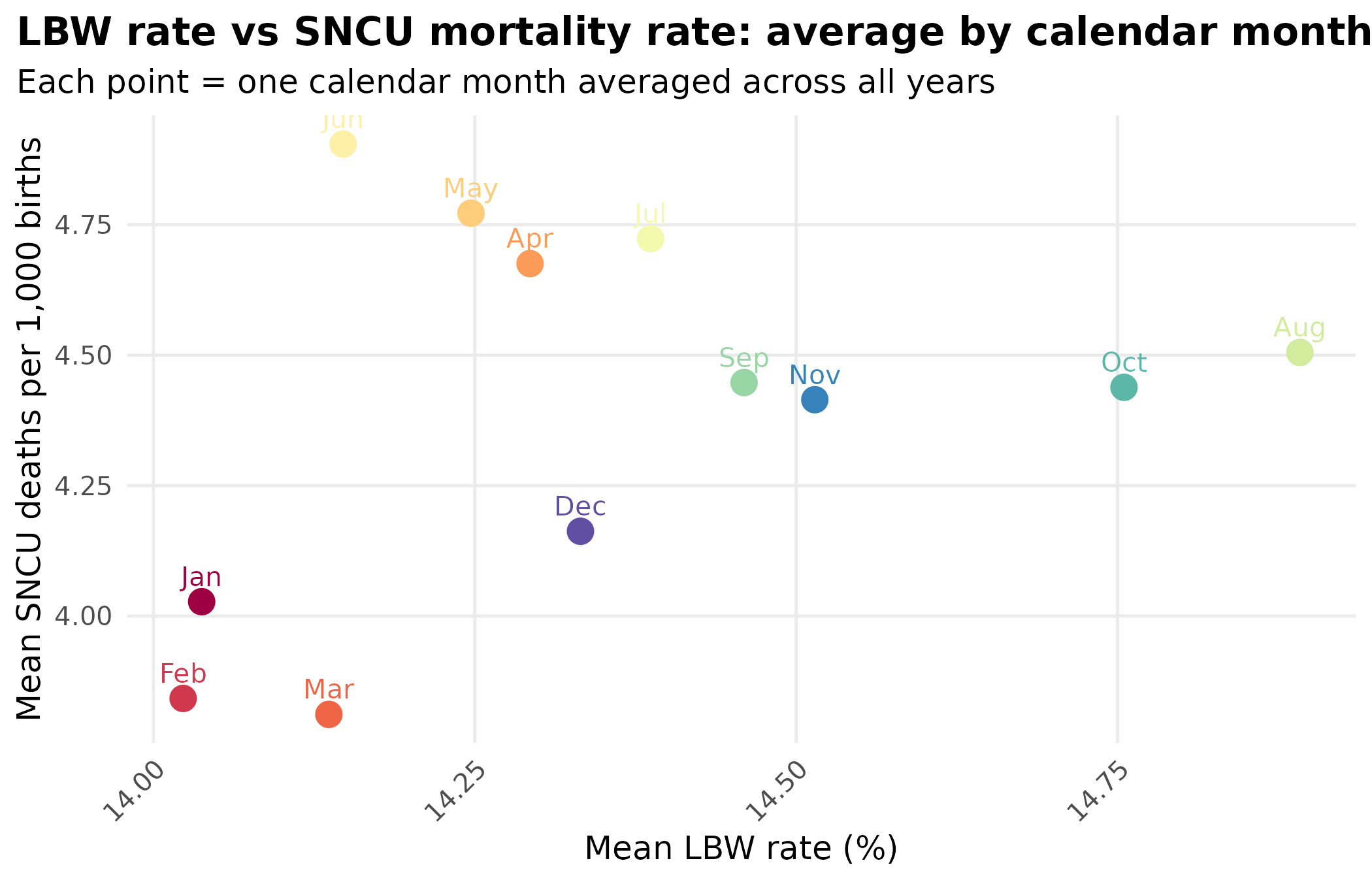
7. Pre-term births as a mediator
preterm_df <- inner_join(
  preterm_raw |> dplyr::select(state, monyear, preterm_count = value),
  births_sncu_period,
  by = c("state", "monyear")
) |>
  filter(total_births > 0) |>
  mutate(preterm_rate = (preterm_count / total_births) * 100)
national_preterm <- preterm_df |>
  group_by(monyear) |>
  summarise(
    total_preterm = sum(preterm_count, na.rm = TRUE),
    total_births  = sum(total_births, na.rm = TRUE),
    .groups       = "drop"
  ) |>
  mutate(
    value = (total_preterm / total_births) * 100,
    date = parse_monyear(monyear)
  )

ggplot(national_preterm, aes(date, value)) +
  geom_line(color = "#E69F00", linewidth = 0.7) +
  scale_x_date(date_labels = "%b %Y", date_breaks = "1 year") +
  labs(
    x = NULL, y = "Pre-term rate (%)",
    title = "National pre-term birth rate (% of total live births)",
    subtitle = "If seasonal and in phase with mortality rate, prematurity may be the mechanism"
  ) +
  theme_hmis()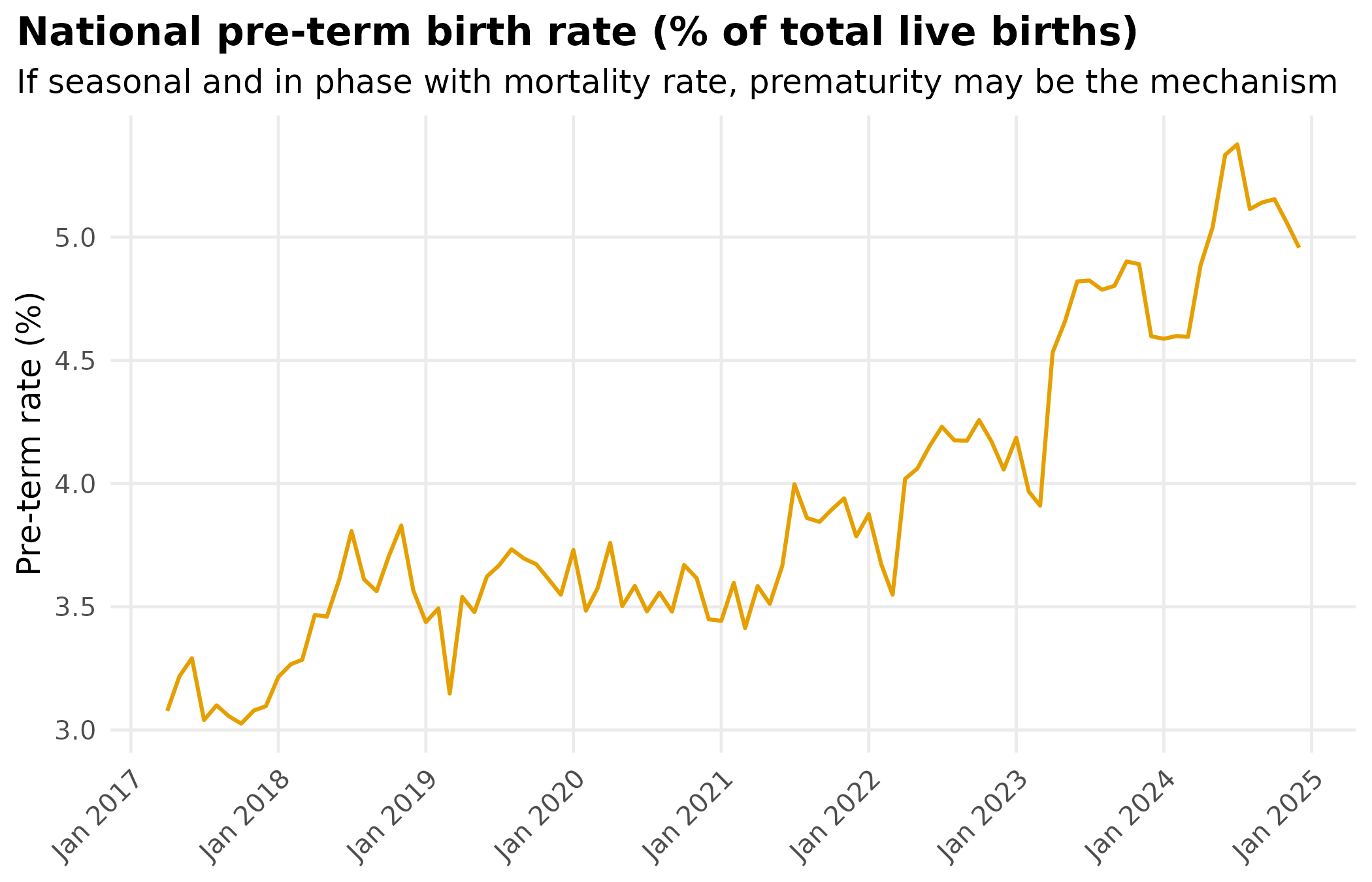
preterm_prd <- detect_periodicity(national_preterm)
print(preterm_prd)
#> Periodicity analysis (n = 93 observations)
#>   Detrended: TRUE
#>   Dominant period: 32 observations
#>   Spectral power concentration: 19.2 %
#>   ACF at dominant lag: -0.311 (threshold: 0.203 )
#>
#> Top frequencies:
#>  period power
#>    32.0 0.353
#>    10.7 0.172
#>    12.0 0.171
#>    13.7 0.165
#>    24.0 0.142
preterm_decomp <- decompose_series(national_preterm)
common_dates <- intersect(preterm_decomp$date, rate_decomp$date)

overlay_preterm <- bind_rows(
  preterm_decomp |>
    filter(date %in% common_dates) |>
    mutate(z = zscore(seasonal), series = "Pre-term rate (seasonal)") |>
    dplyr::select(date, z, series),
  rate_decomp_z |>
    filter(date %in% common_dates) |>
    mutate(series = "SNCU mortality rate (seasonal)") |>
    dplyr::select(date, z, series)
)

ggplot(overlay_preterm, aes(date, z, color = series)) +
  geom_line(linewidth = 0.7) +
  geom_hline(yintercept = 0, linetype = "dashed", color = "grey50") +
  scale_color_manual(
    values = c(
      "Pre-term rate (seasonal)" = "#E69F00",
      "SNCU mortality rate (seasonal)" = "#D55E00"
    ),
    name = NULL
  ) +
  scale_x_date(date_labels = "%b %Y", date_breaks = "1 year") +
  labs(
    x = NULL, y = "Seasonal component (z-score)",
    title = "Seasonal components: pre-term birth rate vs SNCU mortality rate",
    subtitle = "In phase = prematurity drives seasonal mortality. Out of phase = other pathway."
  ) +
  theme_hmis(legend.position = "bottom")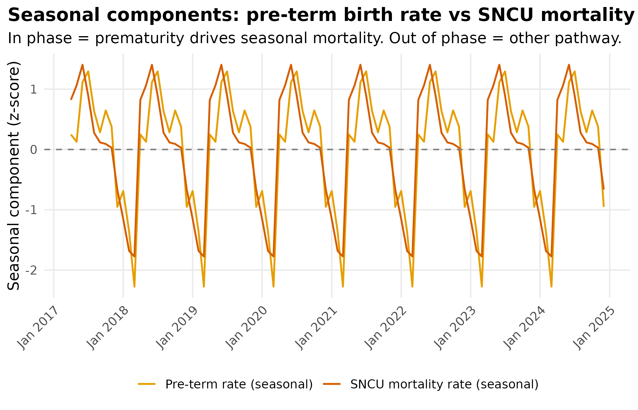
8. State-level variation
state_names <- unique(mortality_df$state)

state_results <- lapply(state_names, function(st) {
  st_data <- mortality_df |>
    filter(state == st) |>
    group_by(monyear) |>
    summarise(value = mean(sncu_rate, na.rm = TRUE), .groups = "drop") |>
    mutate(date = parse_monyear(monyear)) |>
    arrange(date)

  if (nrow(st_data) < 24) {
    return(NULL)
  }

  tryCatch(
    {
      prd <- detect_periodicity(st_data)

      peak_month <- tryCatch(
        {
          decomp <- decompose_series(st_data)
          decomp |>
            mutate(month = format(date, "%b")) |>
            group_by(month) |>
            summarise(mean_s = mean(seasonal, na.rm = TRUE), .groups = "drop") |>
            slice_max(mean_s, n = 1, with_ties = FALSE) |>
            pull(month)
        },
        error = function(e) NA_character_
      )

      data.frame(
        State             = st,
        `Mean rate`       = round(mean(st_data$value, na.rm = TRUE), 2),
        Periodic          = prd$is_periodic,
        `Dominant period` = round(prd$dominant_period, 1),
        `ACF peak`        = round(prd$acf_peak, 3),
        `Peak month`      = peak_month,
        stringsAsFactors  = FALSE,
        check.names       = FALSE
      )
    },
    error = function(e) NULL
  )
})

state_table <- do.call(rbind, Filter(Negate(is.null), state_results)) |>
  as_tibble() |>
  arrange(desc(Periodic), desc(`ACF peak`))
datatable(
  state_table,
  filter   = "top",
  options  = list(pageLength = 20, scrollX = TRUE),
  rownames = FALSE,
  caption  = "State-level SNCU mortality rate: periodicity analysis. States with Periodic = TRUE and high ACF peaks show the strongest evidence for seasonal risk."
)
Summary
Birth volume has a strong 12-month cycle that produces apparent periodicity in raw death counts. After normalising for birth volume, the SNCU mortality rate retains its own seasonal signal, confirming risk-level seasonality rather than a volume artefact.
The phase shift (Section 5) pinpoints when risk peaks relative to births. A shift of 1-2 months is inconsistent with pure volume confounding. Low birth weight and pre-term birth rates (Sections 6-7) are candidate mediators; whether they lead, lag, or match the mortality rate determines whether they explain it or share a common cause.
State-level variation (Section 8) is substantial, likely driven by differences in monsoon timing, facility capacity, and reporting completeness.